If you are the owner of a small business, then you know just how hard it is for you and your business to stand out of the crowd.
Especially when you live in a big town or city and have loads of competitors surrounding you.
Luckily enough, word-of-mouth marketing is beginning to take a backseat when it comes to people deciding on whether or not they should use your services.
This is because 81% of people perform some sort of online research about your business before actually visiting or using your services.


One crucial way you can stand out from your tens or hundreds of competitors is by having an amazing website to represent you and your business.
I know from personal experience, that before I go anywhere new, I will look up the business or place online, and if their website is out-dated or not easy-to-use, then I simply will not go and search for the next similar place and check out their website, and so on.
Because having a great online presence is so important, I’ve rounded up some of my favorite website designs for small businesses from all around the globe.
Whether you’re an aspiring business owner looking for great websites to gather some inspiration from for your own website, or you’re a graphic designer working on your newest project, we can all learn a little something from these amazing websites.
So, let’s get to it!
Dentistry Website Design
Now there are lots of different ways to present your dental clinic, which the dental marketing guy makes very clear to us.
Because medical services are very personal, it can be an intimidating task for a person to decide which doctors and practices to go with.
That’s why presenting your team front and center on the home page could be a crucial part of winning over a new patient.
Take this website for example.
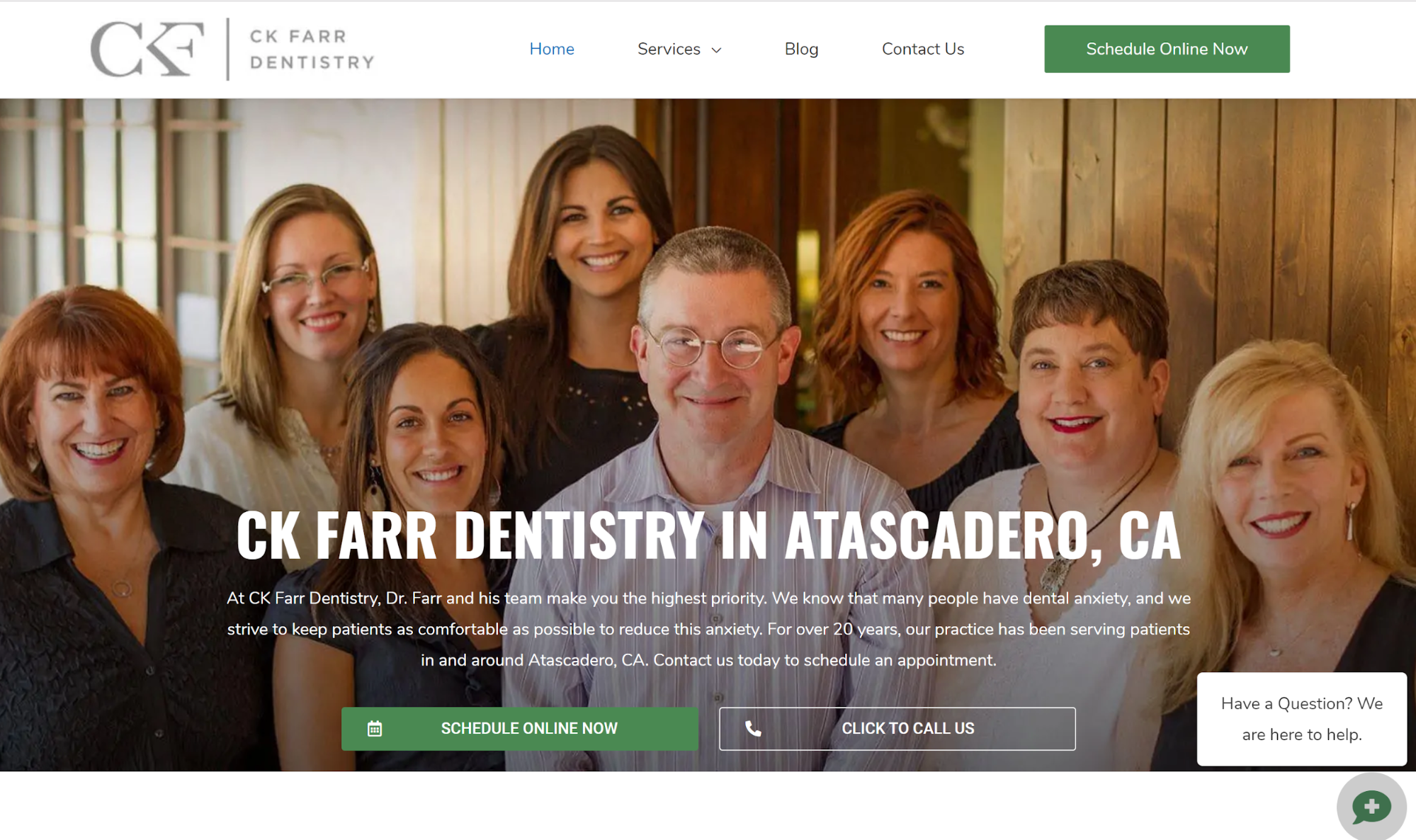

When a person is trying to decide which dental clinic to go to and they search for “Dental clinics near me”, and this website shows up, they’ll surely feel a sense of relief.
Dentists are many times portrayed as scary, but when you present your team on the home page like this, all giving off kind smiles, a person will feel more comfortable and will be more inclined to go with your practice.
This website is clean, clear, and to the point. It’s easy to navigate and the dominating color is blue, which gives a person a sense of trust, loyalty, and calm.
High-quality candid videos and friendly photos on your homepage are a great idea for your website design.
If you specialize in dentistry and want a professional and sleek design for your webpage, but don’t have the time to make it yourself, definitely check out what The Dental Marketing Guy has to offer.
Dermatology Website Design
Next up, we have skincare websites.
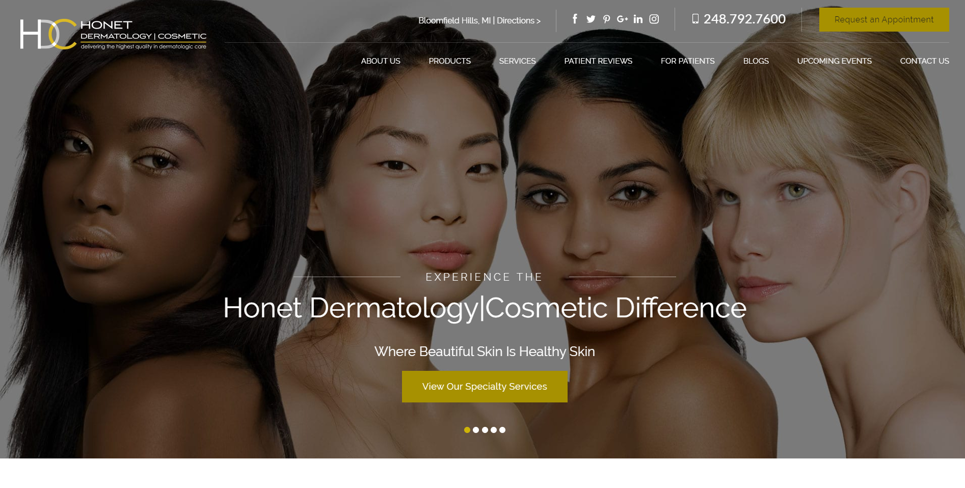
And the main point I want to touch on for the next two websites is representation.
[

[source]
In the image above, we see four stunning women, who are all different but reminding each of us that beauty is diverse and comes in all shades, shapes, and sizes.
I don’t think there’s anything more beautiful than that.
Not to mention the website is minimalist and easy to navigate. A major win-win.

[source]
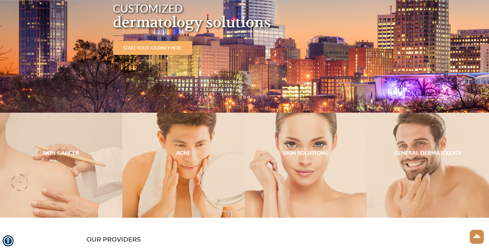
Next up we see Raleigh Dermatology killing the game, by representing both women and men.
We love to see firms being inclusive.
The matching color gradient is top-notch.
Law Firm Website Design
When you are in need of a lawyer, you need someone who is going to fight for you and represent you.
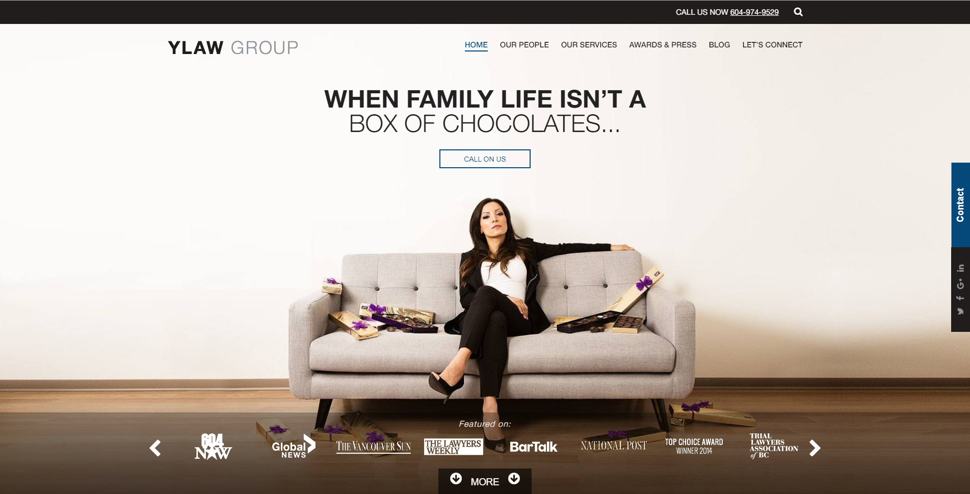
What better way to get a taste of who is going to be representing you, than by being able to see the firm’s representatives on the home page?

[source]
YLAW isn’t playing around when it comes to clever visuals that stick with you. The creativity of play on words in these visuals is incredible.
Check out a few more examples.
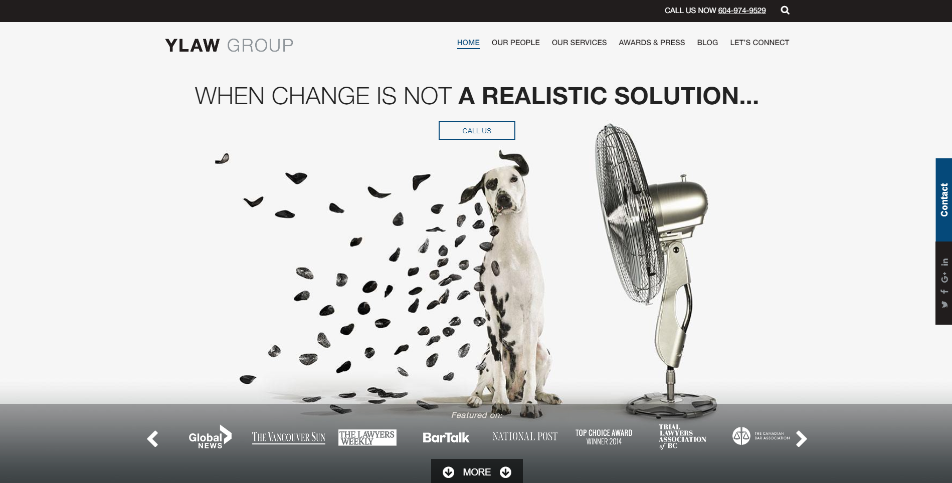

[source]
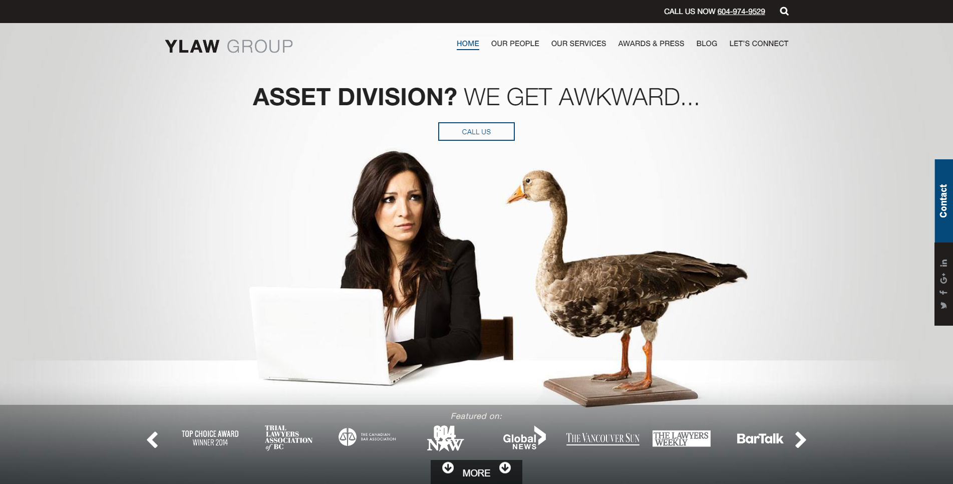

[source]
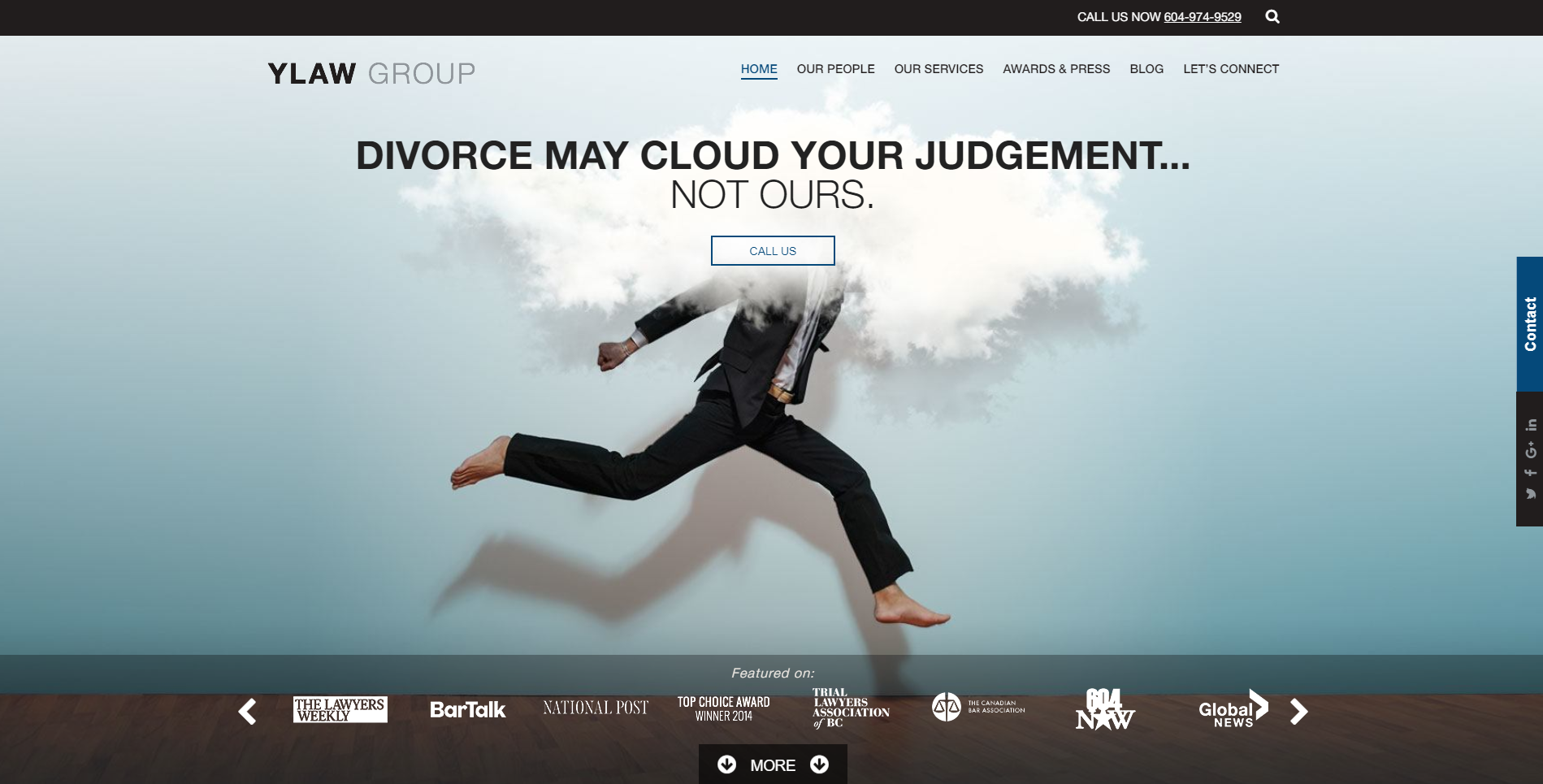

[source]
These are the kind of people you want to fight for you. Check out their website for more inspirational visuals!
Interior Design Website Trends
Everyone loves their house to be just their style.
And that’s where you come in.
You know the competition is high, but no one’s design skills compare to yours!
Display those design skills at the forefront of your website like these people did.
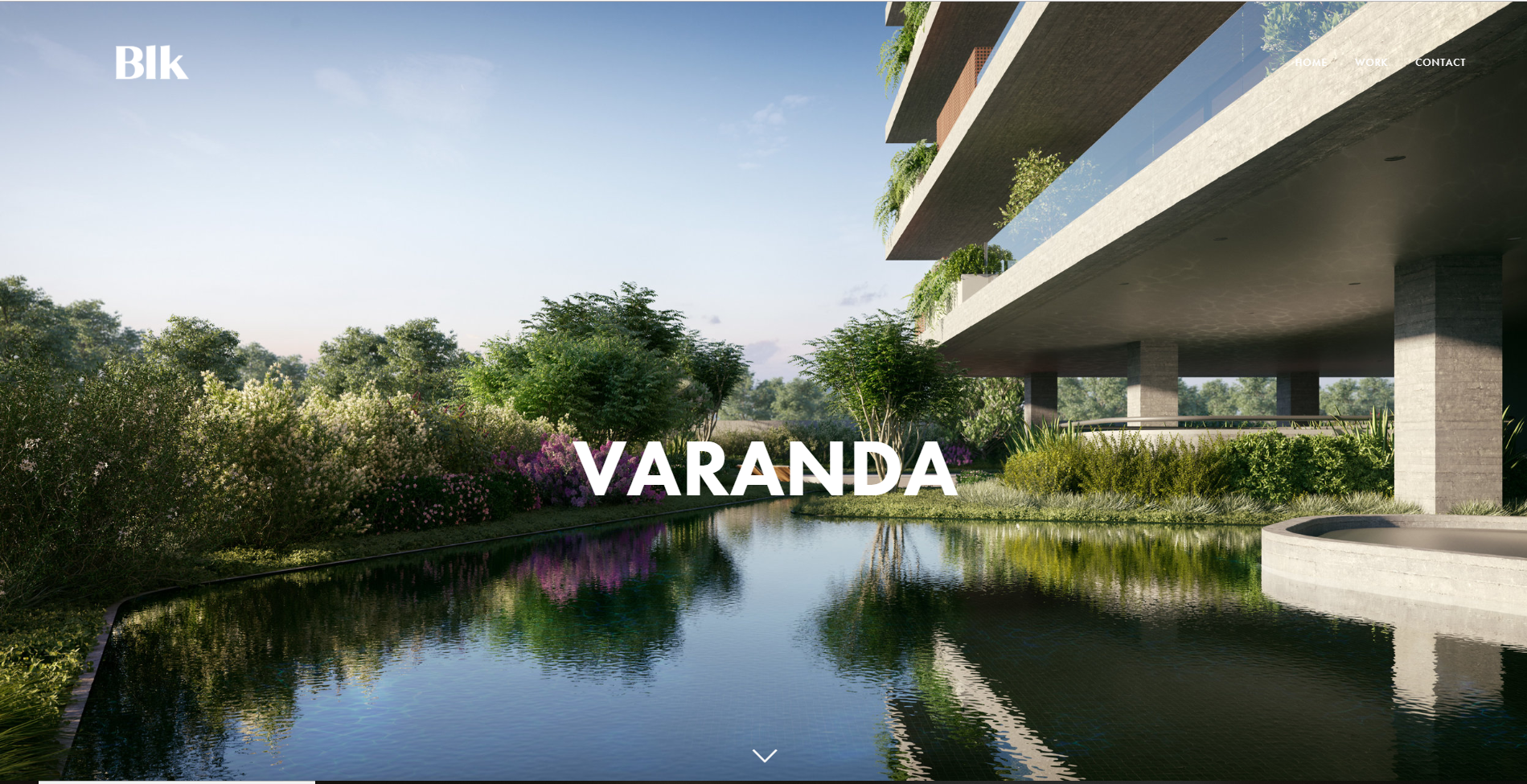

[source]
When you’re showing people what you’re capable, it’s best to put your absolute best work on the front page.
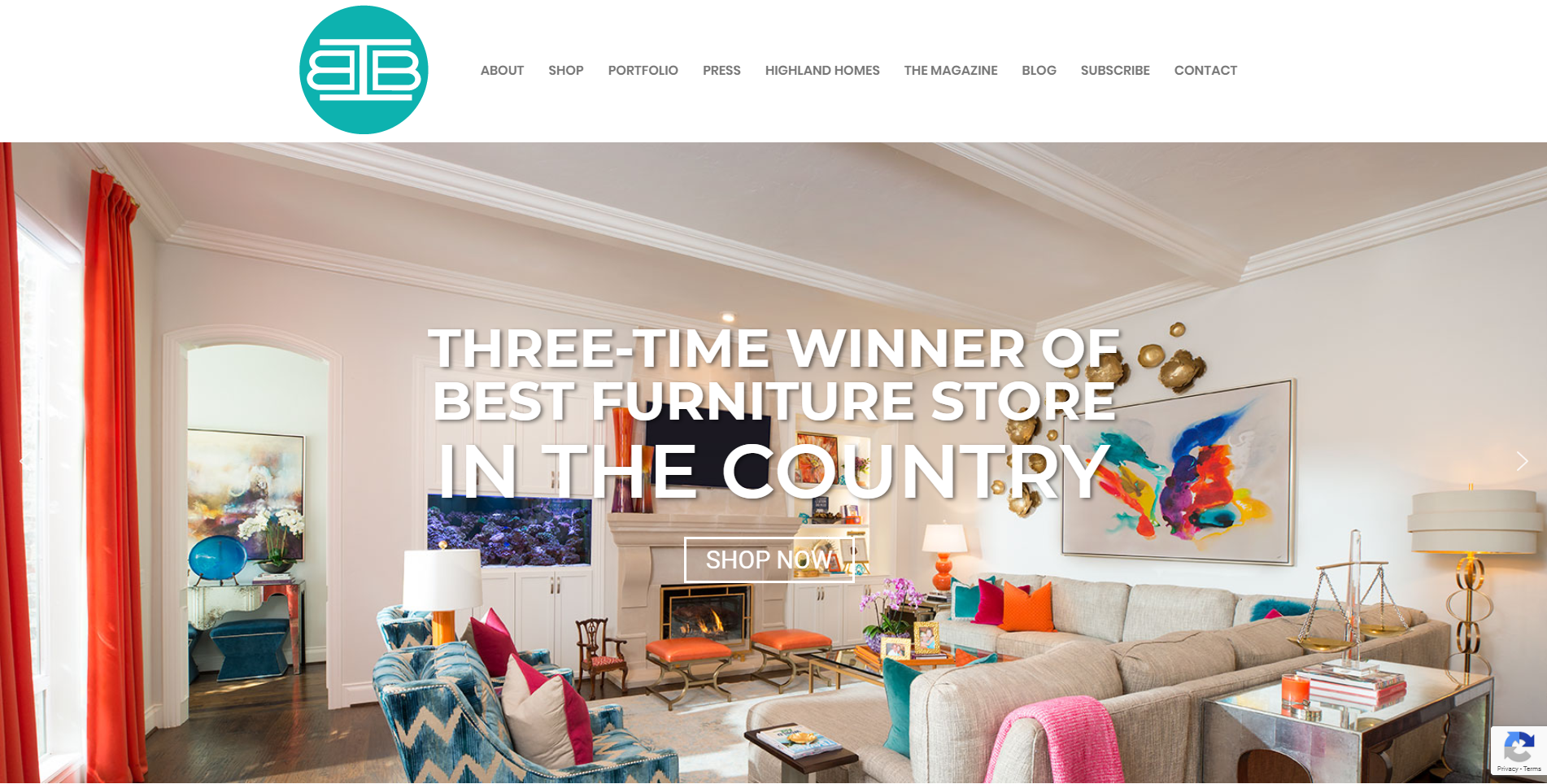

That way you keep people interested and looking for more!
Car Repairs Website Design
We’ve all been there; you’ve got somewhere you need to be, and suddenly, your car breaks down.
Or at least, it’s one of the most common excuses we all use to get out of an awkward dinner we don’t want to go to.
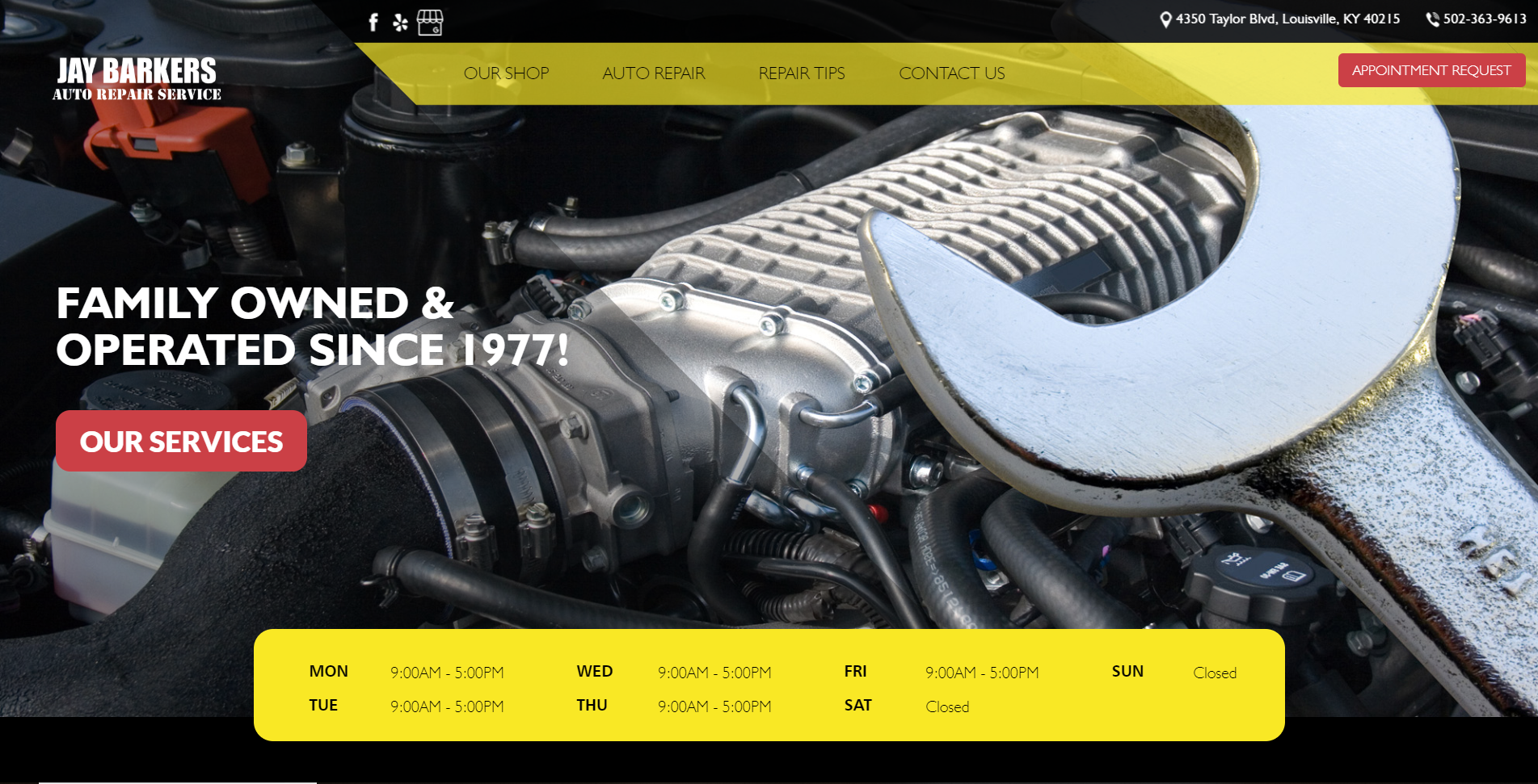
When looking for a mechanic online, you’ll want to see a website like one of these!

[source]
When I hear the words “Family-owned”, for some reason I instantly trust them.
Make sure to highlight the best qualities of your services on the front page to convince people why you’re the best and they should go with you and not someone else.

[source]
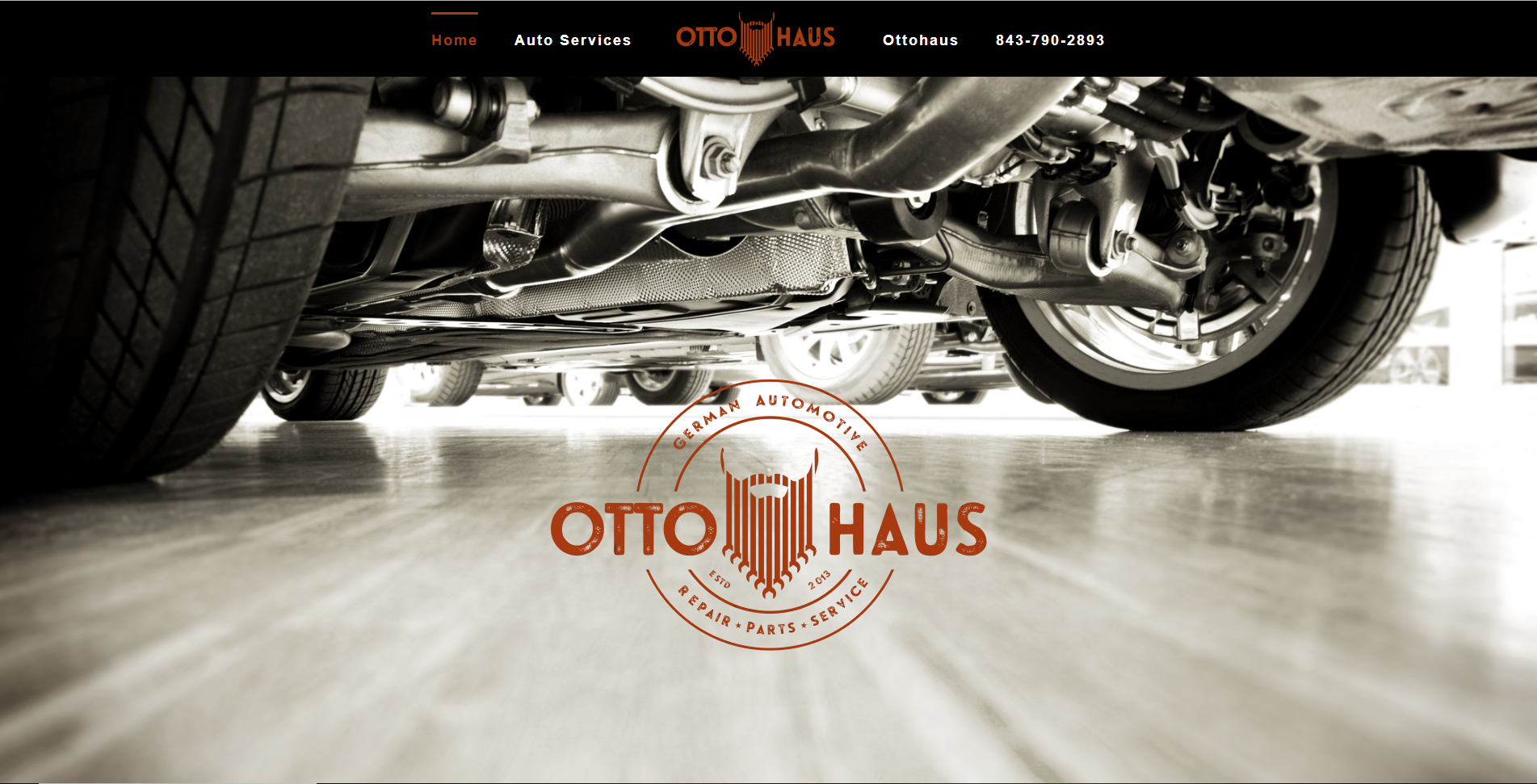
The minimalism of this homepage is just right, and the contrasting colors really give it something interesting for the eyes to gravitate towards.
The logo is then brought to the attention to the viewer and the color is so captivating, they’re bound to read what you have to say, and now you gained more brand recognition.
And Finally
We’ve come to the end of this inspirational article. I hope you found it helpful and inspiring for your next design project.
Drop us a link in the comment section down below to some of your favorite locally-owned business websites that you find inspiring or some you made yourself!
Until next time, folks
Stay creative!
