You’re here because you’re looking for amazing packaging ideas for 2020.
Well, you’re in luck, because I’m showing you 6 ideas for you to implement this year into your packaging designs.


Well, what are we waiting for?
Let’s just jump right in!
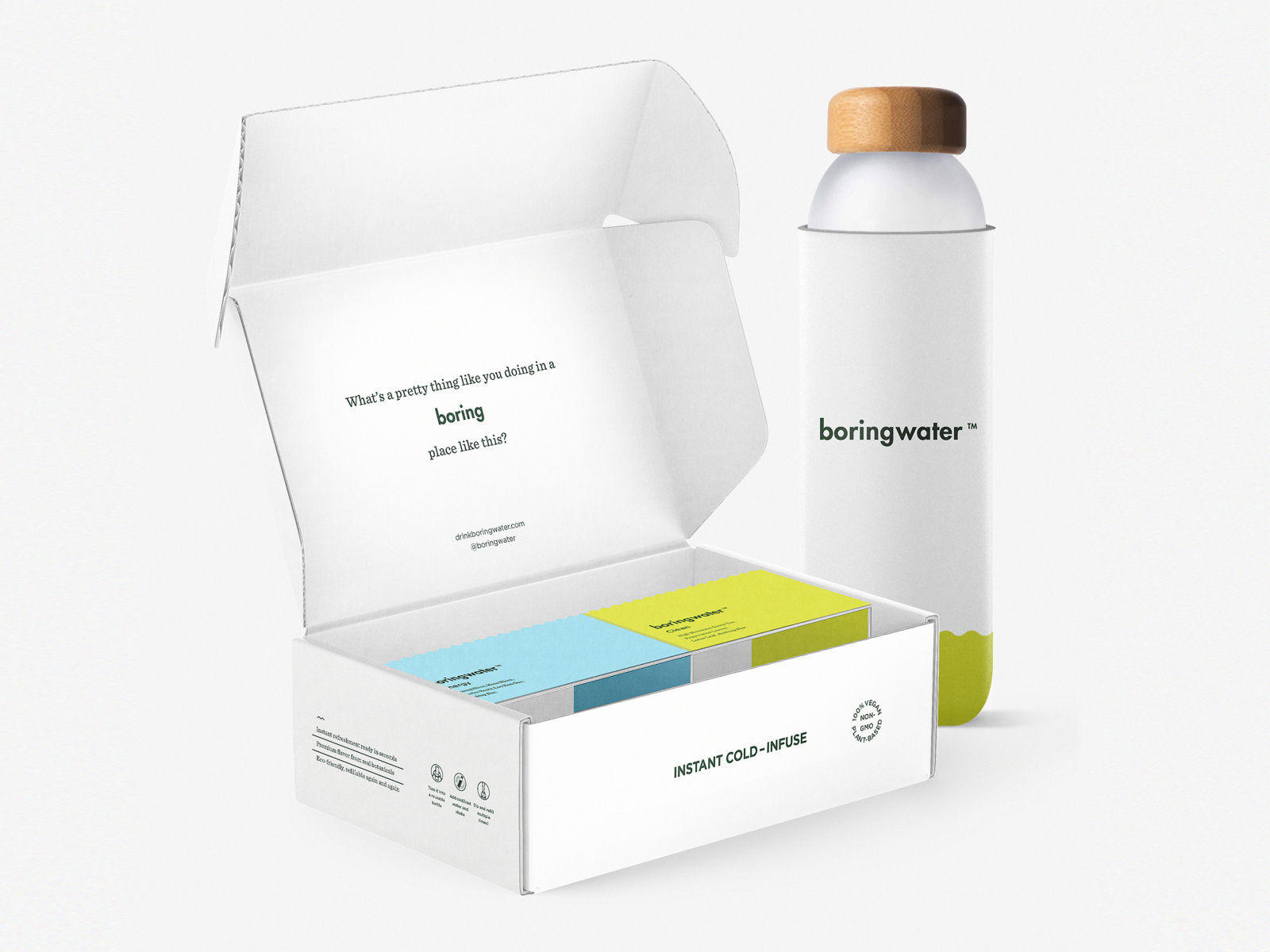
Sustainable Packaging
Sustainability. It’s at the forefront of all of our minds nowadays.
As it should be!
It’s so important that we take care of our world because it’s the only one we’ve got.
And what better way for you as a designer to contribute to this world, than to create your own sustainable packaging ideas for yourself and for your clients?
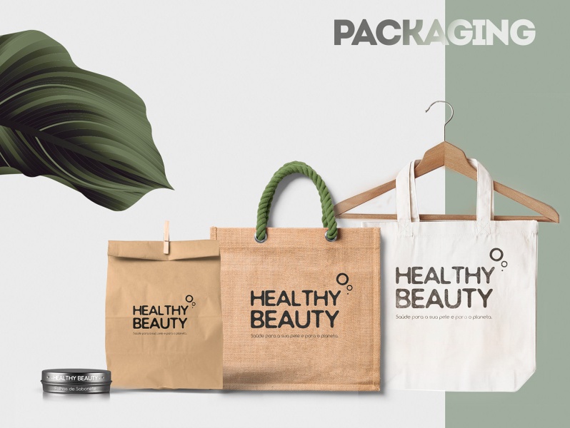
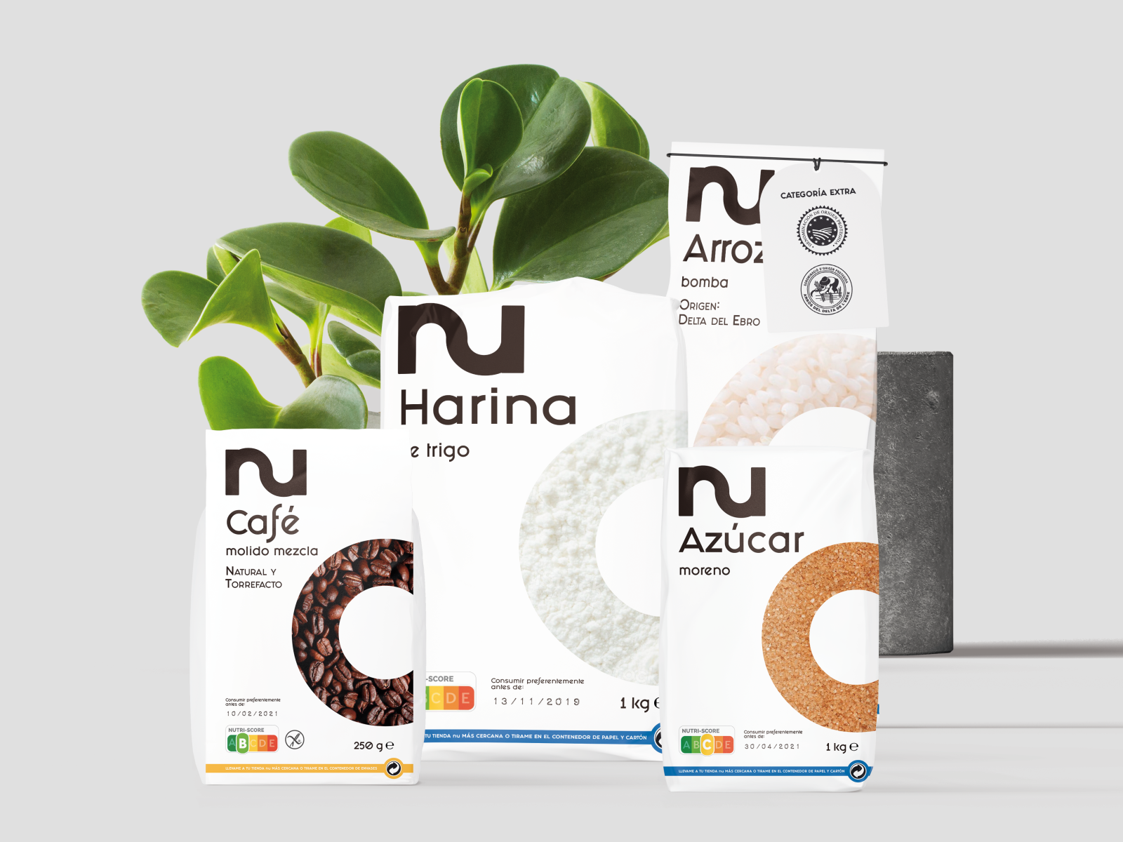
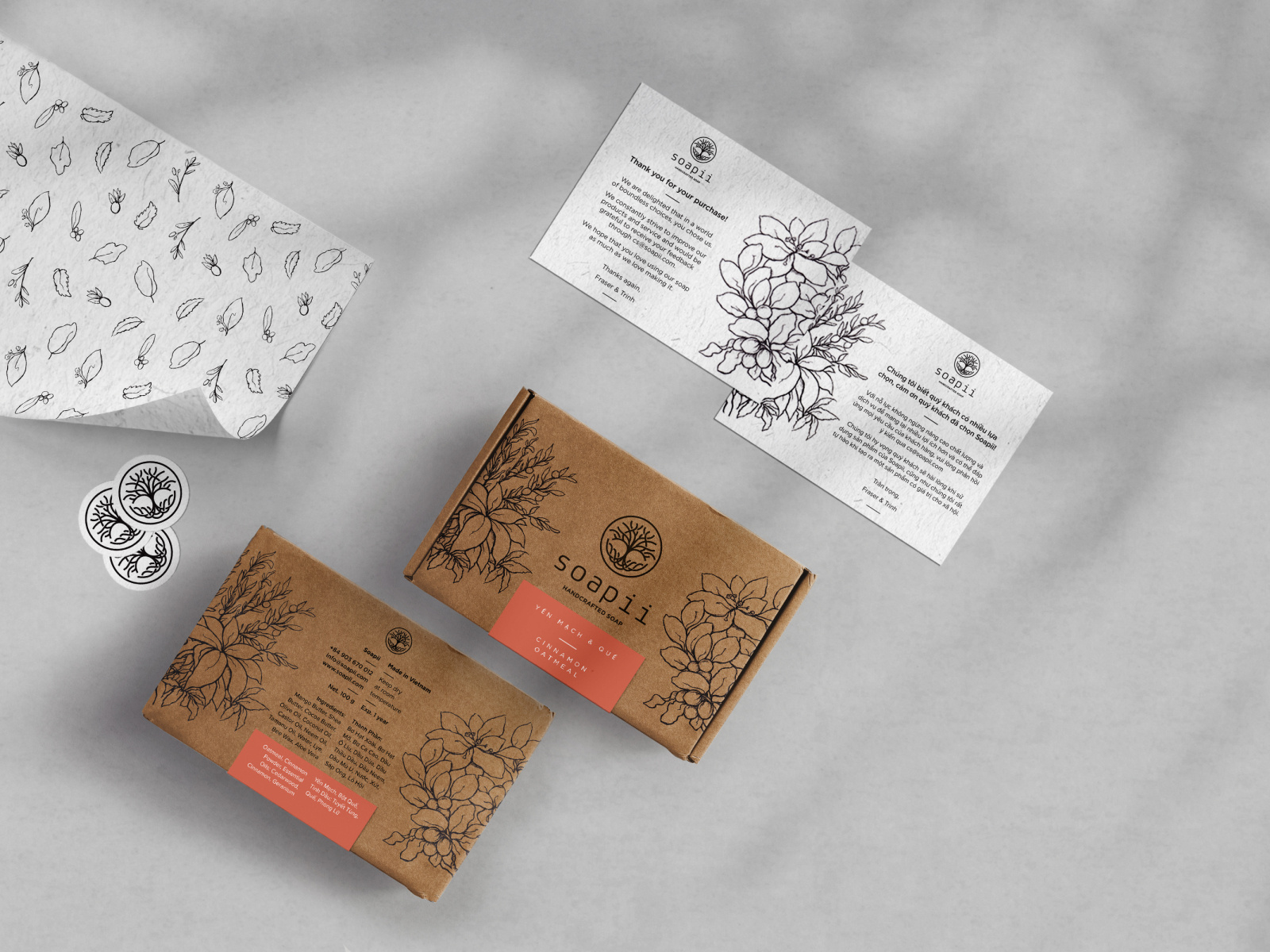
So here are various sustainable packaging design ideas for you to draw inspiration from!

[source]

[source]

[source]

[source]
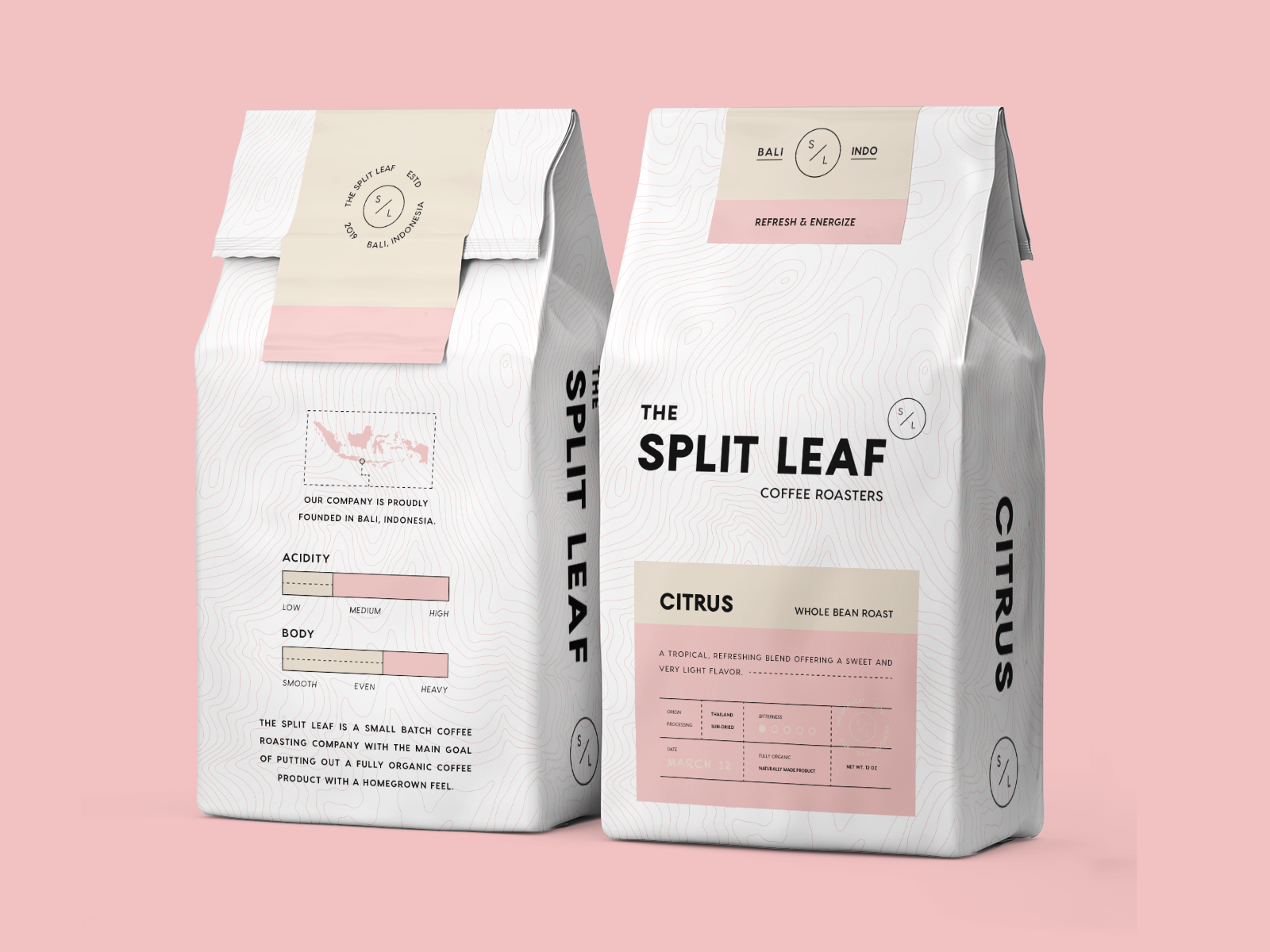
Minimalism
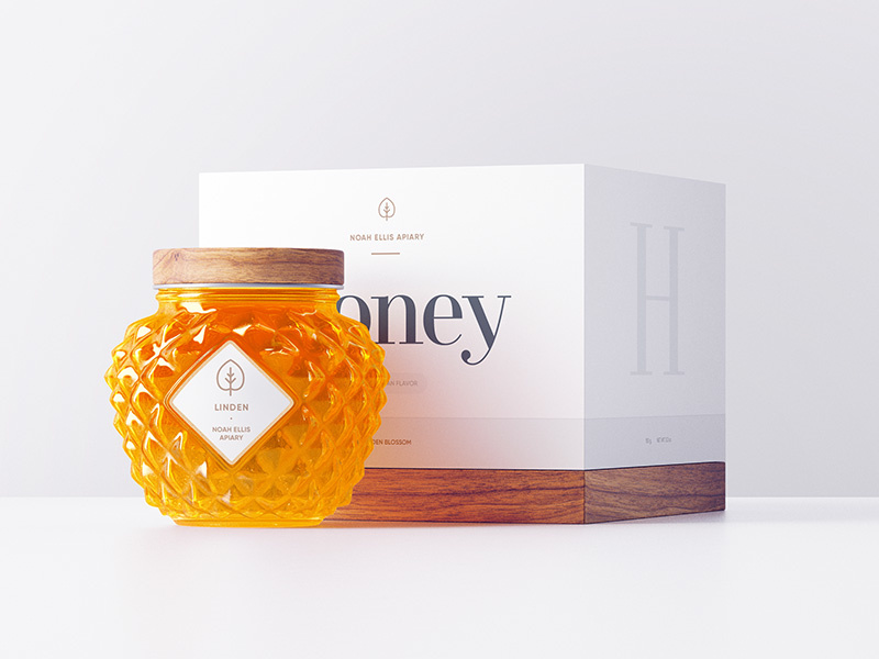
Next up, we have minimalism.
Minimalism was all over the globe last year and we don’t expect anything less this year.
On the contrary, we expect to see minimalism rise up even more and overtake many packaging designs.
Imagine the combo of minimalism and sustainability.
That just warms my designer soul.

[source]


[source]


[source]

[source]
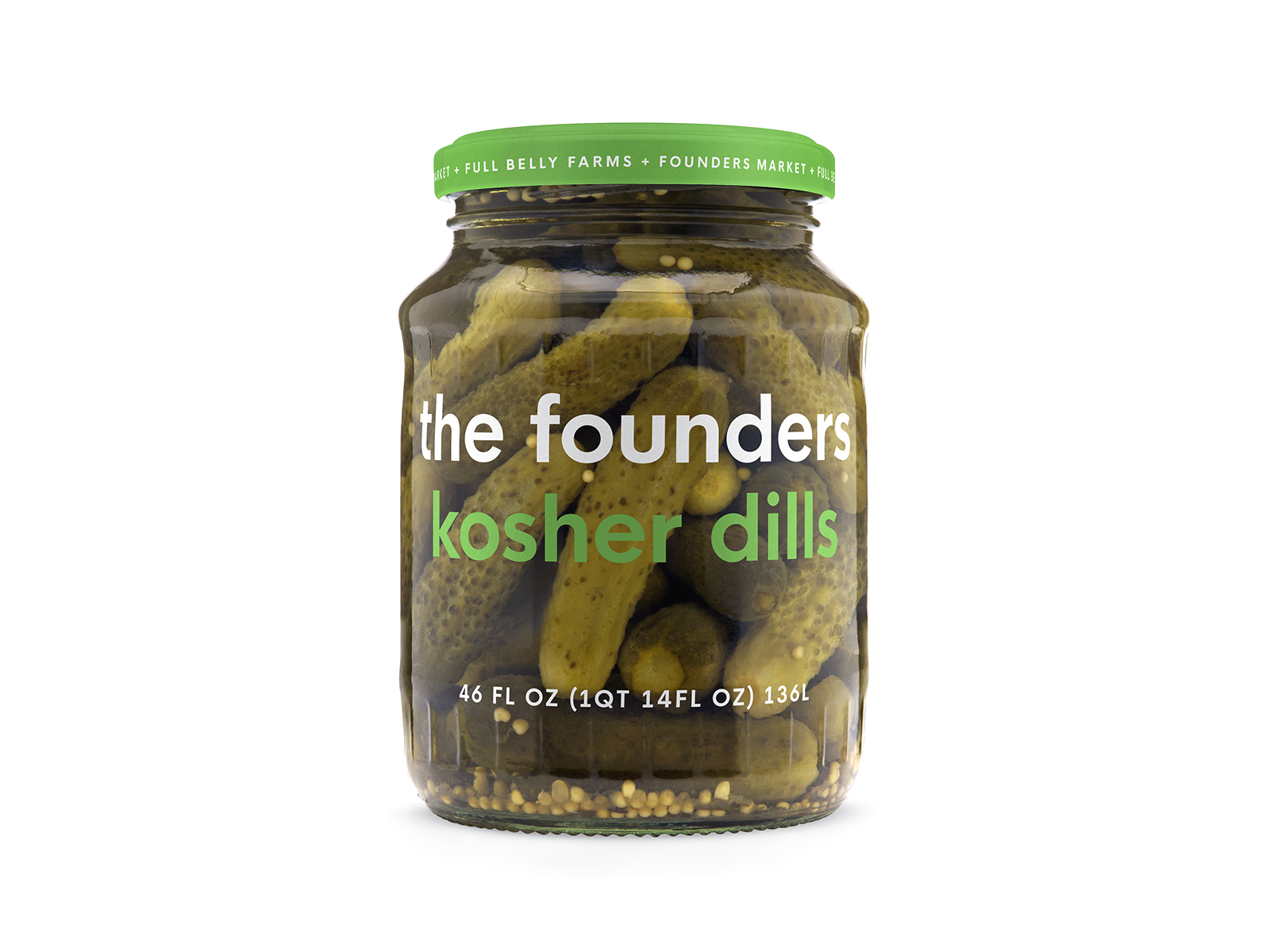
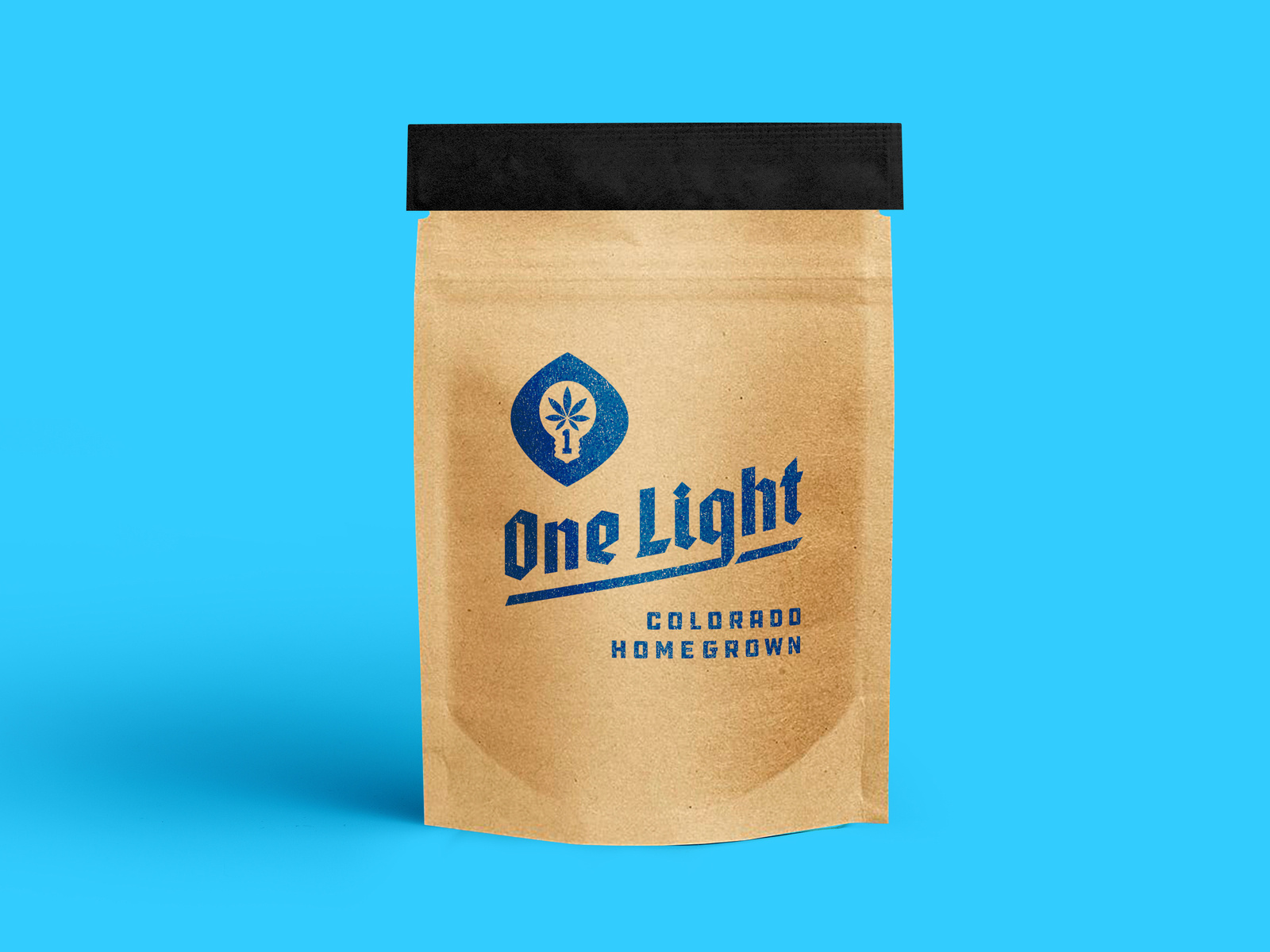
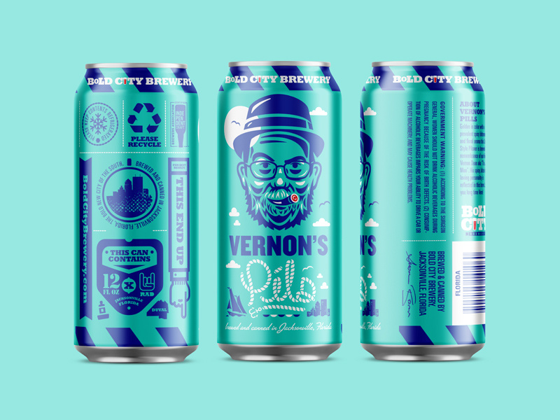
Bold Typography
Boldness.
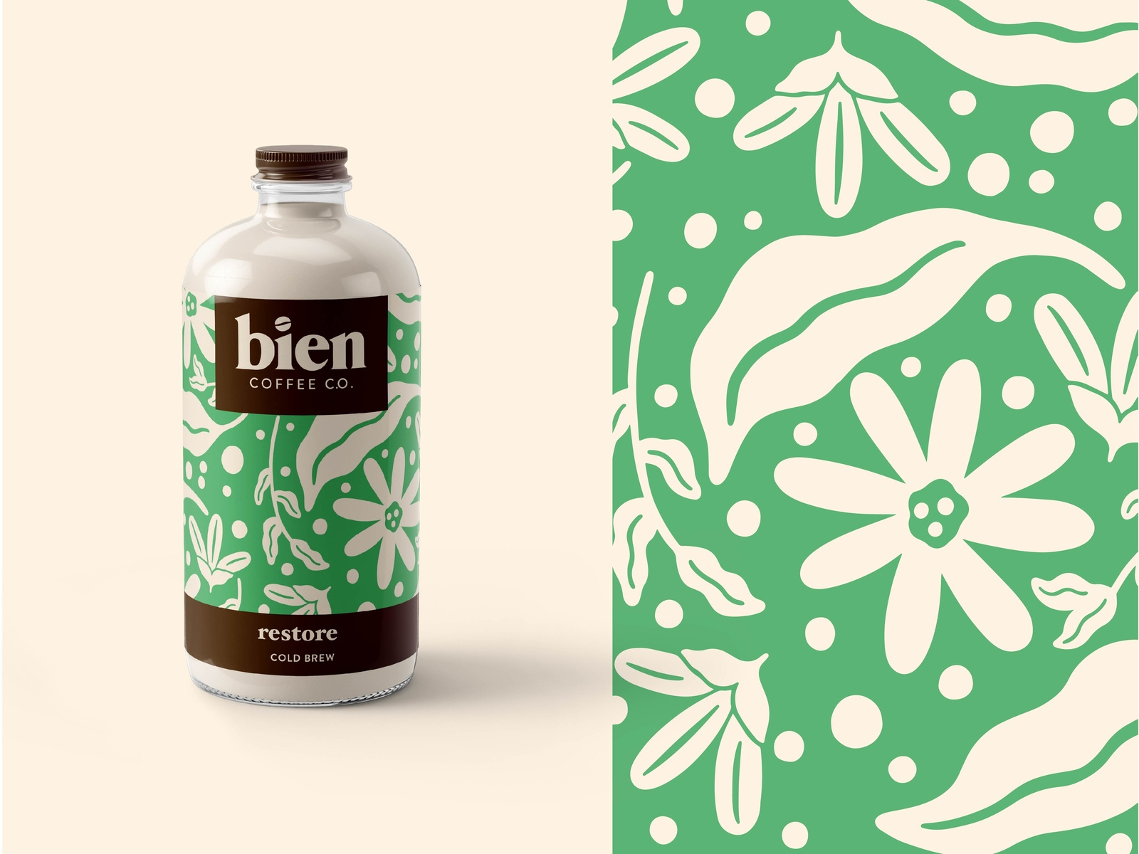
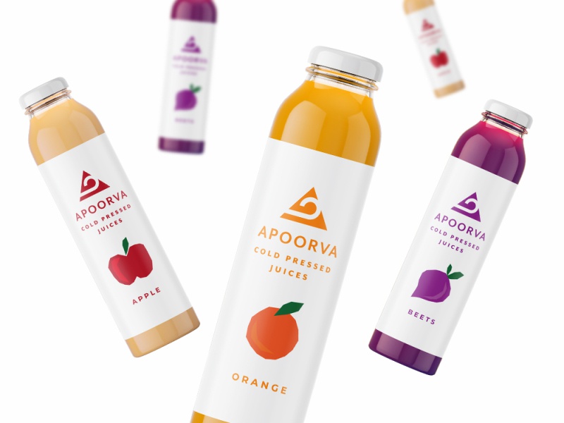
You need packaging that is as bold as the product.
Sometimes the best way to display the boldness of your packaging is by simplicity.
By using bold text, you can have an intricate yet simple design that speaks louder than loads of 3D design factors could.
Here are some examples of what I mean.

[source]

[source]

[source]

[source]

[source]
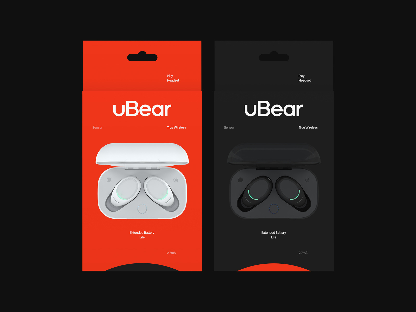
Flat Design
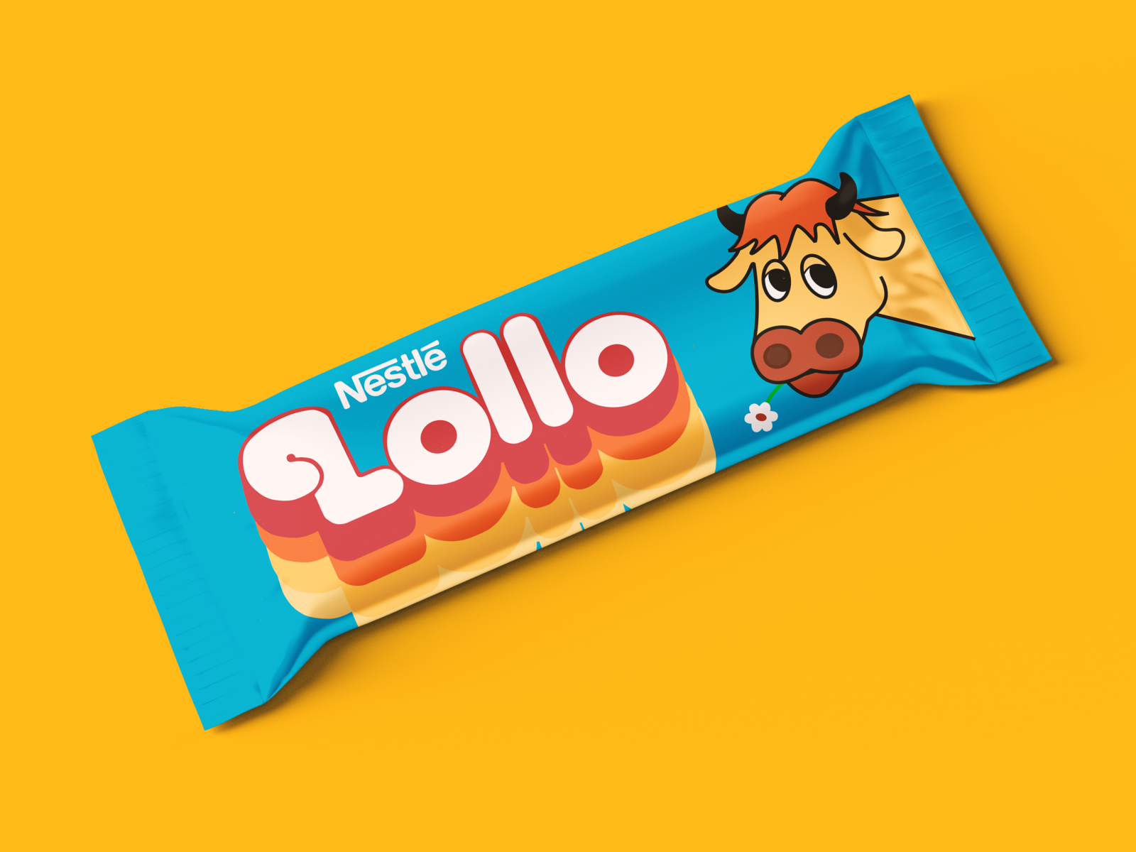
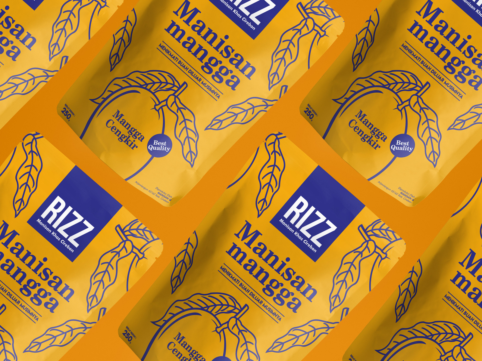
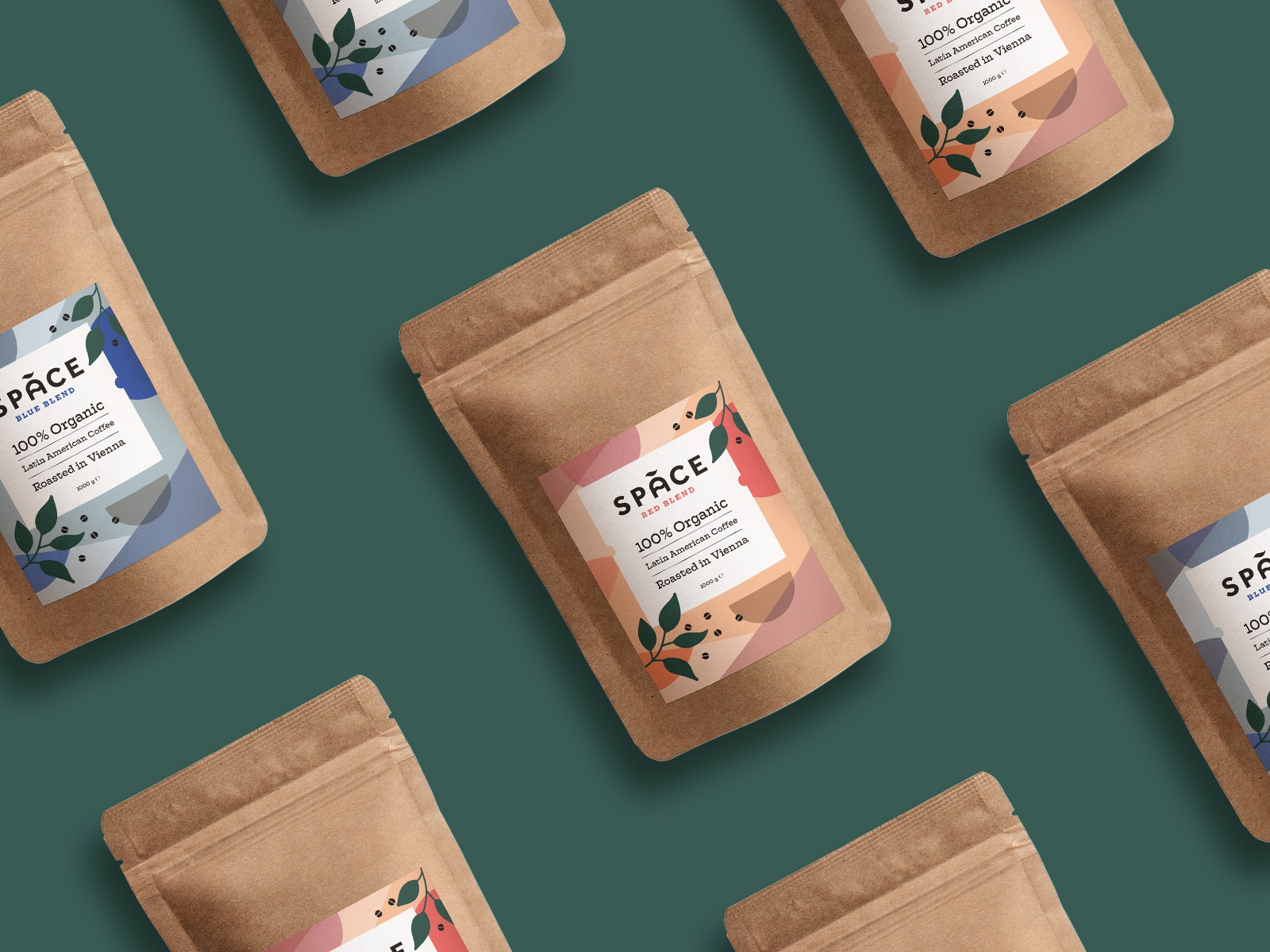
Flat design was another trend that took over all of 2019 but that we only expect it to continue growing in 2020.
Flat design is also a type of minimal design, which is the undertone of the ultimate trend of 2019, which in my opinion was minimal design.
Check some of these designs out!


[source]

[source]

[source]

[source]
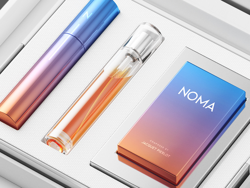
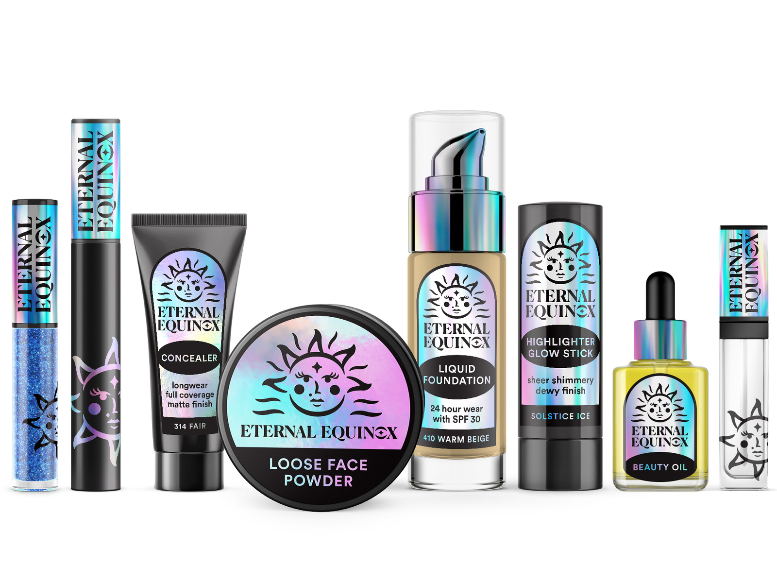
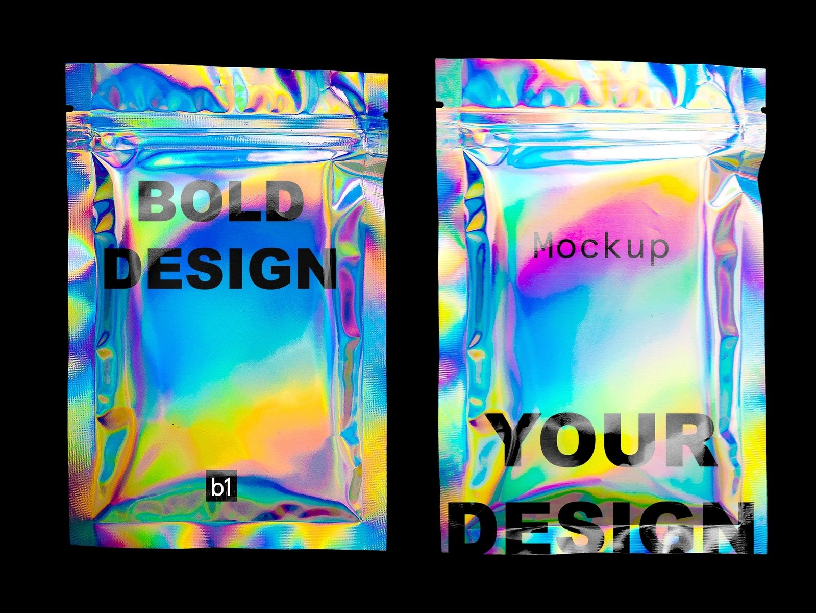
Metallic & Holographic Material
Alright you guys, it’s time to get to the 2 packaging designs that I’m most excited about this year.
And that is metallic and holographic material.
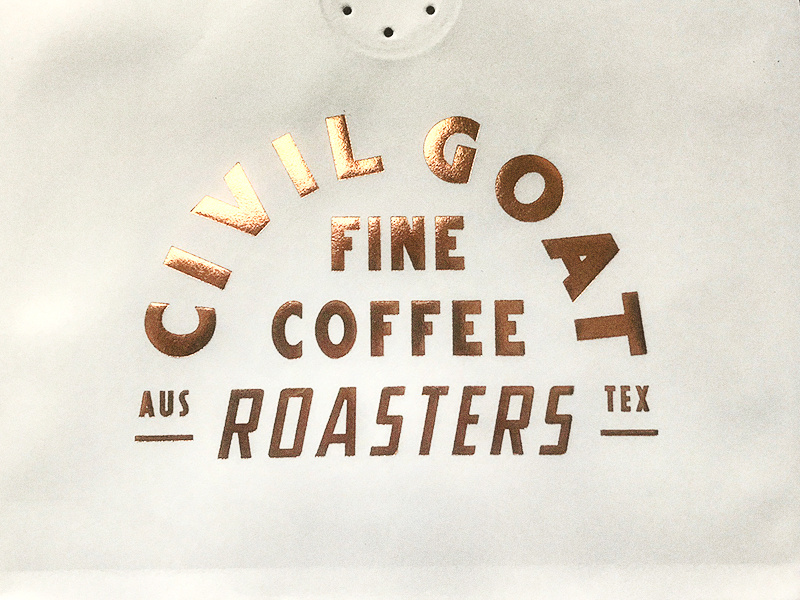
There’s just something so luxurious and eye-catching about this flashy material that will draw the eye of anyone onto your product.
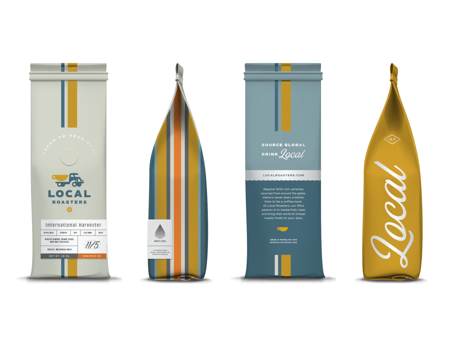
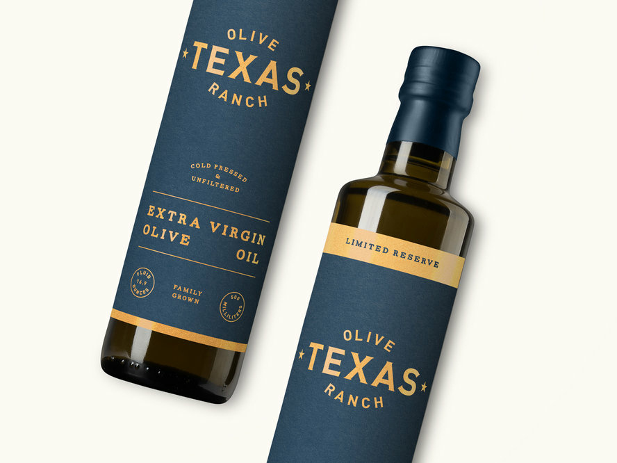
I love the way it looks and the way each designer used it differently.
Here are some examples of what I mean.

[source]

[source]

[source]
[source]

[source]

[source]
Summing Things Up
I hope you found these packaging ideas inspiring!
Soon we’ll have an entire guide dedicated to sustainable packaging, so keep your eyes peeled for that.
Til next time,
Stay creative, folks!
