Wow, has 2020 been a rollercoaster.
For many, many reasons, but one in particular is that it seems to me that every single big player in the car industry game is redesigning their logo.
And they’re all revamping and going for a flat logo design.
First it was BMW, then VW, then just last week it was Nissan and I really thought we weren’t going to be hit with anymore major changes.
But now, we see Toyota coming in hot with a brand new logo design specifically for Europe.
And the people are torn.
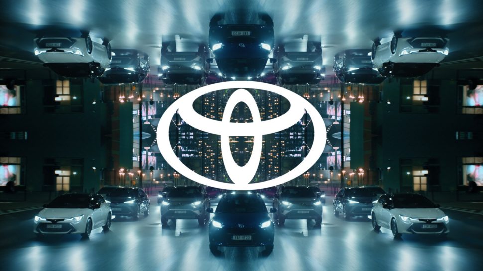
Toyota’s New Logo Design
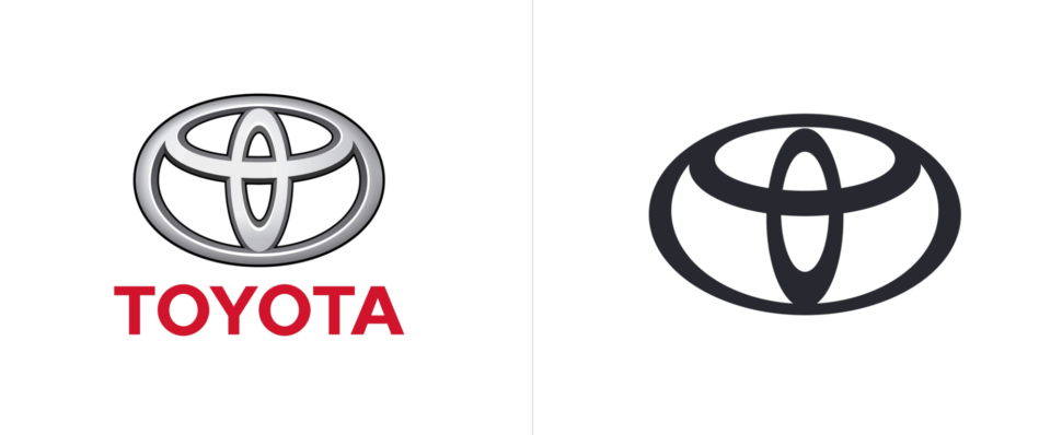
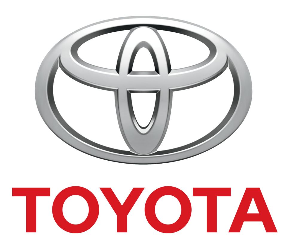
This is Toyota’s first redesign since 2009, and I’m personally happy to say that not only did they decide to drop the incredibly bright red color in the logo, they also decided to drop their famous wordmark.
And also, did you happen to notice how the top of the smaller, center ellipsis doesn’t connect to the top of the logo anymore?
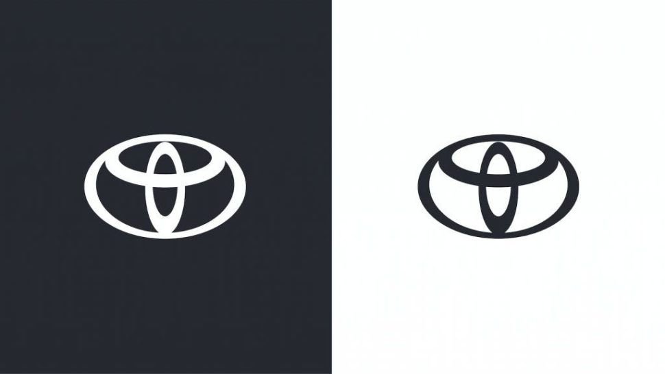
Yes, it irks us as much as I’m sure it irks you too.
I have no idea why they chose to do that, and the internet is not very happy about it.
But I must say, I am in favor of the flat design and the monochrome color scheme they chose to go with in this new Toyota logo.
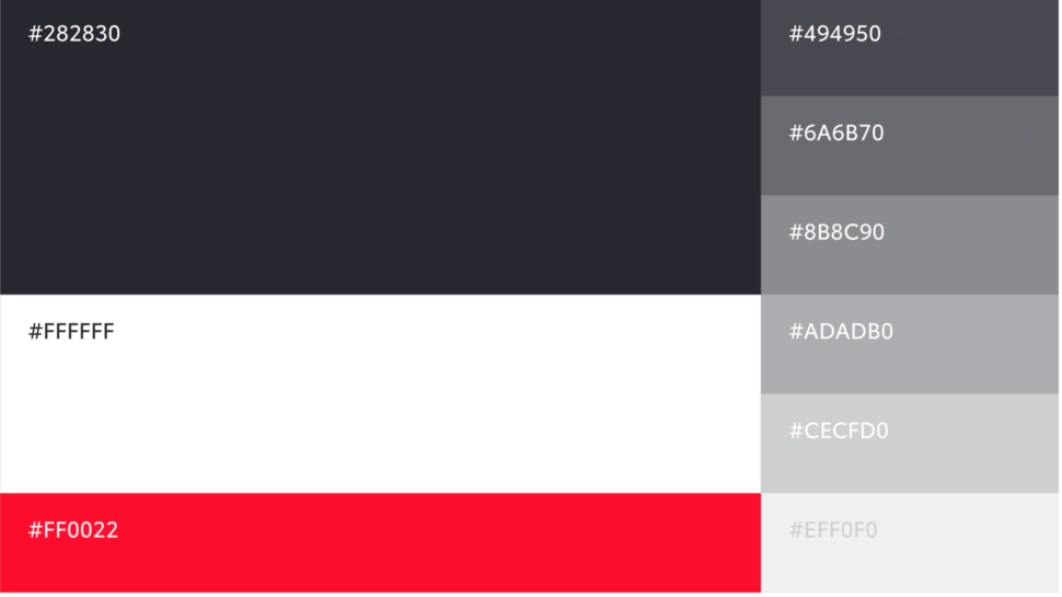
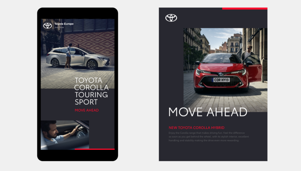
The red is not completely gone tho, as they use it in different parts of the marketing.
Which I’m honestly not opposed to. A little bit of color in a monochrome scheme can be an amazing idea.
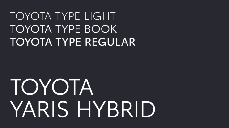
Another selling point that we love is the new sans serif that they came out with and they said that their aim is to be “approachable, human and highly technical, and it has been conscientiously engineered.”
This Sans Serif comes in four preferred and two optional weights, with each weight coming in upright and italics.
The Drop of The Wordmark
One of the most noticeable feature of all, besides the fact that they embraced a flat design and changed their color design, is that they dropped their iconic wordmark.

But, because Toyota’s logo is such a strong one, it can 100% stand alone and be recognized just as easily with or without the wordmark.
Personally, the more minimal, the better.
So, yes, dropping the wordmark was definitely a bold move, but a smart one.
In Conclusion
Here’s what Toyota had to say about their new logo and design.
“The aim of the redesign was to build Toyota’s image as a more progressive brand, while guaranteeing longevity in a digital world and ensuring that the brand continues to appeal to a modern and expanding customer base.
The direction for the new VI is shaped by four key goals: Forward-Thinking, More Premium feel, Consistent and Mobile-First.
The&Partnership’s design approach employed simplification, distilling Toyota’s key visual properties into a clean, considered system that better unifies the brand.
At its core is the new logo, which distils the brand’s emblem to a simplified 2-D design, losing the ‘Toyota’ wordmark; an acknowledgement of its status as one of the most recognisable brands in the world.
The new bespoke typography is Toyota Type, a sans serif font which enhances clarity and consistency across Toyota’s different business units.
Emphasising this is the primary colour palette, a clean, premium monochrome, with a red accent that provides a distinctive nod to Toyota.
The brand architecture has been streamlined and simplified through name changes, consistent typesetting and logo lock-ups.”
All in all, I think that the update was desperately needed and it looks much, much cleaner and modern.
The only thing is that little elipisis that doesn’t touch the top of the logo.
Honestly, it bothers me more than I thought it would.
But other than that, a great update.
What do you guys think of this new logo and all of these new car logos in general?
Let us know in the comment section below!
Until next time,
Stay creative, folks!

