Every business owner wants more conversions.
More conversions equal more sales, and more sales mean exponential business growth. But netting those conversions can prove challenging, especially if your website is not in the best shape.
This is where web design plays a major role.
The web design concepts you utilize directly impacts growth and how many of those coveted conversions your business racks up.
Let’s say your SEO is on point, but conversions are lacking. Yes, optimization is a must-do for your website.
Unfortunately, if you’re not converting site visitors, all is for not.
From New York to Houston, a web design agency could be useful to fix that conversion problem. But you can certainly develop a web design plan starting today.
This is why we compiled the following 6 web design concepts proven to increase conversions.
Let’s dive in!
1. Grab Attention In 8 Seconds Or Less
The human attention span has been compared to that of goldfish.
This may be a myth, but there is no denying that online consumers have a very short attention span.
To ensure you lead potential customers down the path toward conversions, you need to grab their attention fast.
The 8-second rule is a web design concept that can help you increase conversions.
This small window of opportunity is critical, so make it count, because you are on the clock.
For example, you can employ creative imagery to grab attention, like this example from Mailchimp:
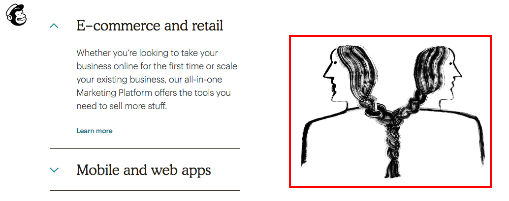
This artistic image has little to do with email marketing, the core of Mailchimp’s business. However, it is so unique, it catches the site visitor’s eye quickly.
Other web design assets for grabbing attention in under 8 seconds include:
- Large signup and CTA buttons
- Power words and clever terms that are engaging
- Video and other interactive content
- Hover effect on buttons and links
- Animated transitions in sections
- Pop-ups that add value to the site visitor
- Big benefit headlines that are concise
Web design is not solely about making Google happy. A clever design that grabs attention quickly can have a serious positive impact on your conversion rate.
2. Encompass Speed And Increase Conversions
“Most industries are highly competitive, and to gain a competitive advantage in your market, you need to have a fast website. This is a search optimization (SEO) essential that is tethered to web design.
This is especially so for image search and compatibility with Google’s spiders. If images & design are slow to render, Google views that as an unfavorable compared to your competitors in a particular SERP” says Matt Bertram, co-host of BestSEOPodcast.
Let’s face it: A consumer’s attention span is pretty low. But not as low as his or her patience level. Did you know that a one-second delay in page loading can decrease your conversion rates by 7 percent?
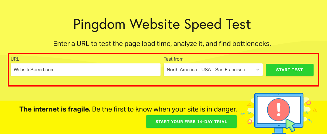
Is your website fast enough to keep potential customers on-page and off your competitors’ pages? To find out, you can utilize a few different speed check platforms, such as Google PageSpeed Insights:

Pingdom is another good site speed platform you can use to get insight on just how fast your website is, on desktop and mobile, as well as info on what you can do to fix poor page load time.
3. The “Rule Of Thirds” Is Also A Web Design Concept
The Rule of Thirds is a very important photography concept that can also be used in web design.
What is the Rule of Thirds exactly?
This web design concept divides a screen by thirds horizontally and vertically.
The intersections created by this division become very important strategic points.
The Rule of Thirds looks like this for web design:
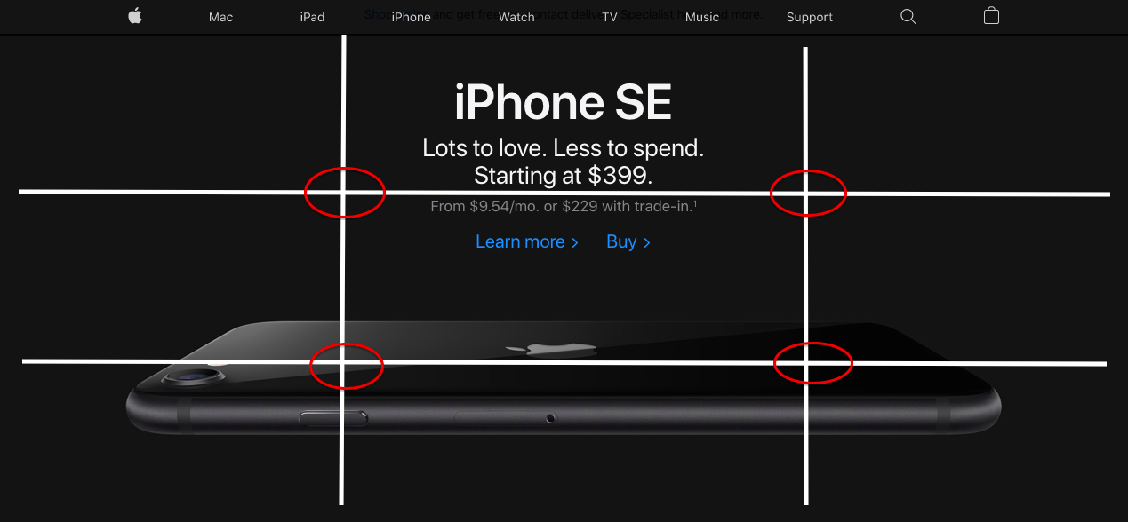
You can see that the intersecting lines are more enticing to the eyes. This could be why the Apple web design team placed the iPhone image directly in the middle of the bottom horizontal line.
The price point also sits strategically between the two top intersection points, just above the horizontal line:
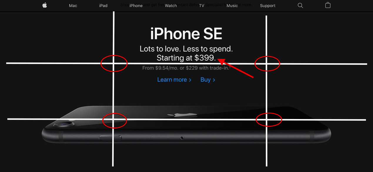
The Rule of Thirds can help you design each section of your website with strategic focal points in mind. You can place CTAs on these intersection points, key marketing messages, product images, and more.
4. Maximize Conversions With Powerful Color Design
Color remains an essential part of quality web design, especially when it comes to increasing conversions. But choosing the right color scheme for your website, and subsequently, your brand can prove a bit difficult.
There are a ton of colors to choose from, but you should consider employing a bit of color psychology. That’s right, consumers are more motivated to buy from a website based on the color scheme used.
Here’s a color wheel you can use:
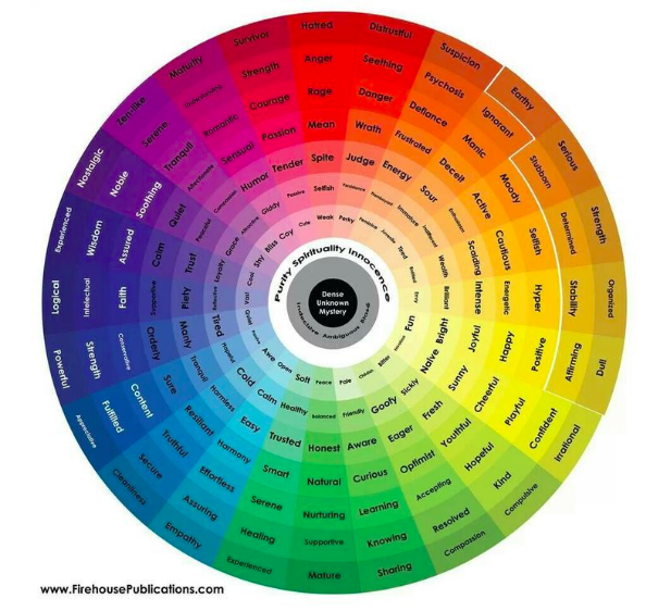
Most consumers don’t even know that color played a role in the purchase. For example, a HealthTech website will need to convey trust, empathy, and security on their website to increase conversions. The colors used could be:
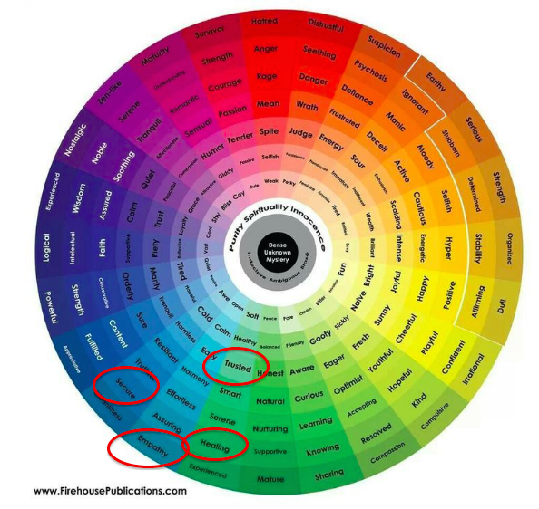
Using this color psychology, a website in the HealthTech industry can convey confidence to buy or signup quickly using a subconscious psychological connection.
However, do not just pick a few colors and start developing your website. Quality web design using color means utilizing the power of contrast as well.
Contrast will ensure headlines, CTAs, and text standout against your primary brand colors.
Contrast looks like this in web design:
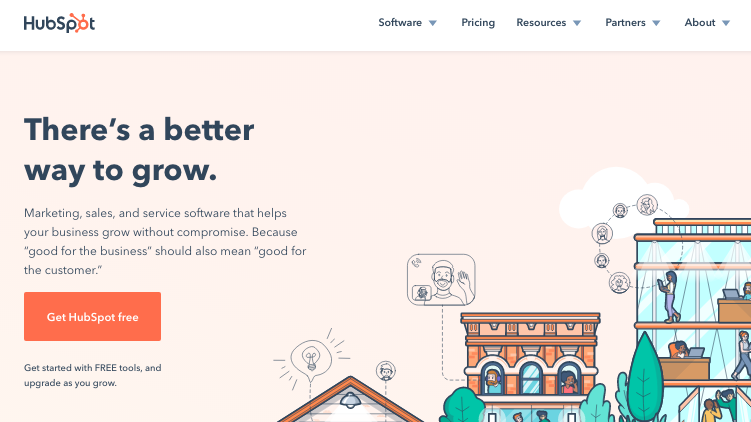
You can see how HubSpot used contrast and a mixup of their primary brand colors to create a visually aesthetic website that also serves up a psychological connection.
5. Employ The Law Of Similarity (Gestalt Principle)
The Law of Similarity, Gestalt Principle, is another web design concept worth employing to increase conversions.
How? The Law of Similarity states that the human eye groups similar objects, which enables the human brain to make sense and organize what we see.
This is important for web design since websites have multiple aspects. By grouping together these aspects using the Law of Similarity, site visitors can easily and quickly process website information and make a purchasing decision.
For example, you can group testimonials with CTA buttons to drive more conversions. Here’s how this looks on a website using the Law of Similarity:
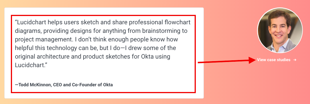
You also serve up a powerful user experience when using the Law of Similarity as a web design concept. By having main aspects of your site grouped, like headline, paragraph text, and CTA, information is much easier to process for the visitor.
6. Increase Conversions By Using Real People In Images
To make your business more familiar, it is essential to put real people front and center.
Most consumers can tell a stock image from a unique one, so having the people of your business front and center on your website can make the difference between conversion, or lost customer.
This supports the current shift in marketing messaging for brands. In fact, a study found that 80 percent of consumers are more likely to make a purchase from a business that provides a personalized touch. Images of you and your team can achieve this.
A good example small businesses can draw from is this image from Paradise Service Technologies:

You can see the people that represent this small business. Having a personalized, real-life touch within your web design is paramount.
Videos are also exceptional for delivering these personalized moments consumers demand in today’s overly competitive market. The same website that served up the team image employed video content as well:

Are You Using Web Design Concepts To Increase Conversions?
Creating a website for your business is more than simply putting optimized text and images together.
You need to add that human element in order to net the conversions you want and need for growth and success.
The above 6 web design concepts can prove useful while revamping your website. You may choose a few to implement, or maybe even all.
Combining every web design concept, and more you find online can ensure that conversion rate continues to rise. Happy designing!

