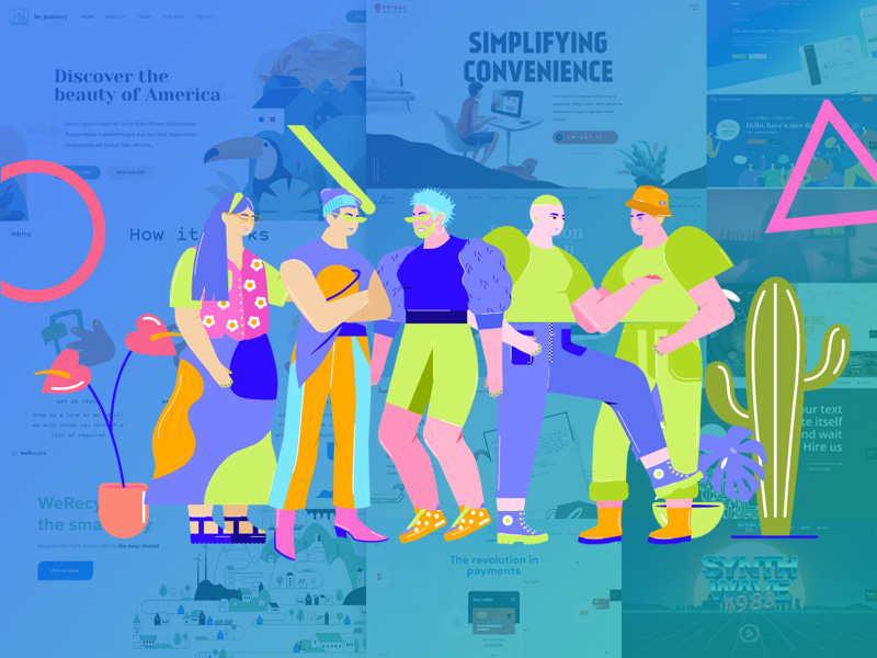
If you are encountering problems finding photos for your website, there’s a simple solution you might consider. Use illustrations. The examples in this post will show you various ways to go about doing so
Sound reasonable? If you believe that to be true, when you start building your next website you’re going to have to ask yourself this:
What kind of visual style do you want to use?
You don’t have to reject photographs out of hand. That’s not the point. Other options are readily available should you want or need to take advantage of them.
You might choose to take a more abstract, creative, and illustrative approach. That’s one of the approaches we’ve taken when creating our huge selection of pre-built websites for BeTheme; a selection you’ll find to be both informative and inspirational.
Today, we’re going to present a selection of them along with a number of great websites that have creatively used illustrations as we explore seven good reasons to use illustrations to spice up your websites.
- When a photograph is unable to fully capture a complicated subject
You may have already discovered that for some brandsit can be terribly difficult if not impossible to find a photo that fully conveys a message as to what that brand is all about or what it does.Taking a photo of you at your keyboard doesn’t necessarily convey the fact that you are a great copywriter (or even a decent typist).
The BeCopywriter 2 pre-built site shows why an illustrative style can be a much better way to tell your story:
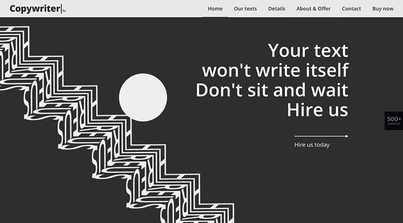
The design is definitely worth a second look while the text conveys a simple, yet powerful, message.
How about looking for a photo that accurately describes what a recycling services company does? Not an easy task.
Check out WeRecycle:
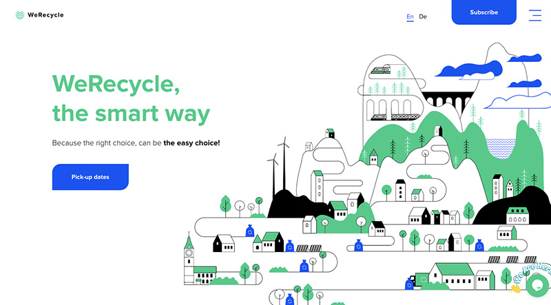
Clean air, clean water, clean neighborhoods thanks to everyone’s use of blue recycle bags or bins. This image gives a website visitor important insight as to what the company does.
- When a brand has a unique look that requires a similarly unique website design approach
When discussing brands, you’re essentially talking about styles and personalities. One of the challenges owners of a given brand often have lies in finding out how to differentiate it from a competing brand that features a similar style.
A brand with a far-out style can be easier to work with, especially for a web designer who enjoys taking on far out design approach. One such a design approach is one that cleverly blends photographs with images, which is how BeTheme’s BeFoodTruck pre-built site handles it:
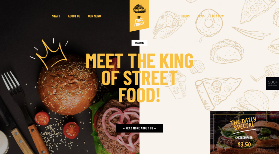
As you might expect, the illustrations used are a unique choice for this type of industry, yet a food industry websitewould have a difficult time engaging customers without real photos of food.
Handwrytten uses a similar balance between real photos and attention-getting illustrations:
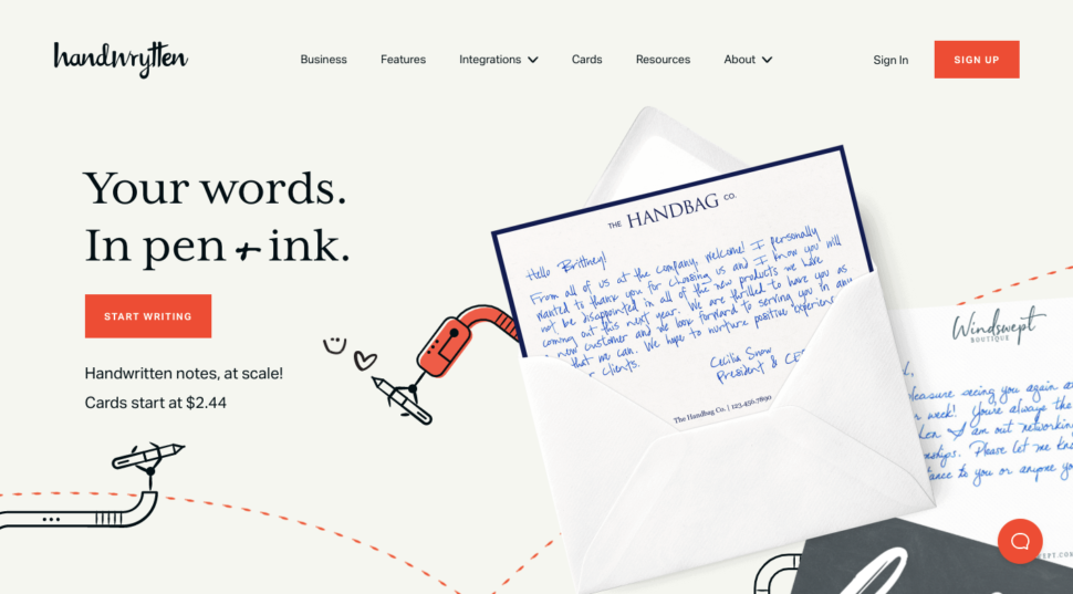
Here, the use of animated illustrations gives the homepage an added twist. It is a good example of a unique concept with a website to match.
- When a company wants to stand out by breaking with tradition; in this case, photo-strewn sites
Businesses in a given industry can be expected to have websites that are similar in style to other businesses in that industry. A business selling in-person experiences such as travel and hospitality businesses, rely heavily on photos to get their messages across.
This is to be expected. If you want your website to stand out among the lookalikes in a given industry, the use of illustrations is a good way to do it.
BeJourney 2 is a case in point:
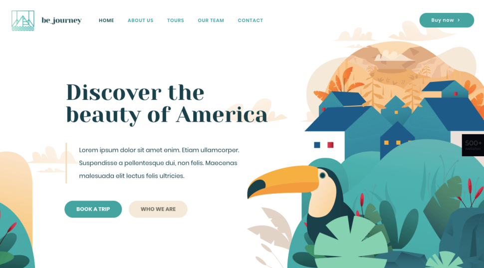
This site isn’tcompletely devoid of photos. There are just enough to tell a story that helps to get the message across.
The Bateau Mon Paris boat rental company’s site takes a comparable approach:
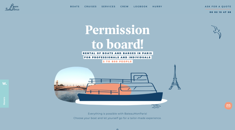
You can plainly see why this website’s main use of illustrations with its peekaboo photo caneasily engage its visitors.
- When a new company wants to leverage the style of a brand that consumers already trust
This approach can be somewhat challenging but can also be very effective. If you have a brand-new company your objective would be to create a website style that reminds visitors of a popular established brand.
This approach can help to erase any doubts a visitor may have as to whether your product or service is really up to the task. Stripe’s website style became a standard that many other software companies entering the same space have sought to emulate:
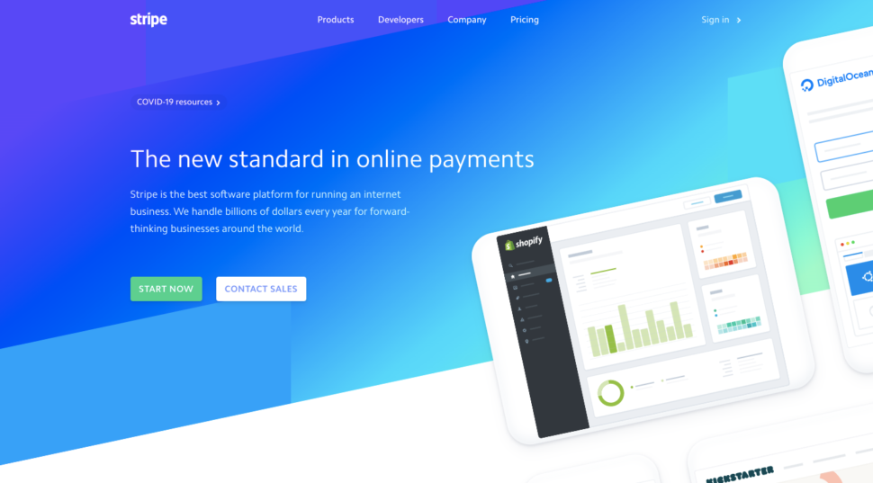
It’s not hard to see why this illustrative style, with its ingenious use of gradients has been copied for years.
Our BePay 2 site also emulates the trust-building Stripe style; with a unique spin.
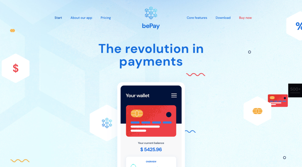
The blue color is symbolic of trust and stability, and the site design makes a good use of illustrations and mobile application images.
- When a creator has an interesting story and work worth sharing
Showing photos of themselves or their teams is a practice some web developers and design agencies use to give their sites a personal touch. While it can be nice to see who you might be working with, it’s even nicer to see what they are capable of doing for you.
Illustrations tend to be much better at showing what a business can do for its clientsand do so in a more exciting way that a photo can do.
The BeBand 5 pre-built siteuses illustrations and animations to give its site a 1980slook:
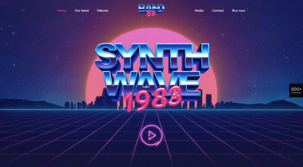
Photos can’t always convey the style of music the band plays. Illustrations on the other hand, can make it relatively easy to do.
Artist Polly Kole took this unique approach to building their illustrative website:

Besides exhibiting a dramatic look, the site is also interactive. It gives the viewer a sense of actually being there and able to examine works of art up close and personal.
- When a company is selling a smart app or tool
What a smart app does can’t always be captured in a photo. The experience inside the smart app, tool, or resource is what counts.
This experience typically involves a solution to a problem which can in turn require managing a good amount of data. This is where illustrations tend to shine.
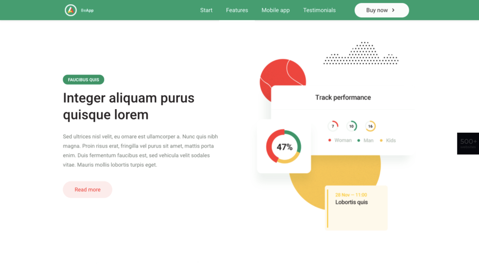
BeApp 6 cleverly uses data visualizations to get its point across:
Swiggy Labs builds products that solve big problems for consumers. Its site uses illustrations rather than a series of screenshots to show how these problems are solved:
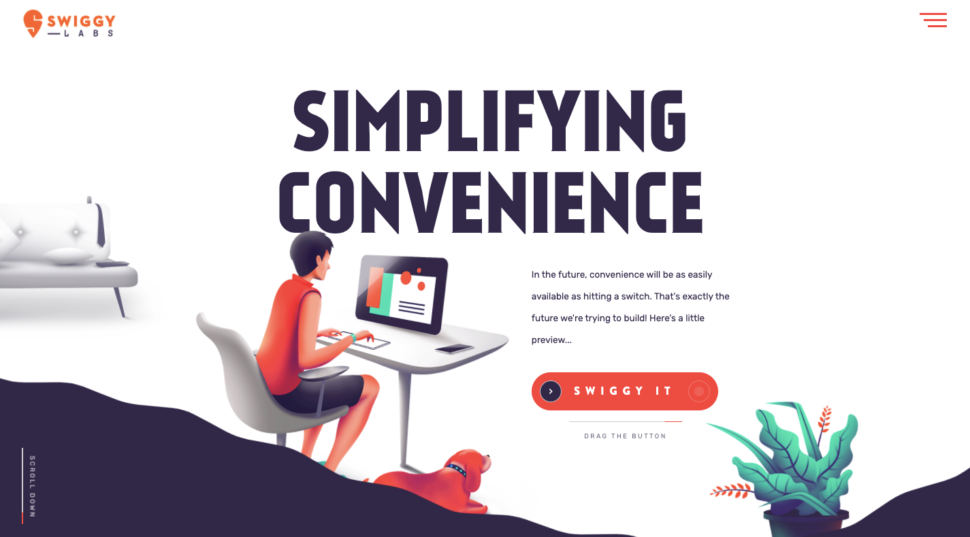
Drag the “Swiggy It” toggle to the right and you’re sure to agree that this is much more than photos or screenshots.
- When a brand’s target audience is children or, in many cases, their parents
Employing an illustrative style is a no-brainer since that children love cartoons and games (parents do too for that matter).
Add the fact that illustrations can be used to simplify an otherwise complex subject, like learning a language, and it’s not hard to see why their use can be so effective.
BeLanguage 3 is a language learning website:
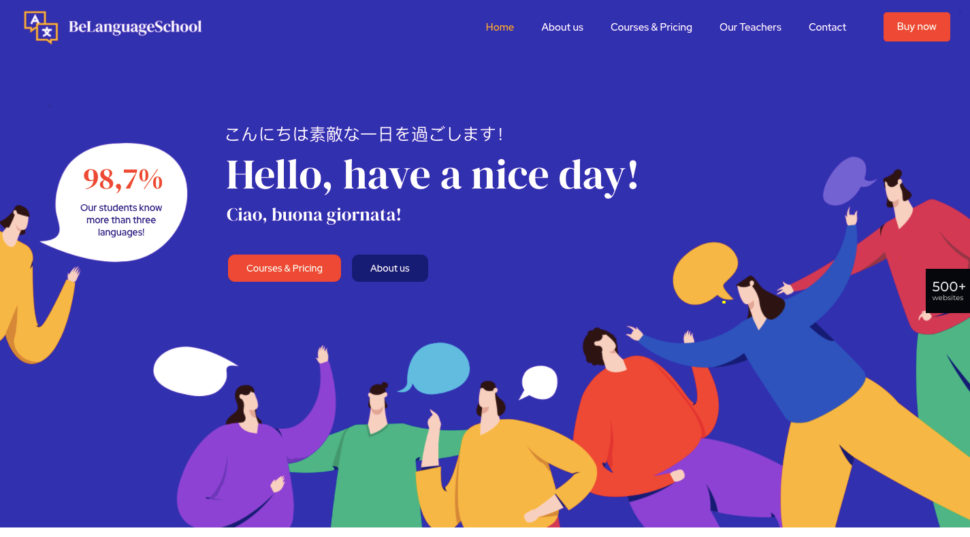
You don’t need to understand Italian or Japanese to understand what this site is all about.
See Make Play is another site that effectively uses illustrations to strengthen its sales pitch is
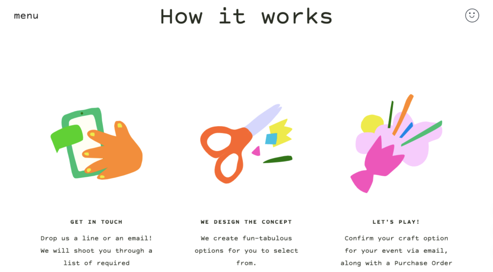
The illustrations on this section of the home page are static images, but animated graphics elsewhere on the page combine to give the site a youthful quality and a lighthearted touch.
Will you use illustrations to style your website?
If you’re finding it’s a real challenge to use photos to tell your brand’s story and are open to considering a little less conventional design style, illustrations might be the right fit.
As you can see in the websites from BeTheme and the other examples given, illustrated websites are relatively common. Still, when you come across one, it tends to have a unique look that can draw you in.
If you want to make your website really cause a stir and even bring smiles to people’s faces, try experimenting with an illustrated website style.
Admit it. You love cartoons as much as the next person.

