Everyone wants to make a powerful first impression. Moreover, you need to make a lasting impression that engraves the brand into a customer’s mind. This should be a top priority in marketing.
This lasting impression reinforces brand awareness, cultivates strong relationships, secures return clients, and solicits new ones. It is behind the success of your venture.
Part of that lasting impression comes in the form of an email signature.
Finishing off an email newsletter, it creates a link between the brand and overall impression so that users do not confuse your company with something else. It cements an overall effect. When done right, it can accomplish various marketing missions.
Let’s dive a bit deeper into email signature design, consider best practices, replenish the toolkit with helpful instruments, and get inspiration from real-life examples to see how to end every correspondence on a professional note and drive extra traffic to your website.
What is an Email Signature?
A signature is a small block that adds information to correspondence: your name, position in a company, and contact information.
Online Email Template Builder
With Postcards you can create and edit email templates online without any coding skills! Includes more than 100 components to help you create custom emails templates faster than ever before.
Try FreeOther Products
An email signature is also a personalized sign-off that appears at the end of every sent email in digital marketing. They are almost the same thing, with one exception. An email signature can increase response rates, drive extra traffic to the website, and even increase cash flow.
Why is it Important to Create an Email Signature?
There are several reasons why you should invest in an email signature design.
- It is an integral part of brand identity that helps create an overall picture of your company.
- It is a quick way to provide contact information for those that prefer to scan rather than read.
- It provides alternative communication channels where subscribers can get help or assistance.
- It addresses issues that may occur at the end of the story.
- It shows your respect for the audience.
- It says much about high professionalism and sociability.
- It is a perfect chance to sparkle and delight.
- It is a great marketing opportunity since it can be used to achieve campaign goals.
Goals of Email Signature Design
When the email signature design looks professional and visually-appealing, it can become a solid foundation for playing some marketing tricks. For example, you can show an extra offer for those who reached the end of the newsletter, share a link to helpful resources on your website, or promote a reward program.
Along with advocating the brand, an email signature can help you reach goals such as:
- Market the brand
- Build respect for the brand
- Increase trust in the company
- Encourage reader response
- Increase engagement
- Drive traffic
- Generate leads
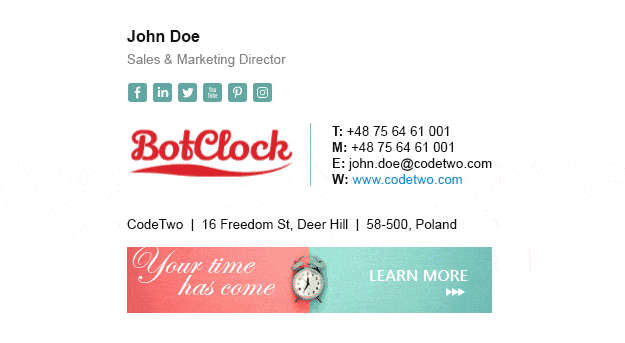
Bot Clock Email Signature with Animated Logo
Email Signatures for Businesses
The business email signature is strict, clean, neat, and straight-to-the-point. While in email marketing, you are welcome to show your creative side, business matters need to be serious and neutral. Your image should be consistent and play along with your company.
Consider its main characteristics:
- It should include only essential elements.
- First name and last name
- Company name and job title
- Telephone number
- Email address
- Physical address
- It should have your headshot and company logo.
- It should use brand colors.
- It should use neutral typography.
- It should have a strict structure with clearly delineated blocks.
- It should avoid such things as
- Inspirational quotes
- Bright colors
- Overly decorations
- Too many icons and glyphs
- Emojis
- Animated gifs since they may look unprofessional in some cases
- Promotional stuff
A business email signature is all about showing your contacts that you mean business.

Business Email Signature
Email Signatures for Marketing
Email signatures for marketing differ since they are more flexible and forgiving. It is here where you can show creativity. What’s more, depending on the email campaign, this signature may have different styles.
It is a general practice to have one email signature for new emails and another for replies and forwards. First and subsequent emails also may have different signatures. It is also highly recommended to align the email signature design to the occasion. The marketing calendar is full of various wonderful events: Christmas, Thanksgiving, Black Friday, St. Valentine’s Day, Easter, and other fantastic local festivals. A holiday-inspired email signature brings only benefits: it reinforces the festive mood and maximizes the overall email design effect.
Email Signature Design
Unlike the email signature for a business that mostly replicates a business card, this one comes in all shapes and sizes. It ranges from minimal with just several lines of contact information to the biggest one that covers the essentials and a banner with an offer or links to useful resources. It may include animated gifs and even small interactive elements like testimonials or videos. It can be bright and creative, getting some powerful vibes from custom typography or graphics.
Last but not least, it may feature promotional material: banners, discounts, links to promo pages, or hot news.

Email Signature Design
Best Practices for Creating an Effective Email Signature Design
Email signature design is a small block placed at the bottom of the digital newsletter. It does not have much space but it does not mean it has to be blunt and insipid. On the contrary, it should be catchy, impressive, and, most importantly, beneficial for your brand.
It seems that creating a stunning email signature design is not too difficult. After all, it is just a small block with text. What can go wrong? However, you do not have much space to display everything. Studies show that a branded signature will draw more attention than a non-branded one, which means that you also need to apply some design skills.
To nail an email signature design, and create one that quickly reaches its target, follow these best practices.
The first step is to create a basic format to build on. As a rule, the base includes such essentials as:
- First and last name
- Job title or position in a company
- Company and link to the company
- Phone number
After you have your solid foundation prepped, it is time to build on it.
Informative Elements
Providing your name and job title along with the phone number is not all that you can do. If you want to increase brand trust and drive traffic to the website, expand the informative part to make it more comprehensive.
- Add links to social media profiles such as LinkedIn, Twitter, Facebook, and Instagram. Alternative channels for direct communication help connect with potential clients, bridge the gap between the company and people, build trust in the brand, and retain customers’ faith. Simple circle-shaped icons will do. Avoid linking to irrelevant social accounts or those that are rarely used.
- Include call-to-action. The CTA can encourage users to follow you on social media, check out a promoted product, get acquainted with news on your blog, or gain extra points for a rewards program.
- If you have to say something meaningful, promote a particular service or product, share company achievements, or make important announcements, you may add a reference. Do not be too wordy and pushy. One link is enough.
- Include content relevant to the person receiving the email. You can benefit from the proper segmentation and personalization here.
- Add legal disclaimers or requirements in accordance with CAN-SPAM laws, such as the unsubscribe option. Also, you can add a legal statement to protect the confidentiality of your communications. This is highly relevant to insurance and banking sectors, among others.
- Use unique closings to meet audience expectations. Although traditional remarks work well, one that exudes your charisma leaves the person excited to respond to you.
- Sign off with gratitude. The practice shows that an email signature that closes with a thank you note is more likely to get a response. Use such words of gratefulness as “thanks,” “thanks in advance,” or “thank you.”
To make the email signature reinforce the marketing campaign, add one of these things:
- A link to your latest content
- A link to your blog subscription
- A link to a promo page
- A link to customer reviews
- A banner with the latest deal
- Seasonal promotions
- Holiday greetings

Real Estate Email Signature Design
Visual Elements
Even though the email signature takes up just a small area on the bottom, there is room for visuals. Images and graphics are welcome since they enhance the user experience, bring attention to information, and provide cues for scanners and skimmers. Consider some useful tips on what you can do.
- Add your face. People remember visuals better than text, and your smiling face will easily etch on the customer’s memory. Make it bright and shiny since, according to psychologists, color images and powerful emotions are more memorable. Use a portrait. It will elicit trust, create a warm feeling, personify the message, and establish a close connection with the audience.
- Use a logo if you do not want to include a headshot. Although a personal touch is preferable, if you do not wish to share your image, you can choose a valid alternative that is a company’s logo. As a brand identity, it helps to stay neutral and represent the whole team instead of one person. Therefore, it is quite often used by companies in digital newsletters.
- Use animated gifs. If you want to add action and emotions to your email signature design, you can benefit from an animated gif. Play with facial expressions or make it all about the company.
- Take care with emojis. Emojis are great tools for adding emotions, strengthening messages, and lightening the mood. However, an email signature is a part of a brand identity. If you stick to a joyful tone and overly friendly conversation with your target market, using emojis could be an appropriate move. However, if you are up to creating an image of a serious company in a good sense, they can be considered mauvais ton. Therefore, use emojis only if they align with your overall brand and perfectly resonate with the target audience.
- Do not use videos. Although videos are more impactful than images, still bear in mind that they are widely unsupported by email readers. You risk facing disappointment and confusion that may ruin your efforts.

Email signature by Razaul Karim
Design Elements
When you have decided on the content, piece together the mosaic. Follow this general advice on creating an email signature design with a great user experience.
Size
First, let’s define the best size for an email signature.
In an email newsletter, especially in one created with HTML and CSS, size matters.
The email signature, even though it sits on the bottom occupying a relatively small area, still influences overall performance and user experience. It can also add weight that makes the newsletter heavier. As we all know, the heavier the email, the more likely it is to be caught by spam filters. We can’t let it happen.
As a rule of thumb, the optimum size for an email signature is 300–600 px wide and 150–200 px high. Ensure images are well-optimized. Alternatively, you can use hosted or linked images to reduce the size of the email signature design drastically. However, make sure that your recipient does not block it so that he or she can see the actual image instead of a box with a red “X”.
Structure
When it comes to structure, your aim is to make the design functional and aesthetically pleasing. It should be well-balanced and easily scannable since no one is going to pour over it. Everything should be properly-arranged yet tasteful. Use formatting to nail this task.
Follow these tips:
- Categorize content using typography and color
- Use headers of no more than two levels
- Use a bullet list
- Use dividers to separate logical parts of the signature
- Provide contrast for the block to separate the signature from the entire reading flow
- Use colors that shriek at one another, like green and blue
- Unify social media icons in size, color, style, shape
- Avoid too many tiny graphical details
- Avoid long sentences
- Avoid too large banners or overwhelming offers
Last but not least, adopt a two or three-column layout that efficiently accommodates the content. For example, you can include an avatar or company logotype on the left column and contact information on the right column. If you do not want to split your email signature into two, then start with an image and then show contact information.

Modern Email Signature Design for Entrepreneur
Typography
In such a small block as an email signature, typography should be carefully selected. Bear in mind these three main points.
- Avoid different fonts in one signature block. Stick to just one and play with weight, style, and size.
- Use safe fonts supported by most email clients, devices, platforms, and operating systems.
- Use fonts with legible letterforms. Arial, Verdana, Helvetica, and other neutral sans serif typefaces work well here.
General Advice
General pieces of advice for email newsletters also work for an email signature. Consider the most crucial ones:
- Check spelling. Even the smallest chunk of text can have errors. These small flaws can ruin the overall impression and destroy the last impression. Therefore, make sure to check and double-check the copy.
- Ensure compliance with regulatory and legal requirements in your organization and country.
- Use images that look great in Retina displays.
- Make everything responsive and mobile-friendly. As a rule, the email signature features the text set in a small size. While this rule works excellent on giant monitors, it can be a real nightmare for cell-phones and tablets. Therefore, make sure your text is perfectly legible on small screens as well. The same goes for visuals, icons, and call-to-action buttons; they should be perfectly tappable or “thumbable.” Also, make sure the typeface size is legible. Apple recommends sticking to a 16px font; however, since the email signature has a B-card nature, you can try a 14px size to make it look natural.
- Make it accessible. Like any other element of a digital newsletter, an email signature should be available to assistive technologies. It means all the information should be easily readable by screen readers. It also goes without saying that all the visuals, including the tiniest icons, should have alt text unless they are purely decorative.
- Preview your email and do tests before going to production. Email designers always overlook this obvious yet effective practice. If you create an email signature on professional platforms like Postcards, you can be sure that it will work great across all the popular devices. However, if you do everything yourself, you need to check whether it works as intended across various platforms.
- Do A/B tests. The final step is to find whether your design solution resonates with the audience. Every detail, including typeface, color, icons, and even offer, is subject to changes. Everything should go along with the audience. Therefore, run A/B tests to define the best design to deliver the message about your persona and company the right way.
Don’ts
There are a dozen don’ts that you should take into account while creating an email signature design, such as:
- Do not overstuff the design. The ideal email signature should be compact and straight-to-the-point.
- Do not make everything tightly packed. Content-heavy blocks always scare users away.
- Do not use an image as an email signature. Some email readers reject visuals while people with impairment simply can’t see them.
- Do not include too many different ways to contact you. Give one or two of the best and the quickest ways to reach you.
- Do not include too many offers. After all, an email signature is an informative piece rather than a promotional one.
- Do not omit job title or position in a company since stating your role lets people know what they can expect from you.
- Do not use more than two images.
- Do not use too many graphics. Strike a balance between the visuals and text.
- Do not add anything of value to your email signature. Avoid quotes or controversial sayings.
Sum Up
A good email signature design should include the following elements:
- Avatar and/or company logo
- First name and last name
- Job title, department, and company name
- Email address and telephone number
- Company physical address
- Social media icons
- Banner (optional)
- Offer (optional)
- Links to additional resources (optional)
- Thank you note (optional)
- Animated gif (optional)
- Emojis (can be safe to use in some cases)
- Holiday-themed graphics (optional)

Simple email signature by Razaul Karim
How to Create an Email Signature Design
There are some helpful step-by-step guides on setting up an email signature in Gmail and Outlook.
Though if you run a large-scale email marketing campaign or you are up to making your company look serious, then you should use professional tools. Gmail and Outlook are great for personal correspondence. Check out our article Why You Should Not Use Outlook or Gmail for Email Marketing.
When it comes to professional instruments, you may use Postcards to assemble all the vital information and make everything look enjoyable.

As one of the most popular HTML email template builders, Postcards has everything you may need to create a visually-appealing professionally-looking email signature design. Coming with stylish field-tested modules and a comprehensive yet handy customization panel, you can make any design you want quickly enough.

Email Signature Example, created by Postcards
Consider this beautiful example that was created in Postcards within minutes. It looks elegant, chic, and refreshing. It has a small avatar on the top that adds a nice human touch, a compact block with text where you can make a statement, vital contact information that is well-highlighted, and refined social media icons that offer alternative ways for communication. The two-column layout gathers all the pieces together, providing a pleasant user experience.
This outstanding sample can become a perfect complement to any professional correspondence.
What’s more, inside Postcards, you will be able to create the entire digital newsletter with an email signature perfectly sitting on the bottom and export everything instantly to Mailchimp or other popular ESPs.
Email Signature Design Examples

Email Signatures from Damian Dmowski
the email signature design from Damian Dmowski looks elegant and sophisticated. It includes only crucial contact information (phone number, email address, and website), a small avatar that wins over clients with a human touch, and a job title.
The two-column layout includes a right column that is more significant to accommodate information comfortably. Inside, you can see another grid – a three-column layout that gives each chunk of information its place under the Sun. Also, the team uses a divider to separate the block from the entire reading flow.
Note, typography. There is just one typeface; nevertheless, it feels diverse thanks to different sizes and capital letters.
This solution is quite universal: it goes well with plain text and rich HTML format. Smart.

Caviar Email Signature Preview by Alex Banaga
Caviar’s email signature is compact, minimal, and straight to the point. Occupying only a small area on the bottom, it mostly reminds signatures that we see in personal correspondence. Only the logotype, job title, and social media icon to LinkedIn betray its business nature.
Note how Alex Bananga has skillfully transformed a plain signature into a piece of brand identity. It feels professional even though it is increasingly small and capsule.

Team E-Mail Signatures for Unicrow by Fatih Turan
This is another minimal email signature design in our collection. Much like the previous example, it reveals only critical information – no marketing tricks, banners, animated gifs, or decorations. Everything is clean, neat, and straightforward. Nevertheless, it does not look oversimplified. It looks great.
Image with brand touch, well-organized contact information, link to the website, and compact size make it look professional. However, thanks to the personal touch, it feels friendly as well.

Email Signature by Tai Valois
Need something bigger and more impactful yet still appropriate for personal correspondence and digital newsletters? Take inspiration from Tai Valois. It reminds you of an excellent old-timey business card that we use in real life. It has a powerful appeal.
The email signature has it all: it includes an avatar, first and last name, job title, contact information, logotype, and even the company’s physical address.
What makes it impactful is design features and the way everything is organized. The team capitalizes on the popular two-column layout, though with a twist in the arrangement. In most cases, the logotype sits on the left, but here it is on the right to stress the company’s contact info.
As for design, it is clean, neat, stylish, and modern. The background echoes with the logo, reinforcing the brand identity. A huge headshot feels positive, making the newsletter look friendly.
It is a smart, branded email signature design that produces a long-lasting impression.

E-Sig..! by Arif Mahmud
Much like the previous example, this email signature makes the most out of modern trends and popular design solutions. As a result, it looks refined, stylish, and refreshing. Beautiful typography, elegant iconography, well-thought-out amount of whitespace, subtle vertical dividers, clean structure, excellent formatting, well-crafted images, well-balanced content, classy black, and white coloring, and blue used for accents: the design is flawless.
Arif Mahmud has shared a dozen concepts made with the same theme.

Hexagonal Email Signature
Email signatures in email marketing can generate leads with the help of smart marketing. This hexagonal-themed example is a case in point. Along with providing contact information, it also increases engagement and kindles interest with a fantastic banner that throws the spotlight on an amazing discount.
Note the banner has a relatively big size. It is a bold move. It plays along with the rest of the design. Thanks to its powerful summer vibe, it serves as a fantastic finishing touch that maximizes the overall effect.
As for structure, the team used a three-column layout that allows dealing with lots of data quite efficiently. Thus, the left column is allocated solely for logotype, the middle column consists of bio and contacts, and the right column has social media icons. Everything is well-organized.
Also, note how the signature achieves consistency in style by using the same shape. Everything is in sync.

Modern All-Inclusive Email Signature
This modern, all-inclusive email signature design skillfully accommodates vital information and more. Based on a rigid two-column layout, it arranges essentials quite cleverly. On top of that, it skillfully employs icons that give extra meaning to each piece of data and provide scanners with necessary visual cues.
This example’s key feature is a banner that unobtrusively and effectively invites users to visit a free webinar. Sitting on the bottom, it still catches an eye thanks to its vibrant on-brand appearance and powerful language.
Overall, the email signature is excellent. The only flaw is the orange color used for tiny icons that look a bit illegible on the white background.
Conclusion
An email signature is just a small block at the bottom of the digital newsletter. However, it is important. Along with playing an essential role in creating a long-lasting impression, it strengthens brand presence, builds trust and credibility, and even generates leads. Therefore, do not miss an opportunity to maximize on your sign off. Make it impressive, personal, and on-brand by adopting the tips in our guide.


