Bootstrap has been one of the widely used web frontend frameworks for responsive development with cross-browser compatibility features. It allows you to quickly build a prototype without spending a large time commitment to build layout designs of your choice and adding additional CSS rules and HTML codes.
With the release of Bootstrap 5, there are a number of key updates to the framework. Bootstrap 5 consists of a wide range of utility classes that are already present in Bootstrap 4 with some newly added classes in the new release.
These utility classes are regularly used in specific situations to quickly put some styles on HTML elements without writing custom CSS rules. If you’re working in a team of web developers or web designers, it is very likely everyone will just have to use these predefined classes and voila! the result will be instant without everyone creating their own CSS rules. This will make sure that your website or app is following the best code practices and code structure consistency from the first day of the development.
In this comprehensive tutorial, I’ll teach you everything you need to know about Bootstrap 5 utility classes in a practical way. Thus, the topics that we will cover in this article are:
- Background
- Borders
- Colors
- Display
- Flex
- Interactions
- Overflow
- Position
- Box Shadows
- Sizing
- Spacing
- Text
- Vertical align
Note: In some cases along the tutorial, I will not discuss or mention the previously introduced utility class but will focus on the topic utility class being conferred.
Bootstrap 5 Utilities
Background
With bootstrap, it’s easy to add some background-color CSS rule in an element to convey a specific connotation using its predefined contextual background color classes which follow it’s built-in theme colors. These are composed of a subset of color palettes for generating color schemes.
Online Email Template Builder
With Postcards you can create and edit email templates online without any coding skills! Includes more than 100 components to help you create custom emails templates faster than ever before.
Try FreeOther Products
Note: Background color utility classes do not set color or text color. You can use the contextual text color utility classes via .text-* color utilities if you want to achieve this style according to your constraint (more on this below).
The following are the supported background color utility classes that you can use when adding background-color:
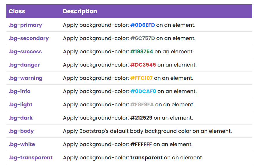
Let’s take a look on how these background color utility classes work. Let’s use the markup below.
<div class="container"> <div class="row g-2"> <div class="col-4 bg-primary text-white"> .bg-primary </div> <div class="col-4 bg-secondary text-white"> .bg-secondary </div> <div class="col-4 bg-success text-white"> .bg-success </div> <div class="col-4 bg-danger text-white"> .bg-danger </div> <div class="col-4 bg-warning text-white"> .bg-warning </div> <div class="col-4 bg-info text-white"> .bg-info </div> <div class="col-4 bg-light"> .bg-light </div> <div class="col-4 bg-dark text-white"> .bg-dark </div> <div class="col-4 bg-body"> .bg-body </div> <div class="col-4 bg-white"> .bg-white </div> <div class="col-4 bg-transparent"> .bg-transparent </div> </div>
</div>
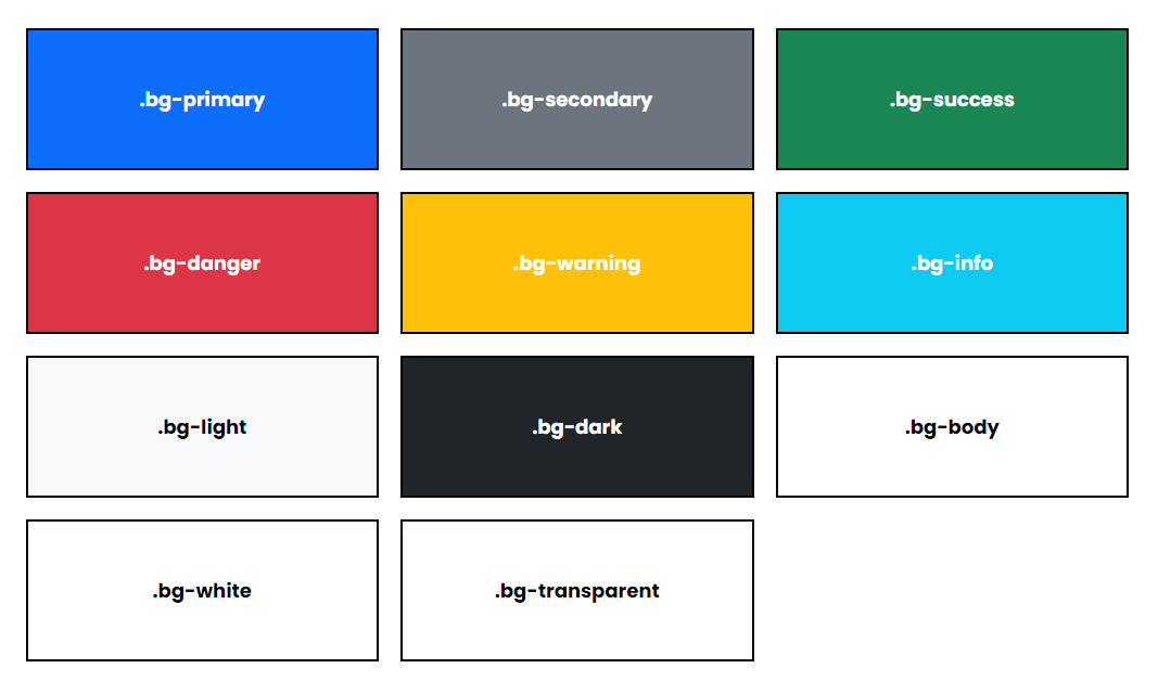
As you can see on our markup above, we use four responsive columns to span over the twelve-column grid layout and added the background color utility classes on each of the columns accordingly.
With some custom styles added for demonstration, we should be expecting a similar output like the image below:
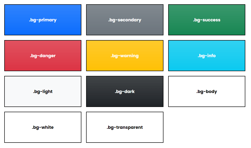
In addition to background color utility classes, you can also quickly add a linear gradient background-color CSS rule to your elements using .bg-gradient class. This linear gradient background color utility class starts with a semi-transparent white which fades out to the bottom.
Using the same markup above, let’s take a look at how these linear gradients work on background color utility classes by simply adding .bg-gradient class on each column. Checkout the markup below:
<div class="container"> <div class="row g-2"> <div class="col-4 bg-primary bg-gradient text-white"> .bg-primary </div> <div class="col-4 bg-secondary bg-gradient text-white"> .bg-secondary </div> <div class="col-4 bg-success bg-gradient text-white"> .bg-success </div> <div class="col-4 bg-danger bg-gradient text-white"> .bg-danger </div> <div class="col-4 bg-warning bg-gradient text-white"> .bg-warning </div> <div class="col-4 bg-info bg-gradient text-white"> .bg-info </div> <div class="col-4 bg-light bg-gradient"> .bg-light </div> <div class="col-4 bg-dark bg-gradient text-white"> .bg-dark </div> <div class="col-4 bg-body bg-gradient"> .bg-body </div> <div class="col-4 bg-white bg-gradient"> .bg-white </div> <div class="col-4 bg-transparent bg-gradient"> .bg-transparent </div> </div>
</div>
With some custom styles added for demonstration, you should be expecting a similar output like the image below:
Borders
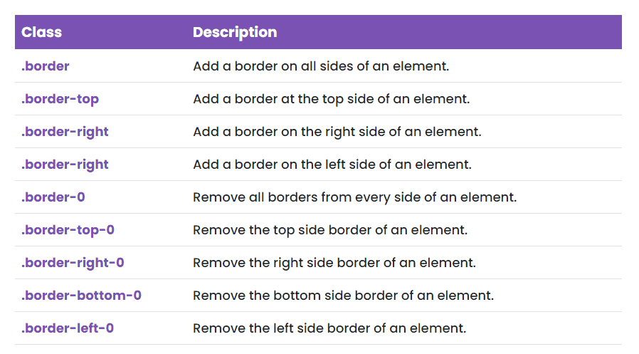
Another CSS style that is regularly used in any layout design is border. The border properties allow you to define the style, width, and color of an element’s border. With bootstrap, you can quickly style the border and border-radius of an element by using the predefined border utility classes.
The following are the supported border utility classes that you can use when adding a border to an element:
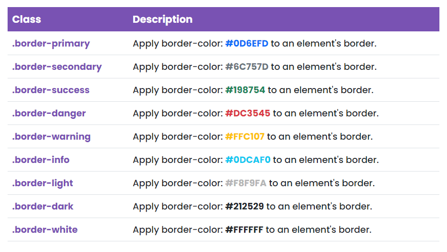
The following are the border-color utilities built on bootstrap theme colors:
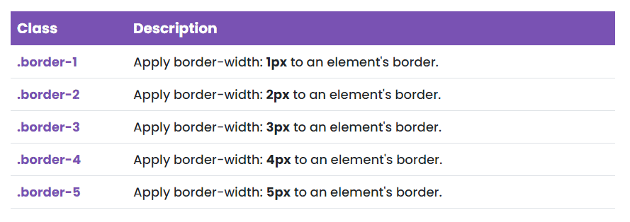
Additionally, you can also define the border thickness of an element using the border width utility classes:
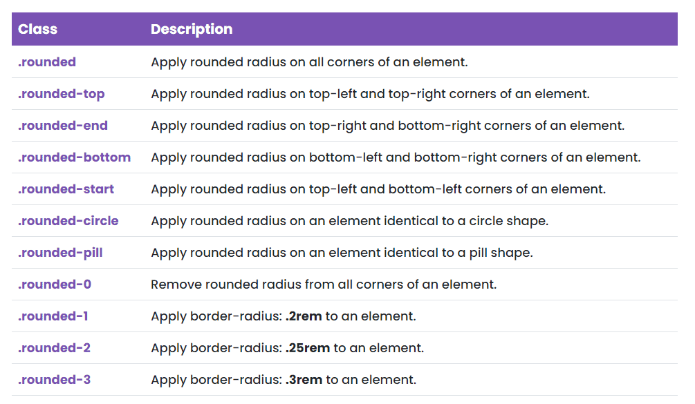
You can also use the border-radius utility classes to quickly add a radius or rounded corner(s) to an element:
Let’s see how we can use some of these utility classes to quickly define the border properties of an element. Check out the markup below:
<div> <a href="#" class="bg-primary border border-dark border-5 text-white">Link 1</a> <a href="#" class="bg-light border border-primary">Link 2</a> <a href="#" class="bg-transparent border-bottom border-info border-5">Link 3</a>
</div>
<div> <a href="#" class="bg-secondary border border-danger border-4 rounded-pill text-white">Link 4</a> <a href="#" class="bg-white border border-success border-2 rounded-bottom">Link 5</a> <a href="#" class="bg-danger border border-top-0 border-dark border-5 rounded-start rounded-end text-white">Link 6</a>
</div>
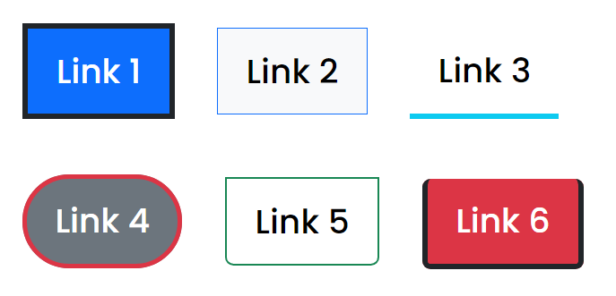
In the markup above, I’ve added some bootstrap background color utility classes to set some basic link layout design to see what is going on. Here’s a breakdown of what you need to know:
- The first link has a background color of #0D6EFD because of the .bg-primary class added to it. It will also a have a border color of #0D6EFD using the .border-dark class as well as a border width of 5px with the .border-5 class added to it.
- The second link has a background color of #F8F9FA with the .bg-light class added to it. Finally, we added a border on all sides with a border color of #0D6EFD using the .border-primary
- The third link has a transparent background because of the .bg-transparent class added to it. It will also have a border on the bottom with color of #0DCAF0 and border thickness of 5px using the .border-bottom, .border-info and .border-5
- The fourth link has a background of #6C757D because of the .bg-secondary class added to it. It will also a have a border color of #DC3545 and rounded radius pill since we added .border-danger and .rounded-pill to it. Finally, the border width will be 4px in thickness because of the .border-4 class added to it.
- The fifth link will have a white background color since we added .bg-white to it. The border color will be #198754 since we added .border-success class and will also have a rounded radius at the bottom due to .rounded-bottom. Finally, the border width will be 2px in thickness because of the .border-2 class added to it.
- The last link will have a background color of #DC3545 and border color of #212529 with .bg-danger and .border-dark class added to it. It will also have a border width of 5px because of the .border-5 Finally, we added .rounded-start and .rounded-end class to it which will add a rounded radius on the top-left, bottom-left, top-right and bottom-right of the corners.
With a few additionally custom styles, the result should look like this:
Color
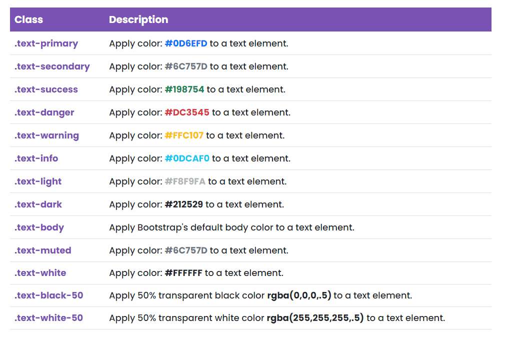
You can also apply the same contextual colors that we used for the background and border color to every text element through bootstrap text color utility classes. These are frequently used for conveying meaning for a particular action or situation on your website or app.
The use of these utility classes is very straightforward. To do this, you can simply utilize the following classes and apply these classes directly to any of your text elements:
Display
Another helpful set of bootstrap utility classes that lets you easily and responsively toggle display value of a specific element in a specific breakpoint or viewport are the display utility classes.
These classes consist of a subset of classes that mostly use breakpoint or viewport abbreviation in them to control the responsive display by showing and hiding elements by screen resolution or device viewport width.
The following are the main supported display utility classes that you can use when dealing with a component’s responsive toggle:
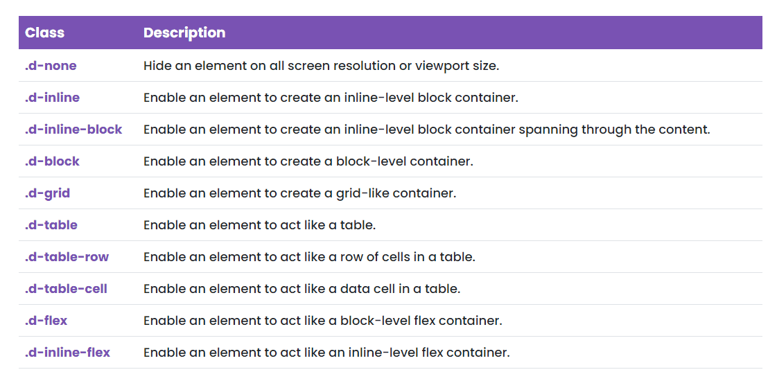
Additionally, display utility classes can be applied to all breakpoints, from xs to xxl. You can use these utility classes to show or hide elements on your preferred screen resolution or viewport width using the format .d-{breakpoint}-{value} for sm, md, lg, xl, and xxl. For instance, you can use .d-md-none, .d-sm-block, .d-md-flex and the list go on.
Lastly, you can change the display value of an element when printing via print display utility classes. These display in print utility classes support for the same display values as the responsive .d-* utilities. You can do this simply by adding the print- after .d-*.
The following are the list of all the display in print utility classes.
- .d-print-none
- .d-print-inline
- .d-print-inline-block
- .d-print-block
- .d-print-grid
- .d-print-table
- .d-print-table-row
- .d-print-table-cell
- .d-print-flex
- .d-print-inline-flex
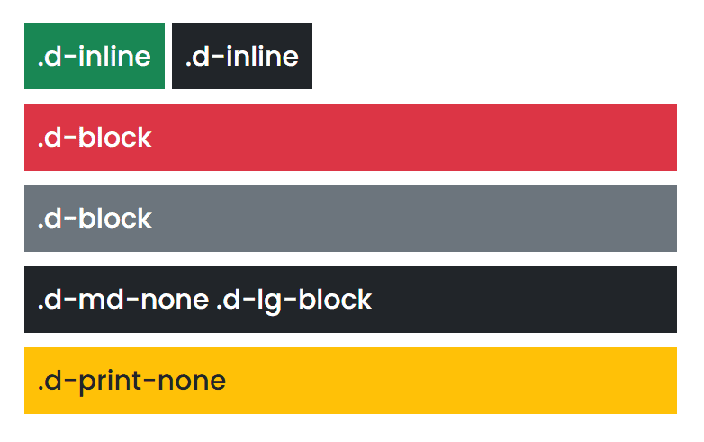
Let’s have a few examples on how these display utility classes’ works using the following markup below:
<div class="d-inline p-2 bg-success text-white">.d-inline</div>
<div class="d-inline p-2 bg-dark text-white">.d-inline</div>
<div class="d-block p-2 mt-3 bg-danger text-white">.d-block</div>
<div class="d-block p-2 mt-2 bg-secondary text-white">.d-block</div>
<div class="d-md-none d-lg-block p-2 mt-2 bg-dark text-white">.d-md-none .d-lg-block</div>
<div class="d-print-none p-2 mt-2 bg-warning">.d-print-none</div>
Here’s a breakdown of what you need to know about the markup above:
- We used .d-inline class on the first and second <div> This will enable our <div> tags to create an inline-level block container which will position both <div> tags next to each other. Any height and width properties will have no effect.
- We used .d-block class on the third and fourth <div> This will enable our <div> tag to create a block-level container which starts on a new line, and takes up the whole width.
- On the fourth <div> tag, we used .d-md-none and .d-lg-block. This will simply display the <div> when it’s large screen resolution or viewport width but hides the <div> if it’s on medium screen resolution or viewport width.
- On our last <div> tag, we used .d-print-none. This simply means that this <div> will only appear on screen only but hides on print display.
With the markup above, the output should look like this on the browser:
Flex
Flexbox offers a better way to organize elements in a web page in a predictable manner. While it sometimes performs like a float, it offers a lot more than that such as reordering elements and avoiding known issues of float.
In version 4 of Bootstrap, flexbox support has finally arrived. Using display properties via display utilities, it’s easy to create a flexbox container and transform direct children elements into flex items.
Bootstrap comes with the following main flexbox utility classes:

Additionally, responsive variations exist on most of these flexbox utility classes. As an example for .d-flex, you can use classes on specific breakpoints or viewports such as .d-sm-flex or .d-xl-flex.
I won’t list all of the flexbox responsive variation classes here since there are plenty of them, but feel free to check the official documentation about flex utility classes to learn more.
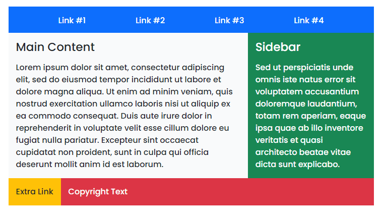
Let’s have a basic example on some of these flexbox utility classes. Consider the markup below:
<div class="container">
<div class="row"> <div class="col-md-7"> <nav> <ul class="nav justify-content-evenly text-white bg-primary"> <li><a href="#">Link #1</a></li> <li><a href="#">Link #2</a></li> <li><a href="#">Link #3</a></li> <li><a href="#">Link #4</a></li> </ul> </nav> <div class="main d-flex"> <div class="bg-light flex-grow-1 p-2"> <h3>Main Content</h3> <p>Lorem ipsum dolor sit amet, consectetur adipiscing elit, sed do eiusmod tempor incididunt ut labore et dolore magna aliqua. Ut enim ad minim veniam, quis nostrud exercitation ullamco laboris nisi ut aliquip ex ea commodo consequat. Duis aute irure dolor in reprehenderit in voluptate velit esse cillum dolore eu fugiat nulla pariatur. Excepteur sint occaecat cupidatat non proident, sunt in culpa qui officia deserunt mollit anim id est laborum.</p> </div> <aside class="bg-success text-white p-2"> <h3>Sidebar</h3> <p>Sed ut perspiciatis unde omnis iste natus error sit voluptatem accusantium doloremque laudantium, totam rem aperiam, eaque ipsa quae ab illo inventore veritatis et quasi architecto beatae vitae dicta sunt explicabo.</p> </aside> </div> <footer class="d-flex"> <p class="bg-warning p-2">Extra Link</p> <p class="bg-danger flex-grow-1 text-white p-2">Copyright Text</p> </footer> </div>
</div>
Let’s take a closer look at what’s happening on the markup above:
- Inside our <nav> tag and <ul> tag, we used the .justify-content-evenly utility class. This will define the alignment of the child elements along the main axis and will provide equal size instead of half-sized space on the edges.
- On our main content elements, we use the .d-flex This will enable our main container to act like a block-level flex container with flex direction row as the default behavior. We also added the .flex-grow-1 on the <div> tag to define the amount of this flex item will grow relative to the rest of the flexible items within a container which would take up twice as much space as the <aside> tag content.
- Lastly, on our <footer> tag, we used .d-flex class again and added the .flex-grow-1 on the second <p> tag which again will take up twice as much space as the first <p>
With some custom added CSS rules, if you view on the browser it should look like this:
Interactions
Bootstrap 5 also provides CSS property controls that allow users to interact with content. This determines whether the user can select text or not and if a specific pointer event is active in a text element. This doesn’t have any effect on content loaded as part of a browser’s user interface except in textboxes.
The following are the supported interactions utility classes:

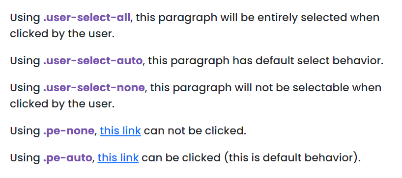
Let’s see these interaction utility classes in action. Consider the markup below:
<p class="user-select-all">Using <span style="color: #7952B3; font-weight: bold">.user-select-all</span>, this paragraph will be entirely selected when clicked by the user.</p>
<p class="user-select-auto">Using <span style="color: #7952B3; font-weight: bold">.user-select-auto</span>, this paragraph has default select behavior.</p>
<p class="user-select-none">Using <span style="color: #7952B3; font-weight: bold">.user-select-none</span>, this paragraph will not be selectable when clicked by the user.</p>
<p>Using <span style="color: #7952B3; font-weight: bold">.pe-none</span>, <a href="#" class="pe-none" tabindex="-1" aria-disabled="true">this link</a> can not be clicked.</p>
<p>Using <span style="color: #7952B3; font-weight: bold">.pe-auto</span>, <a href="#" class="pe-auto">this link</a> can be clicked (this is default behavior).</p>
Our markup above is very straightforward. If you check this out on your browser, you will see the same exact behavior as written on each paragraph.
Overflow
With bootstrap, it’s also easy to set your preferred behavior for an element’s overflow using the overflow utility classes. For instance, when an element’s content is too big to fit in its container context, you can specify whether to clip content in both directions or add a scrollbar on it.
Bootstrap provides the following overflow utility classes that you can use on your elements right out of the box:
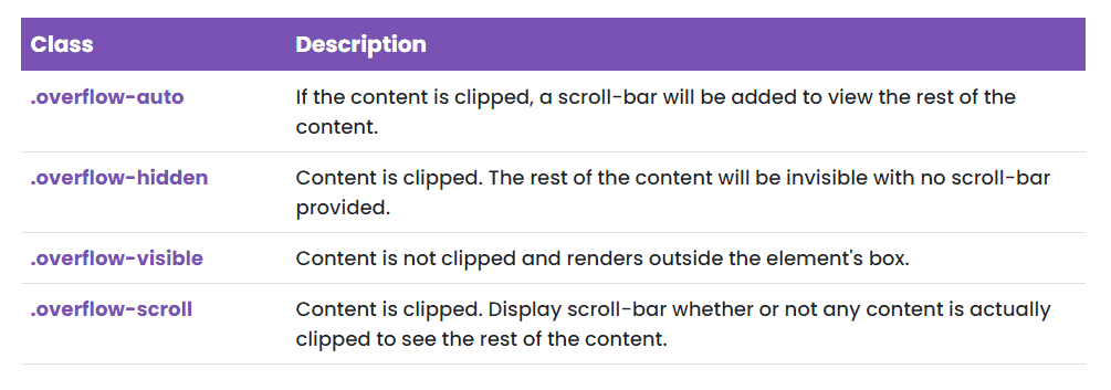
To see these overflow utility classes in action, consider the markup below:
<div class="overflow-auto"> <h3>Overflow Auto</h3> <p>Lorem ipsum dolor sit amet, consectetur adipiscing elit, sed do eiusmod tempor incididunt ut labore et dolore magna aliqua. Ut enim ad minim veniam, quis nostrud exercitation ullamco laboris nisi ut aliquip ex ea commodo consequat. Duis aute irure dolor in reprehenderit in voluptate velit esse cillum dolore eu fugiat nulla pariatur. Excepteur sint occaecat cupidatat non proident, sunt in culpa qui officia deserunt mollit anim id est laborum.</p>
</div>
<div class="overflow-hidden"> <h3>Overflow Hidden</h3> <p>Lorem ipsum dolor sit amet, consectetur adipiscing elit, sed do eiusmod tempor incididunt ut labore et dolore magna aliqua. Ut enim ad minim veniam, quis nostrud exercitation ullamco laboris nisi ut aliquip ex ea commodo consequat. Duis aute irure dolor in reprehenderit in voluptate velit esse cillum dolore eu fugiat nulla pariatur. Excepteur sint occaecat cupidatat non proident, sunt in culpa qui officia deserunt mollit anim id est laborum.</p>
</div>
<div class="overflow-visible"> <h3>Overflow Visible</h3> <p>Lorem ipsum dolor sit amet, consectetur adipiscing elit, sed do eiusmod tempor incididunt ut labore et dolore magna aliqua. Ut enim ad minim veniam, quis nostrud exercitation ullamco laboris nisi ut aliquip ex ea commodo consequat. Duis aute irure dolor in reprehenderit in voluptate velit esse cillum dolore eu fugiat nulla pariatur. Excepteur sint occaecat cupidatat non proident, sunt in culpa qui officia deserunt mollit anim id est laborum.</p>
</div>
<div class="overflow-scroll"> <h3>Overflow Scroll</h3> <p>Lorem ipsum dolor sit amet, consectetur adipiscing elit, sed do eiusmod tempor incididunt ut labore et dolore magna aliqua. Ut enim ad minim veniam, quis nostrud exercitation ullamco laboris nisi ut aliquip ex ea commodo consequat. Duis aute irure dolor in reprehenderit in voluptate velit esse cillum dolore eu fugiat nulla pariatur. Excepteur sint occaecat cupidatat non proident, sunt in culpa qui officia deserunt mollit anim id est laborum.</p>
</div>
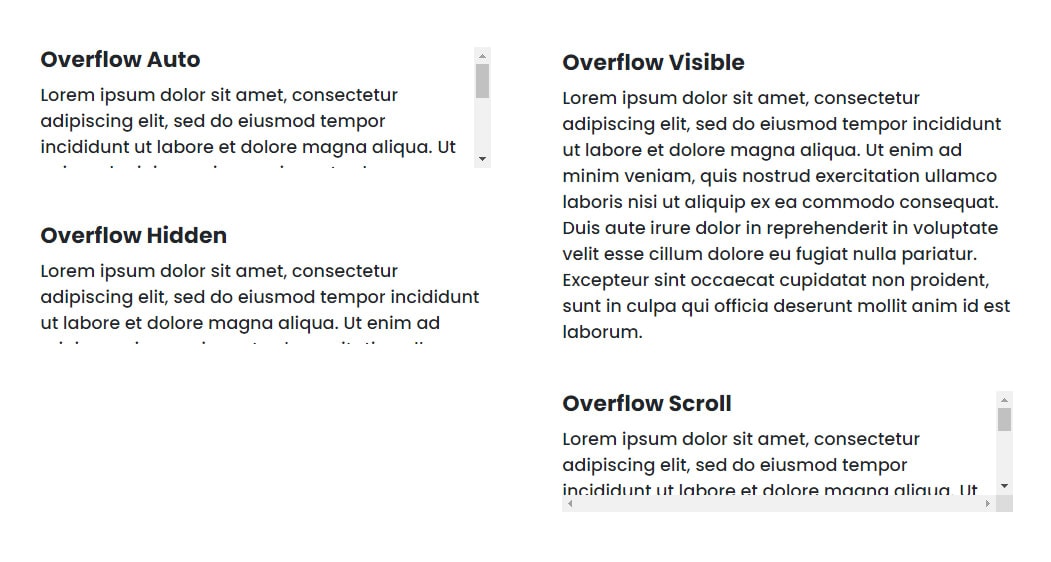
Let’s take a closer look on the markup above in details:
- On the first <div> tag, we used the .overflow-auto This will add a scroll-bar to view the rest of the content.
- On the second <div> tag, we used the .overflow-hidden Because of this, content will be clipped and the rest of the content is invisible with no scroll-bar provided.
- On the third <div> tag, we used the .overflow-visible Again, the content will be clipped but this time it will render outside the element’s box.
- On the last <div> tag, we used the .overflow-scroll Content will still be clipped and it will be displayed a scroll-bar both at the top and bottom.
With a slight custom CSS rule added, the result should look like this:
Position
Another useful set of bootstrap utility classes are the position utilities. These classes allow you to define the type of positioning method and final location you want an element to behave in a web page.
Bootstrap offers the following position and edge positioning utility classes on the fly:
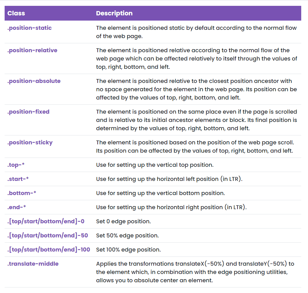
Let’s have some examples using these utility classes. Check out the markup below:
<nav class="navbar navbar-dark bg-dark position-sticky"> <div class="container-fluid"> <a class="navbar-brand" href="#">Position Sticky</a> </div>
</nav>
<div class="container-fluid">
<div class="row"> <div class="col-md-12 mx-auto"> <aside class="bg-danger text-white p-4 position-absolute top-50 start-50 translate-middle"> <h3>Position Absolute With Translate Middle</h3> <p>Lorem ipsum dolor sit amet, consectetur adipiscing elit, sed do eiusmod tempor incididunt ut labore et dolore magna aliqua. Ut enim ad minim veniam, quis nostrud exercitation ullamco laboris nisi ut aliquip ex ea commodo consequat. Duis aute irure dolor in reprehenderit in voluptate velit esse cillum dolore eu fugiat nulla pariatur. Excepteur sint occaecat cupidatat non proident, sunt in culpa qui officia deserunt mollit anim id est laborum.</p> </aside> <div class="main bg-success p-4 text-white position-relative top-0 end-0"> <h3>Position Relative</h3> <p>Lorem ipsum dolor sit amet, consectetur adipiscing elit, sed do eiusmod tempor incididunt ut labore et dolore magna aliqua. Ut enim ad minim veniam, quis nostrud exercitation ullamco laboris nisi ut aliquip ex ea commodo consequat. Duis aute irure dolor in reprehenderit in voluptate velit esse cillum dolore eu fugiat nulla pariatur. Excepteur sint occaecat cupidatat non proident, sunt in culpa qui officia deserunt mollit anim id est laborum.</p> </div> </div>
</div>
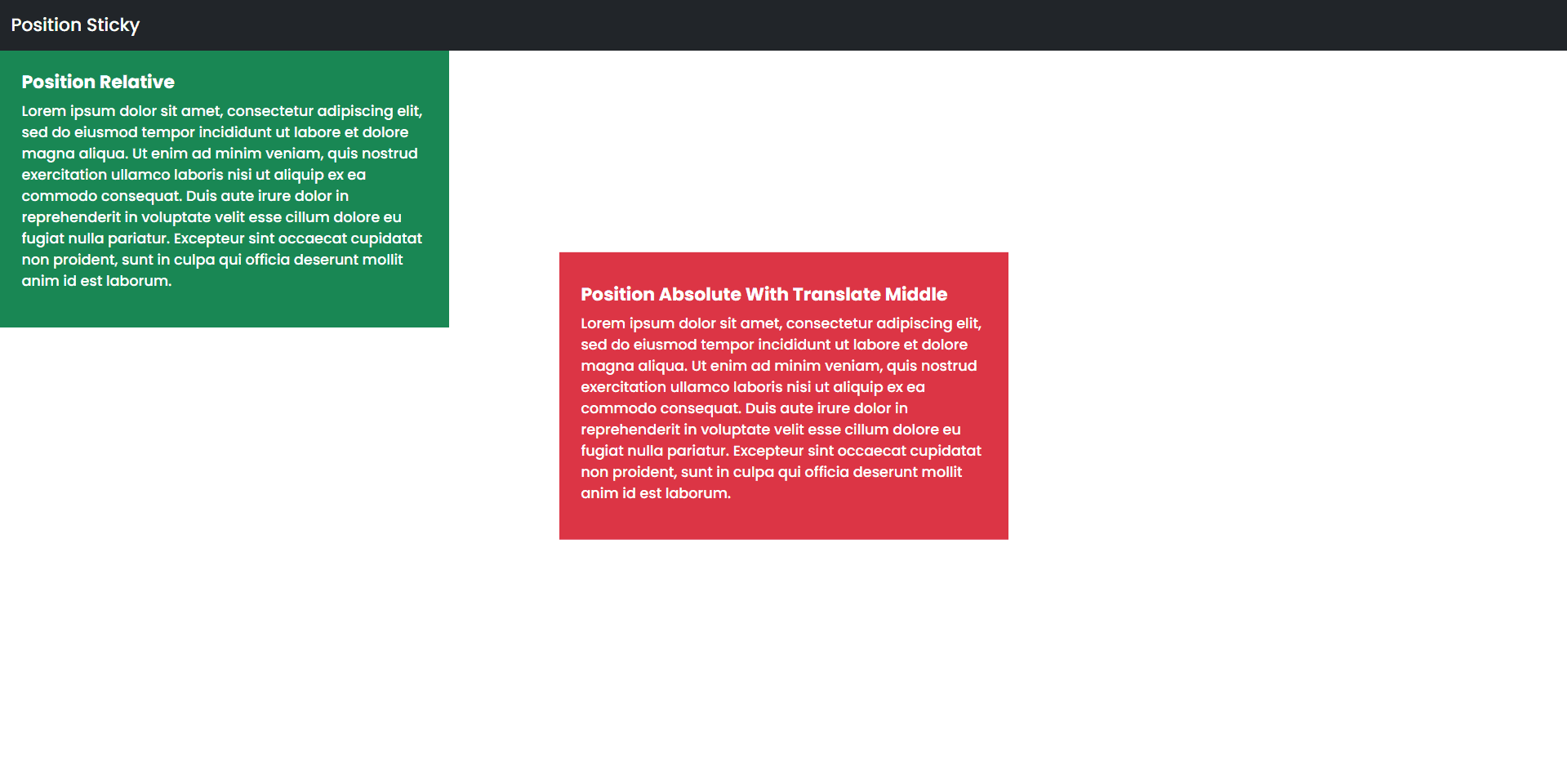
Here’s a few points that you need to understand on the markup above:
- We used bootstrap’s navbar markup to demonstrate a position sticky position. This is a good example on when to use this position method.
- Next, inside the <aside> tag we added the .position-absolute, .top-50, .start-50 and .translate-middle This will position the <aside> tag relative to the closest containing element and set the horizontal left position to 50% edge position and set the vertical top position to 50% edge position. With .translate-middle class, it applies the transformations translateX(-50%) and translateY(-50%) to the element which will position the element to absolute center.
- On the last <div> tag we used .position-relative, .top-0 and end-0 This will position relative according to the normal flow of the web page. Using .top-0 and .end 0 class, we set up the vertical top position to 0 edge position and the horizontal right position at 0 edge position.
The end result should look like this on the browser:
Box Shadow
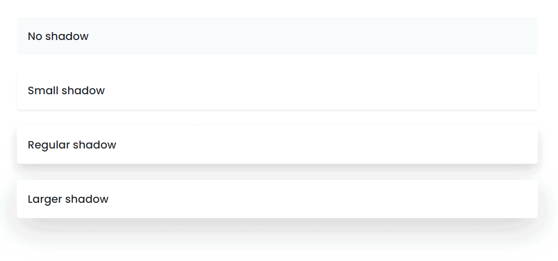
With the box-shadow CSS property, you can cast shadow effects around an element’s frame which is determined by X and Y offsets. Bootstrap 5 also has its own out-of-the-box utility classes to quickly add box shadows to your elements.
The following are the supported box-shadow utility classes:

Let’s see these classes in action. Consider the following markup:
<div class="shadow-none p-3 mb-4 bg-light rounded">No shadow</div>
<div class="shadow-sm p-3 mb-4 bg-body rounded">Small shadow</div>
<div class="shadow p-3 mb-4 bg-body rounded">Regular shadow</div>
<div class="shadow-lg p-3 mb-4 bg-body rounded">Larger shadow</div>
The markup is very straightforward as we only added each box-shadow class on each <div> tag.
The result should look like the image below:
Sizing
One of the important factors in web design is the responsive sizes of each element that can span or shrink in size across different screen resolutions or viewport widths.
Aside from the responsive columns and flexbox classes, bootstrap also offers sizing utility classes that can make an element as wide or tall depending on the layout you are trying to achieve.
This became possible through the sizing utility classes provided by bootstrap out of the box.
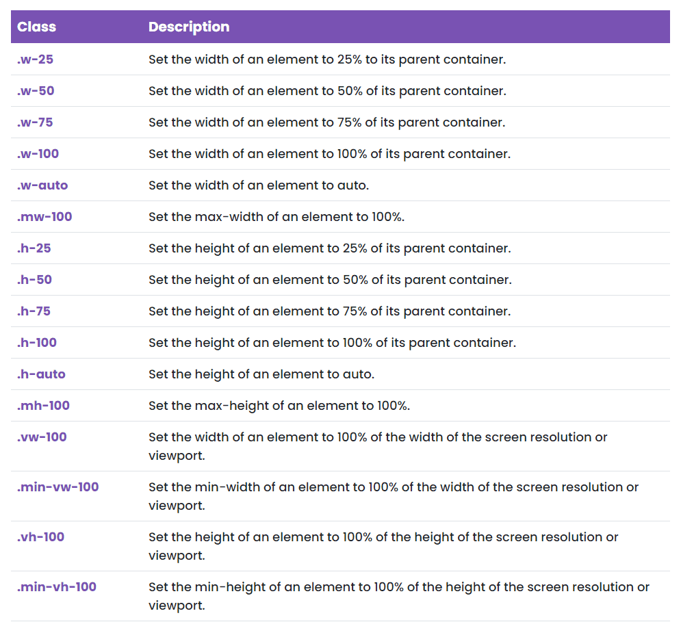
Let’s try some of these classes. Consider the markup below:
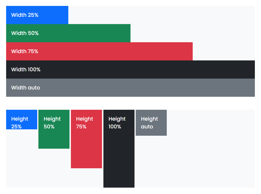
<div> <div class="w-25 p-3 bg-primary text-white">Width 25%</div> <div class="w-50 p-3 bg-success text-white">Width 50%</div> <div class="w-75 p-3 bg-danger text-white">Width 75%</div> <div class="w-100 p-3 bg-dark text-white">Width 100%</div> <div class="w-auto p-3 bg-secondary text-white">Width auto</div>
</div>
<div> <div class="h-25 d-inline-block p-3 bg-primary text-white" style="width: 120px;">Height 25%</div> <div class="h-50 d-inline-block p-3 bg-success text-white" style="width: 120px;">Height 50%</div> <div class="h-75 d-inline-block p-3 bg-danger text-white" style="width: 120px;">Height 75%</div> <div class="h-100 d-inline-block p-3 bg-dark text-white" style="width: 120px;">Height 100%</div> <div class="h-auto d-inline-block p-3 bg-secondary text-white" style="width: 120px;">Height auto</div>
</div>
On the markup above, we have two containing <div> tags. The first <div> tag covers all of the width sizing utility classes while the second <div> tag covers all height sizing utility classes accordingly.
Using these codes, you can expect similar result to the image below:
Spacing
Bootstrap offers a variety of shorthand responsive margin, padding, and gap utility classes to modify an element position or appearance. These spacing utility classes can be used on any supported breakpoints, from xs to xxl and don’t have any breakpoint abbreviation in them. The standard measurement for each margin, padding and gap classes are ranging from .25rem to 3rem.
These classes are formatted {property}{sides}-{size} for xs and {property}{sides}-{breakpoint}-{size} for sm, md, lg, xl, and xxl. Available sizes starts from 0 up to 5 and an extra auto keyword to set the margin to auto.
The following are supported spacing utility classes:
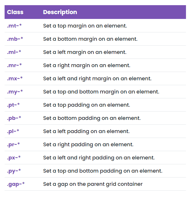
As an example you can use .mt-5 to add a 3rem margin at the top of an element or .pb-1 to add a .25rem bottom padding on an element.
Additionally, you can also add a negative margin via the n keyword. For instance, if you want to add a negative margin at the top of an element, you can use the .mt-n1 class. This class format is likely identical with the positive margin utilities with just the n keyword added to it.
Text
Bootstrap 5 also added a few new extra utility classes for common text or link control. With these classes, you can easily realign text to components, wrap text, modify the font size or weight, transform case and more. Just like the previous set of utility classes that I introduced and demonstrated above, responsive classes are also available on some of these text utility classes which you can use with viewport width breakpoints as the grid system.
Let’s take a look on all of the supported text utility classes.
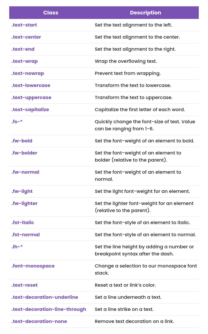
Let’s see how some of these text-utility works. Check out the markup below:
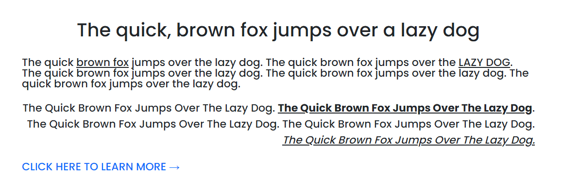
<h2 class="fs-4 text-center mb-4">The quick, brown fox jumps over a lazy dog</h2> <p class="text-start lh-1">The quick <span class="text-lowercase text-decoration-underline">BROWN FOX</span> jumps over the lazy dog. The quick brown fox jumps over the <span class="text-uppercase text-decoration-underline">lazy dog</span>. The quick brown fox jumps over the lazy dog. The quick brown fox jumps over the lazy dog. The quick brown fox jumps over the lazy dog.</p> <p class="text-end text-capitalize">The quick brown fox jumps over the lazy dog. <span class="fw-bold text-decoration-underline">The quick brown fox jumps over the lazy dog</span>. The quick brown fox jumps over the lazy dog. The quick brown fox jumps over the lazy dog. <span class="fst-italic text-decoration-underline">The quick brown fox jumps over the lazy dog.</span></p> <a class="text-decoration-none text-uppercase text-sm-center" href="#">click here to learn more →</a>
Here are some of the highlights you should be aware of about the markup above:
- On the <h2> tag, we used .fs-3, and .text-center This will simply set the font size of the text to 1.75rem and will align the text to center.
- In the first paragraph, we used the .text-start and .lh-1 This will simply set the text alignment to the left or start of the container and will give it a line height of 1. Using a couple of <span> tags, we added the following classes: .text-lowercase, .text-decoration-underline and .text-uppercase. These classes are very straightforward. They simply transform the text to lowercase and uppercase and put a line underneath each text.
- In the second paragraph, we used the .text-end and .text-capitalize. This is almost identical with the first paragraph except that it will align the text to the right or end of the container. Again, using a couple of <span> tags, we added the following classes: .fw-bold, .text-decoration-underline and .fst-italic. These classes will simply add a font-weight of bold and font-style of italic to the spanned element. The .text-decoration-underline class will put a line underneath the spanned text.
- On the anchor tag, we added .text-decoration-none, .text-uppercase and .text-sm-center Comparable to .text-decoration-underline, the .text-decoration-none will remove the line on the link. The .text-sm-center will align the text to the center when the small screen resolution or viewport width is reached.
The preceding markup will look like the following output:
Vertical alignment
With bootstrap, it’s also easy to add vertical alignment options to your components. You can choose from .align-baseline, .align-top, .align-middle, .align-bottom, .align-text-bottom, and .align-text-top as needed.
Note: If you want to vertically align non-line components such as elements that use <div> tags, you need to use flex box utilities instead. Also, vertical-align can only take effect on inline, inline-block, inline-table, and table cell elements.
Let’s take a look at how these vertical alignment utility classes work. Consider the markup below:
<table> <tbody> <tr> <td class="align-baseline">.align-baseline</td> <td class="align-top">.align-top</td> <td class="align-middle">.align-middle</td> <td class="align-bottom">.align-bottom</td> <td class="align-text-top">.align-text-top</td> <td class="align-text-bottom">.align-text-bottom</td> </tr> </tbody>
</table>
On each table standard data cell, we added all of the supported vertical alignment class and it’s should look something like this on the browser:

Visibility
While bootstrap already has its own display properties for hiding and displaying elements on a specific screen resolution or viewport width, it also has two extra classes to control the visibility of an element using the .visible and .invisible class.
These utility classes are very straightforward. You will use the .visible class to make an element visible and use the .invisible class to hide an element both visually and for assistive technology/screen reader users.
Wrapping Up
Woah! That’s a long list of utility classes!
In this article, you learned all of the supported utility classes added in Bootstrap 5 including the recently added ones. These are really essential classes for creating websites with high-quality web apps while preventing repetitive custom CSS rules on your site. Knowing them in depth gives you a huge advantage and helps with the handling simple tweaks on your web design. Remember that consistency across the website is the main thing about Bootstrap, saving your valuable time.
