We’re seeing more and more dark mobile UI apps appearing on the scene, and it is definitely a good choice if you want to create a slick, sophisticated, and modern interface.
The high contrast between dark backgrounds and vivid colors enable designers to emphasize functions and features, making it easier for users to understand and interact with the app quickly. However, it is mandatory to balance between colors that are too light or too dark, as this can negatively affect readability.
In this collection, I’ve curated a list of 20 of the most stylish and clean dark mobile UI designs that will boost your inspiration. Here you’ll see how renowned companies adopted this trend to reduce eyestrain to make it more comfortable for users to use the app for extended periods.
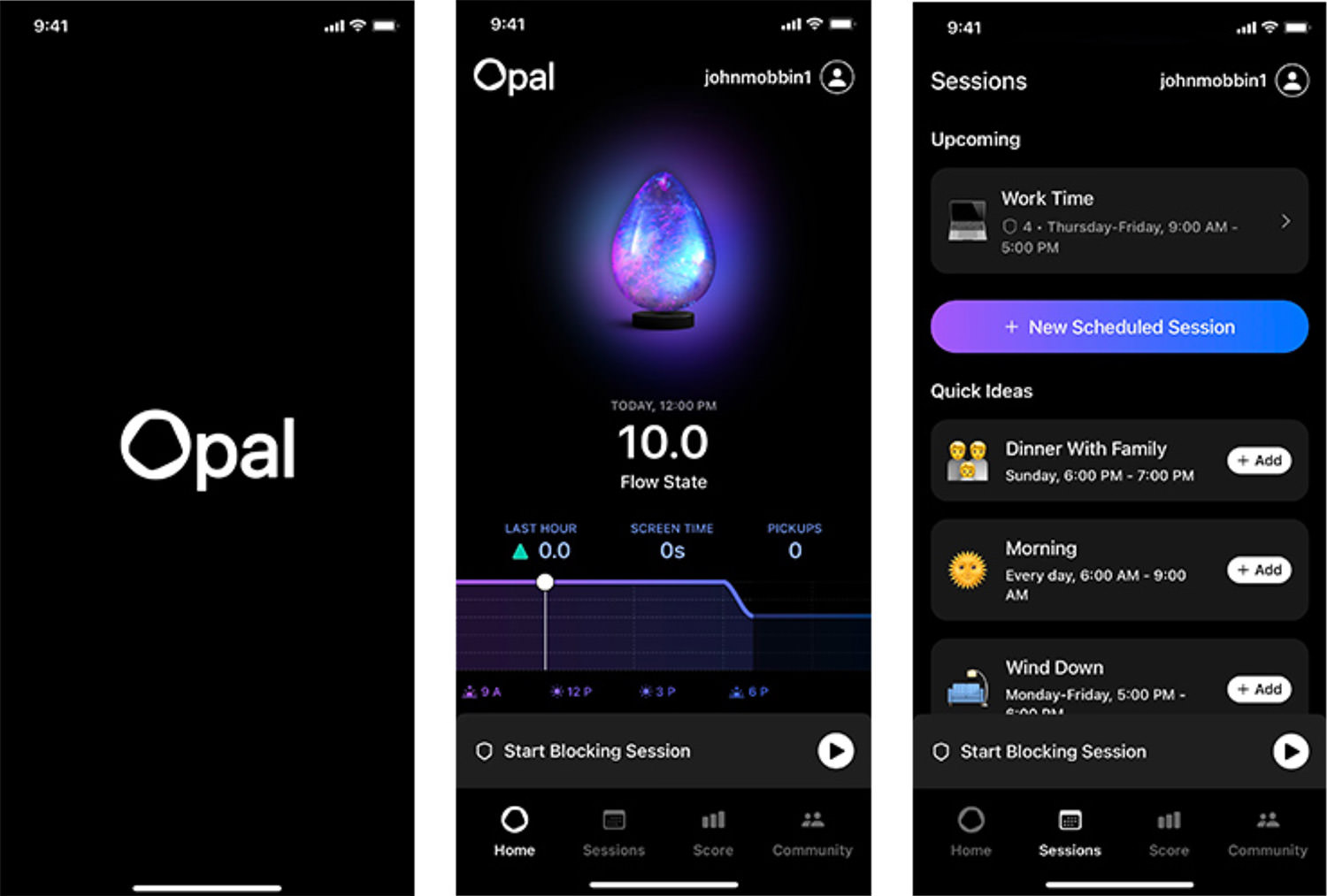
1. Opal
The Opal Mobile App gives a unique spin on the classic dark UI design. It helps users retain their focus by providing an option to hide apps that are distracting them. The gradients and illustrations offer a modern and futuristic vibe.

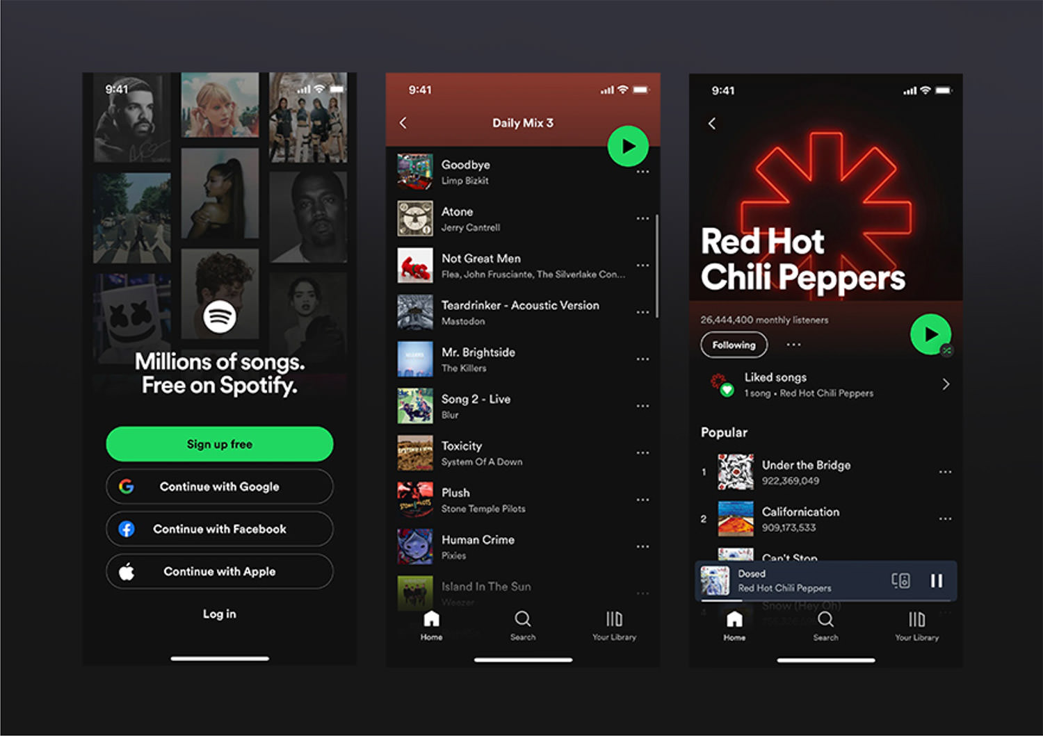
2. Spotify
Founded in 2006, the audio streaming company has gone through several designs along the way, but no plan was successful as the dark one they adopted in 2014.
Michelle Kadir, Spotify’s director of product, told The Guardian:
“When you log on to Spotify now, everything else is secondary except the music, which is popping.”

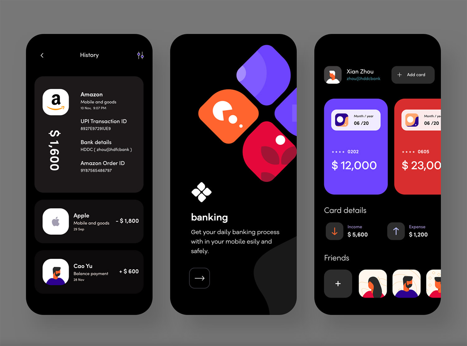
3. Banking App
Sudhan Gowtham’s Dribbble shot is amazingly creative. The intense hues stand out effectively without being too intrusive. The use of white on the transaction history over the black background makes it very effortless to follow.

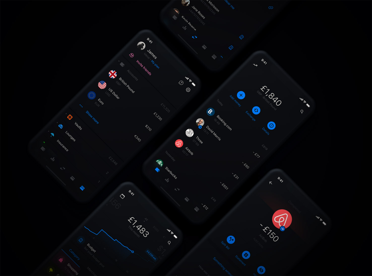
4. Revolut
Many of us use Revolut on our phones to monitor expenses, build budgets, and move money around. But in 2020, they made it even better by introducing a dark mode option, for a more fluid user experience.

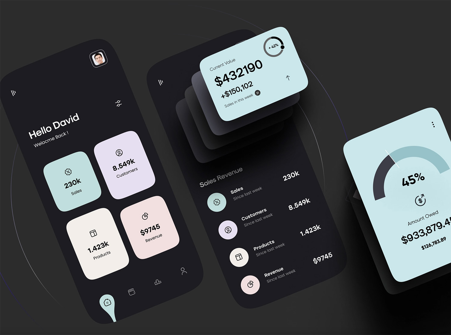
5. Finance Dark Mobile Design
If you’re a fan of simple, minimal UI design then you have to keep an eye on Ghulam Rasool’s work, one of the main designers from Cuberto’s team. His use of pastel colors, black lettering, and outlined icons is a combination that I’d call picture-perfect!

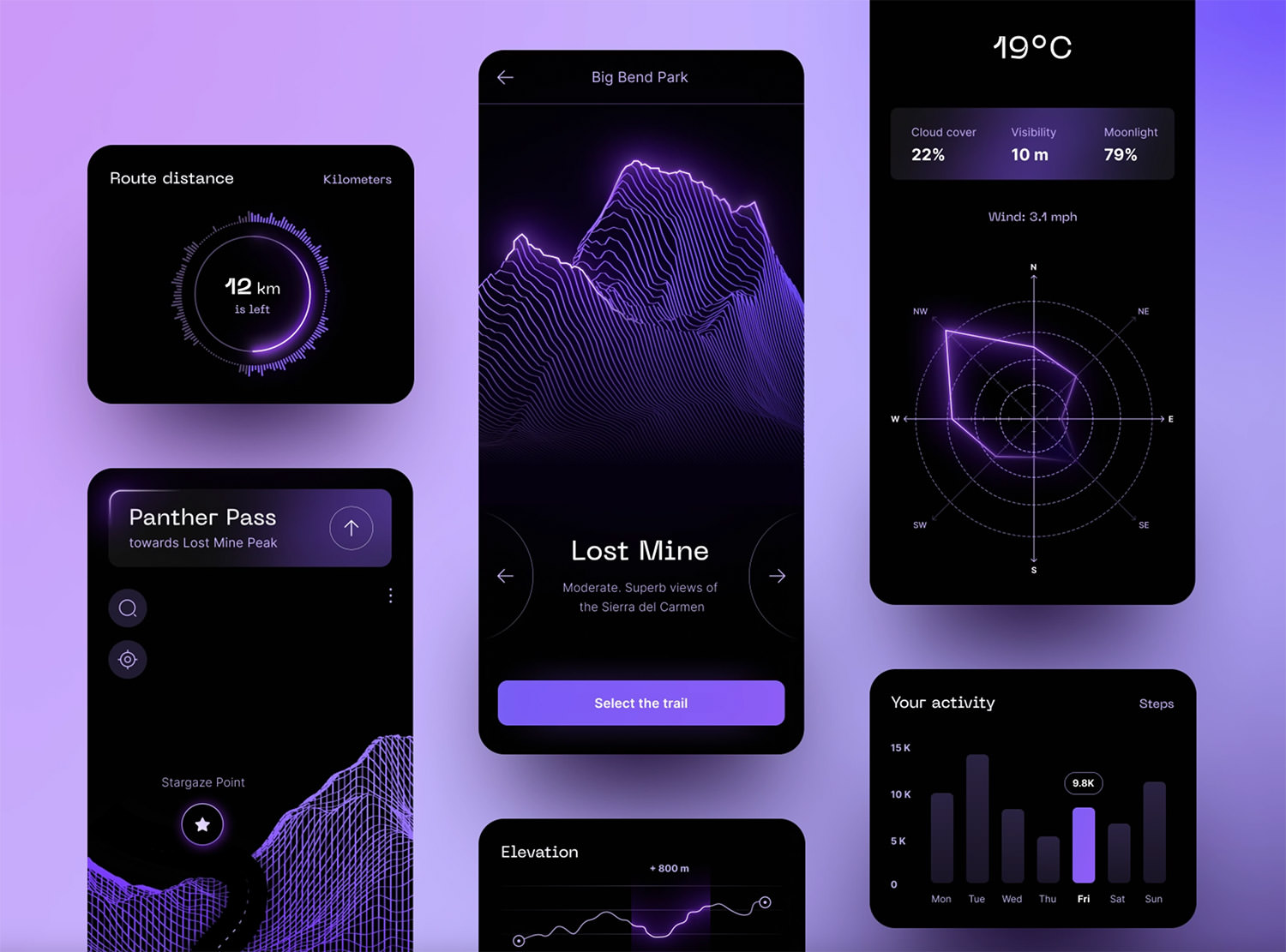
6. Night Hiking App
Katerina Krukova has done a remarkable job designing a dark mobile application that guides users through a route and measures their steps, altitude, and the weather.
Furthermore, it even locates ideal spots for star gazing. Truly, this is a remarkable user interface design.

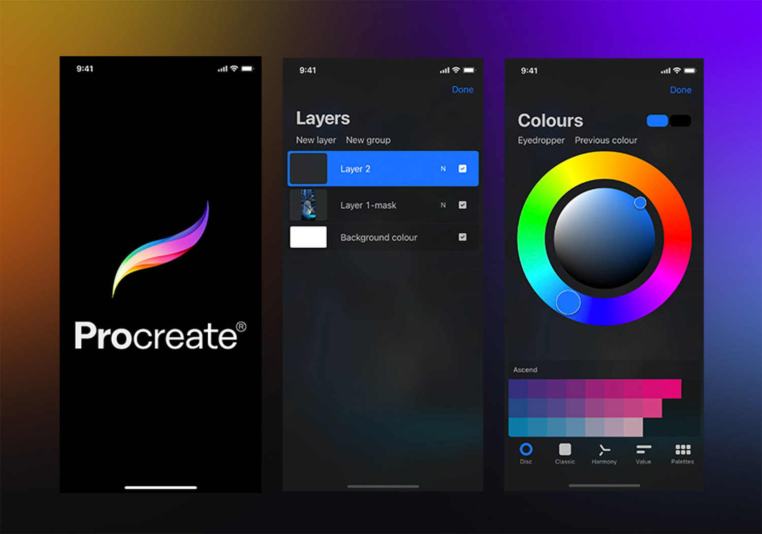
7. Procreate App
Who would have thought you could draw and paint digitally right on your phone? They say the most difficult task is creating something straightforward. Its pared-down design enables users to browse and produce stunning results quickly. Amazing user experience!

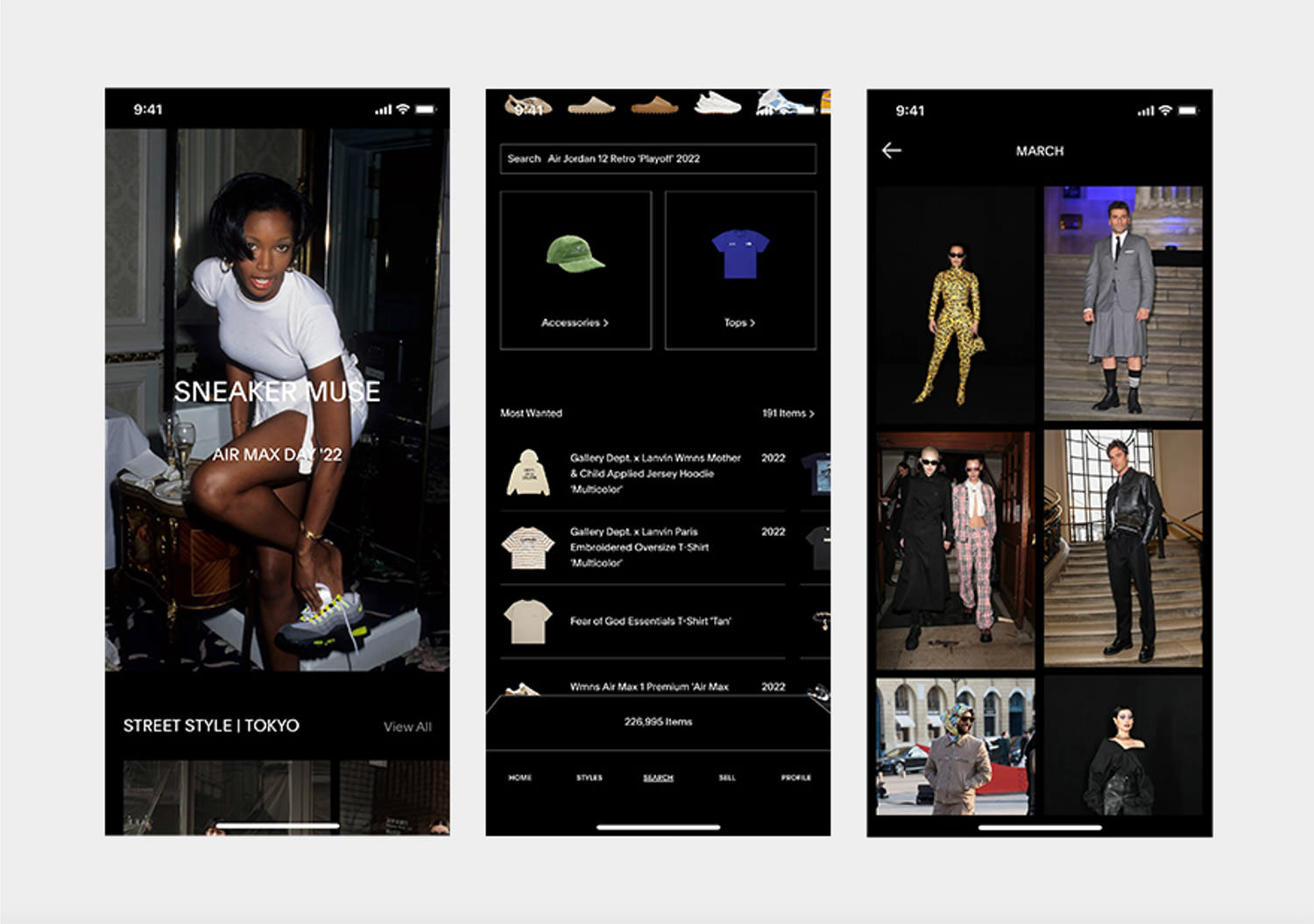
8. Goat Fashion Apparel
When designing a fashion app, the ideal formula is combining thin lines, tasteful typography, and powerful visuals. If you’re aiming for a minimalistic and dark aesthetic, Goat is the perfect source of inspiration.

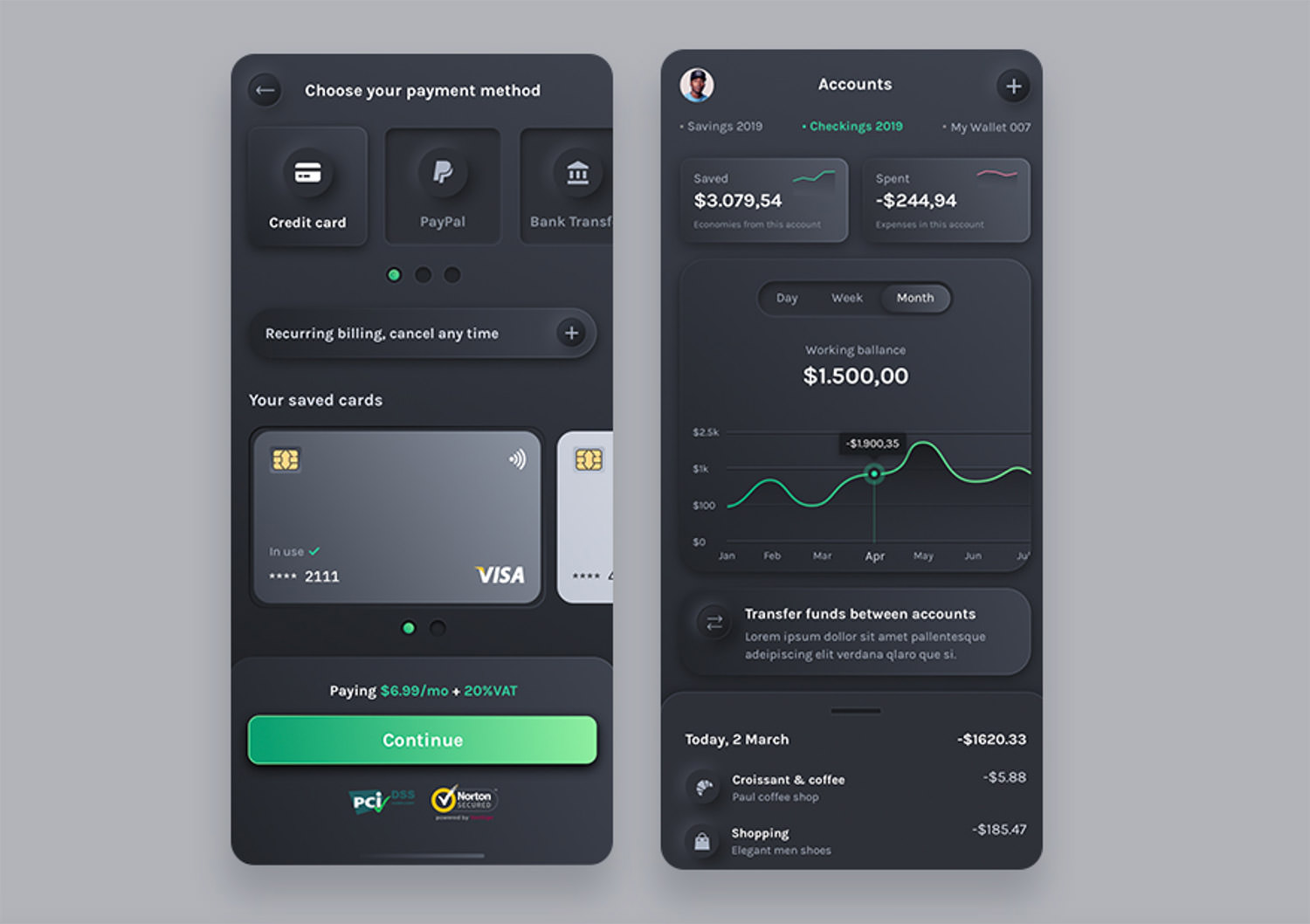
9. Dark Budget Planner
This is my personal piece, a wallet mobile ui kit that enables people to track their expenses in order to save money. The design style that I used is called neumorphism, which represents a soft interface with embossed shadows, in-depth effects, and strong accent hues.

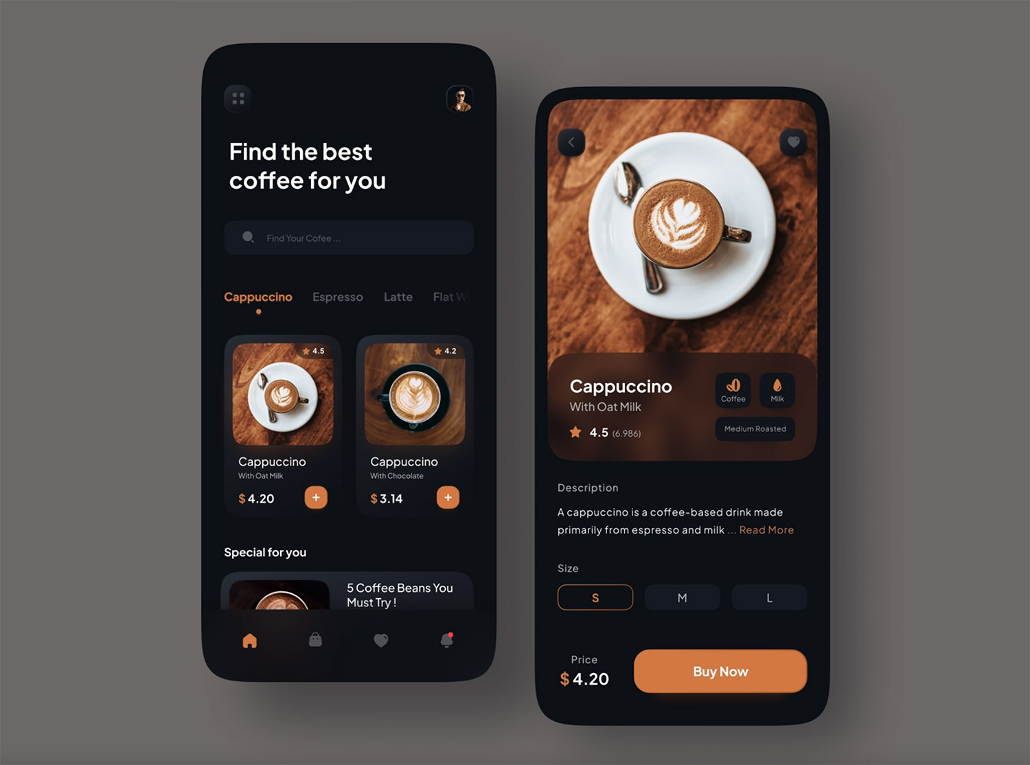
10. Coffee Mobile App
It’s not always easy to find excellent pictures like the ones featured in Adhiari Subekti’s coffee shot, but you should consider hiring a photographer. Also, if you’re looking to boost your e-commerce app’s conversion rate, orange is the way to go!

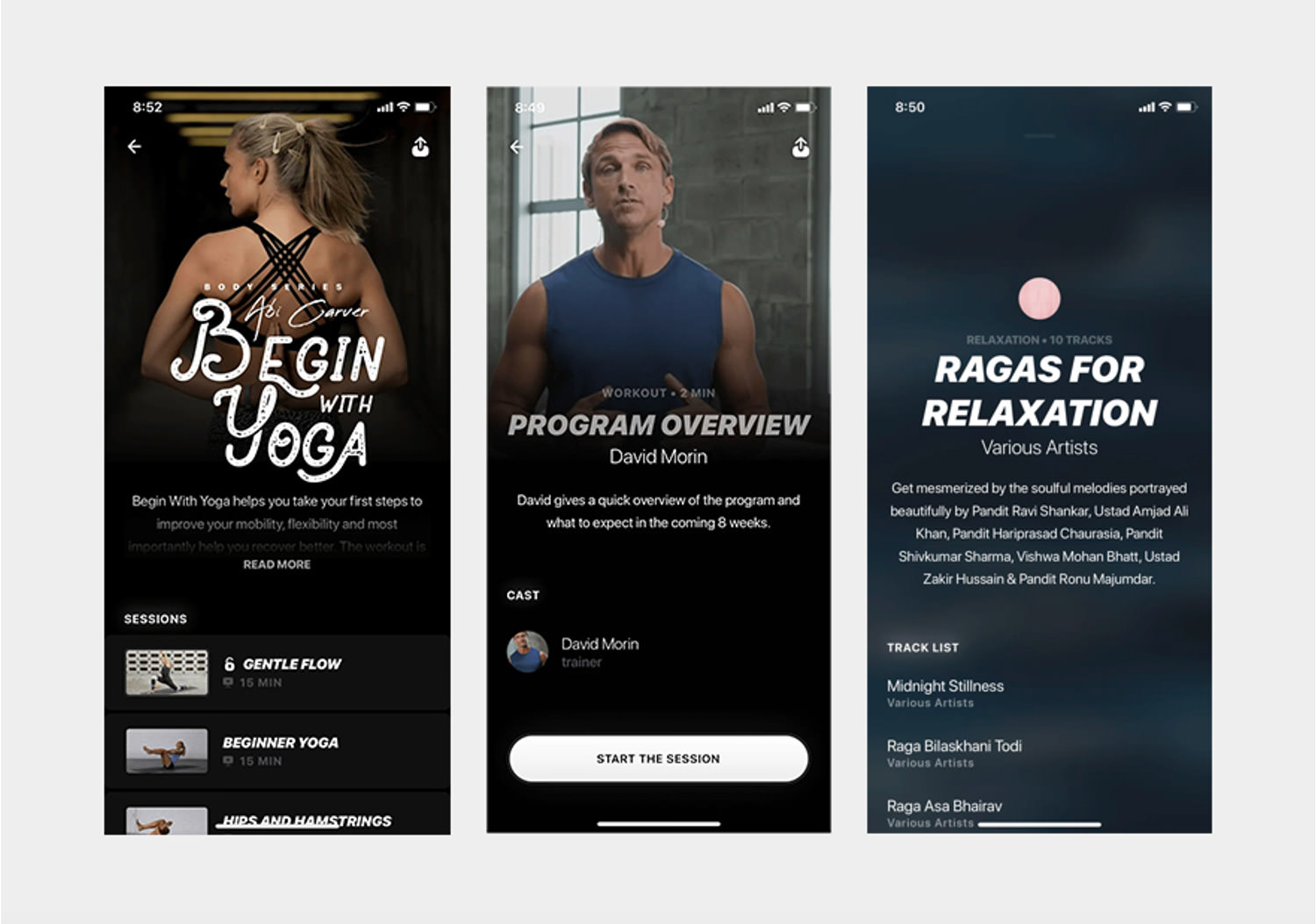
11. Ultrahuman Fitness UI
Not every aesthetic should be overly creative. You can achieve outstanding outputs with just a few things, like white buttons over dark backgrounds, bold italic typography, and minimalism.

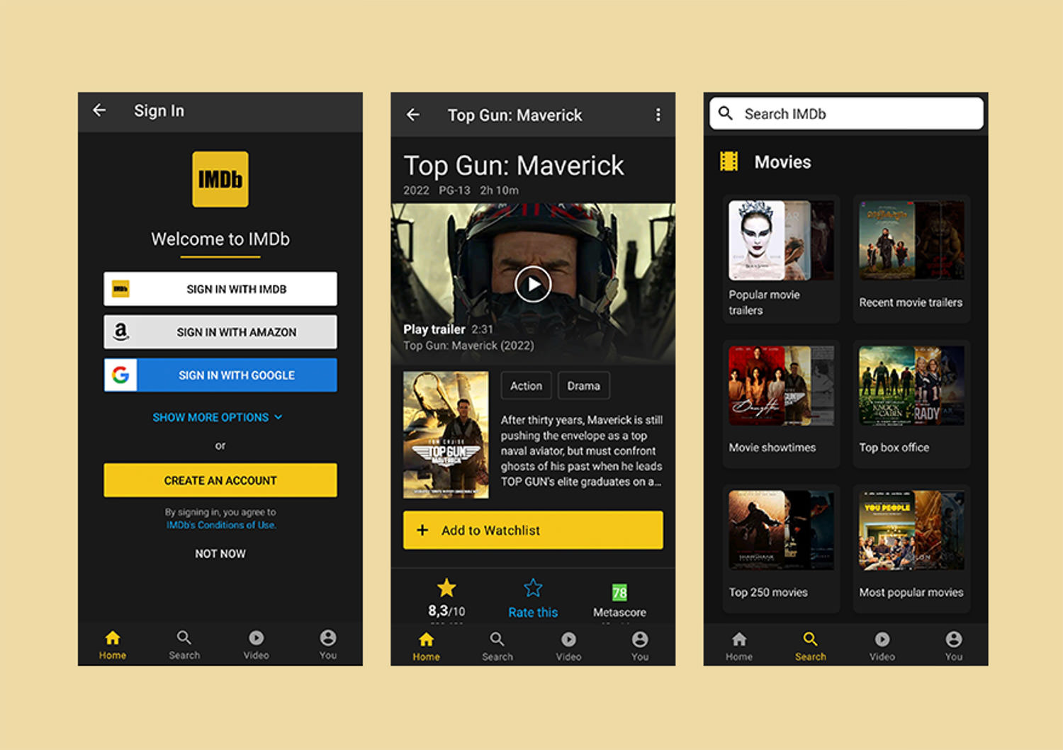
12. IMDB
Who would have guessed that yellow could be used to such great effect? The text aligned to the left, even on the button itself, gives it great readability, and even if there is a lot it doesn’t appear too cluttered.

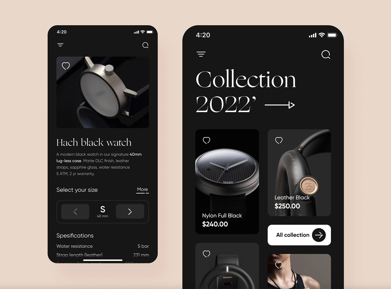
13. Watch Collection App
Taras Migulko really nailed it with the design of this dark Shopify theme – the interface is sophisticated, featuring the Gilroy typeface, and all the shapes have rounded edges.
Plus, the photography of the watches is simply amazing!

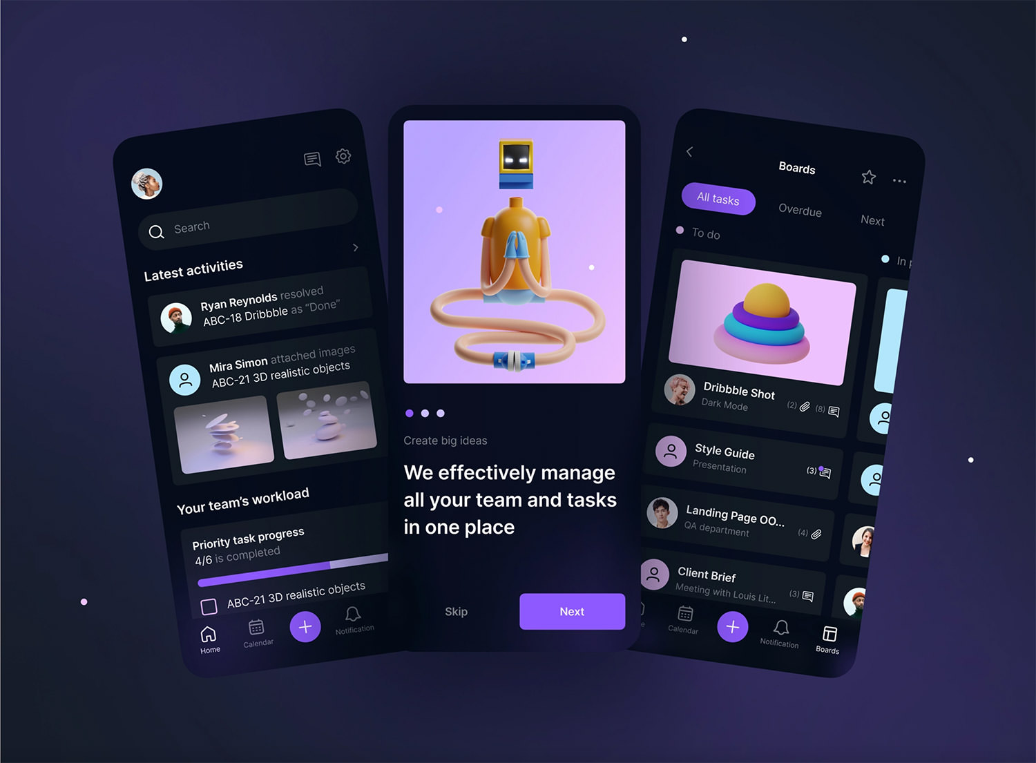
14. Task Manager Mobile Concept
This is proof that you can create something usable and attractive simultaneously. These custom-made illustrations are very suggestive and bring a lot of fun to this. Great work by Veronika Sadkova!

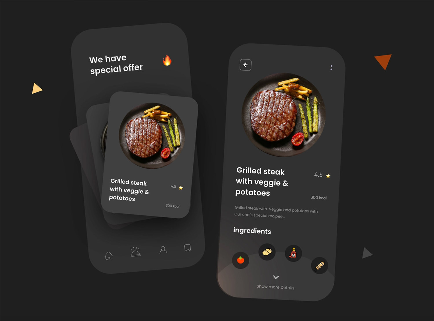
15. Food App Dark Theme
The shading inside the circle gives the impression of a physical plate that has space for each meal. Very creative, right? The components are arranged in a round shape, making the entire appearance truly remarkable. Good job Ghulam Rasool!

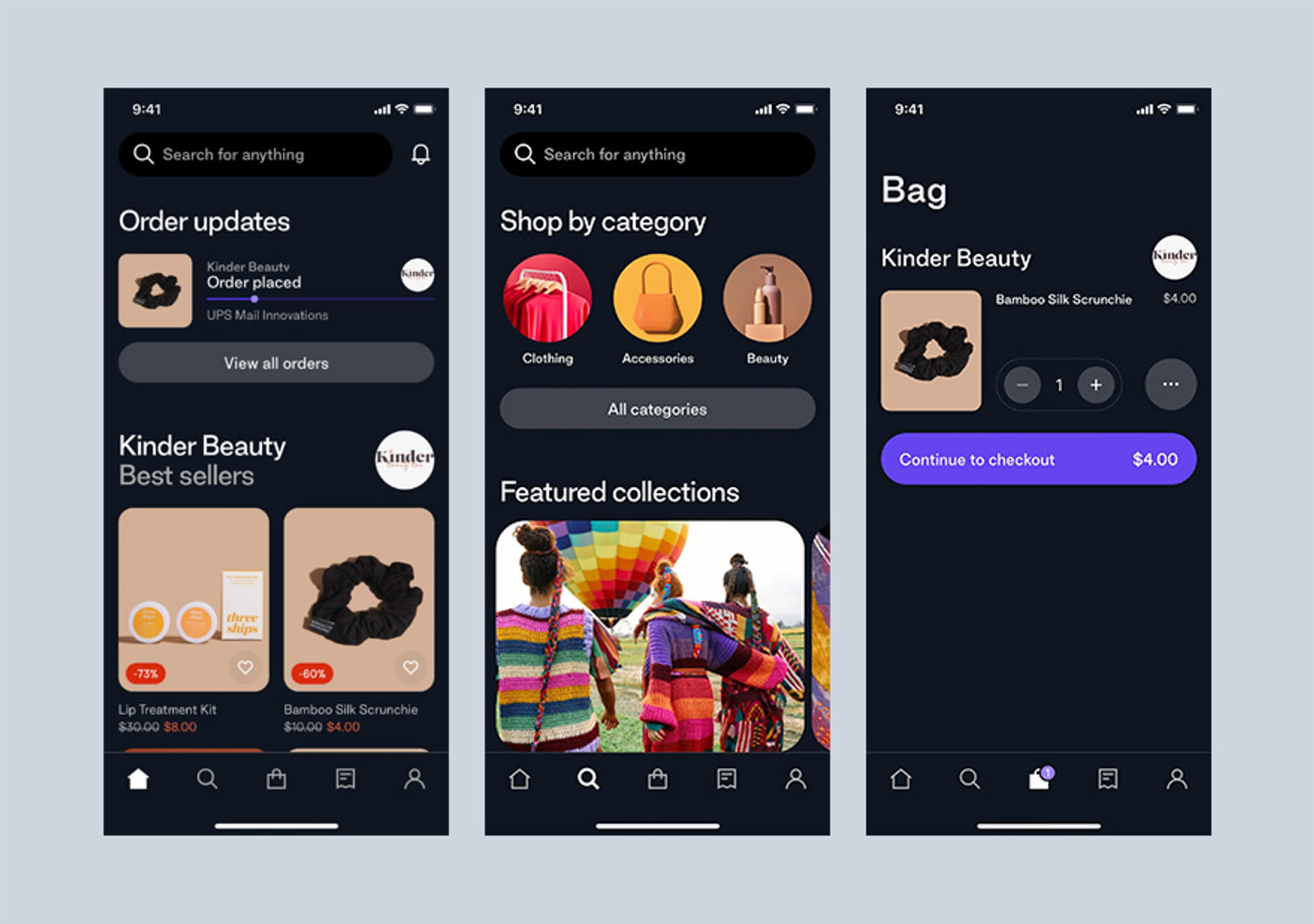
16. Shop App by iOS
The iOS eCommerce app is what I call a great user experience. Big headlines, rounded edges, and the price shown on the main call-to-action button guide the user toward the checkout experience so smoothly.

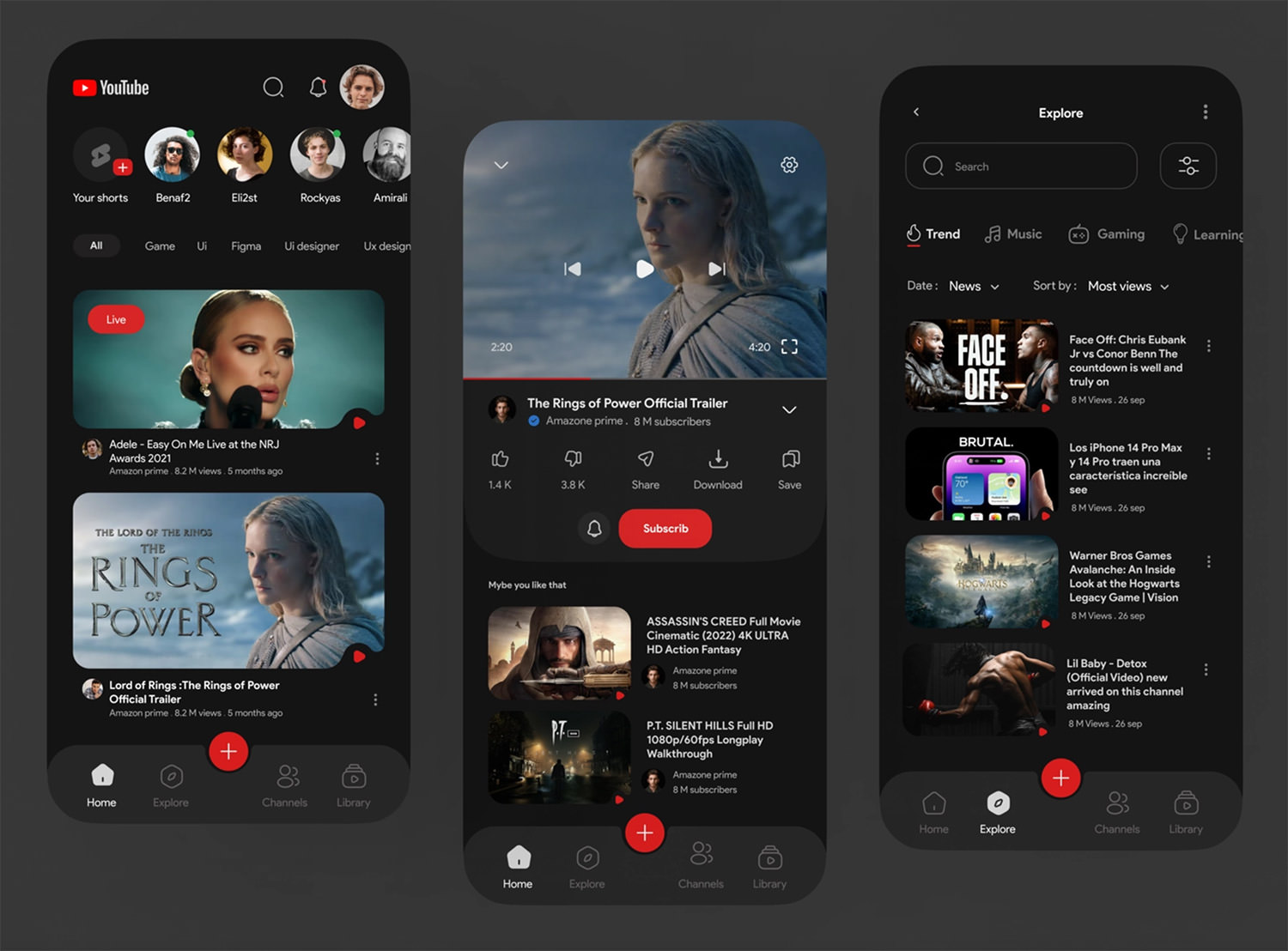
18. YouTube Redesign Concept
This concept is way more subtle and sophisticated than the original design. Soroush made an exceptional dark design, with subtle navigation, where the subscribe button is more emphasized.

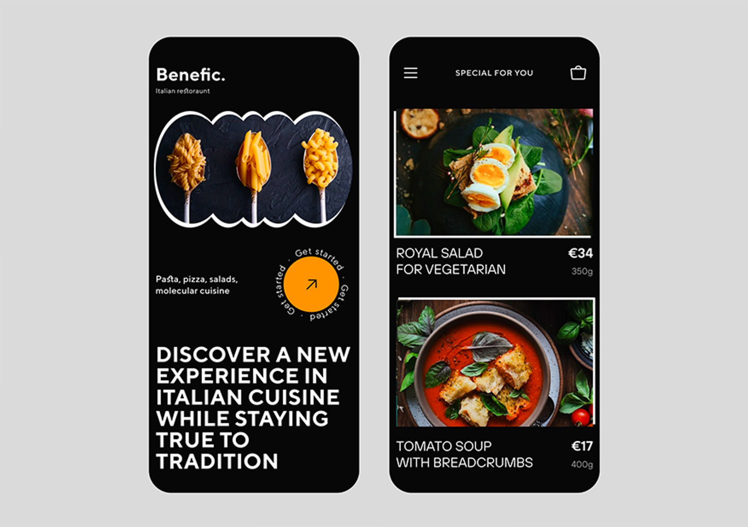
19. Food Order Mobile UI
The Purweb agency created a design that is both user-friendly and aesthetically pleasing, largely due to the legible typography. This design is highly functional and elegant.

20. Notes Mobile App
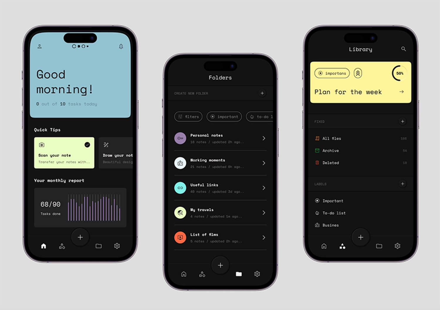
The personal notes app is made by Layo, a talented UI designer who dared to add bright and strong hues over a black background. The high contrast is amazing and the font brings a personal note to it.

21. Netflix
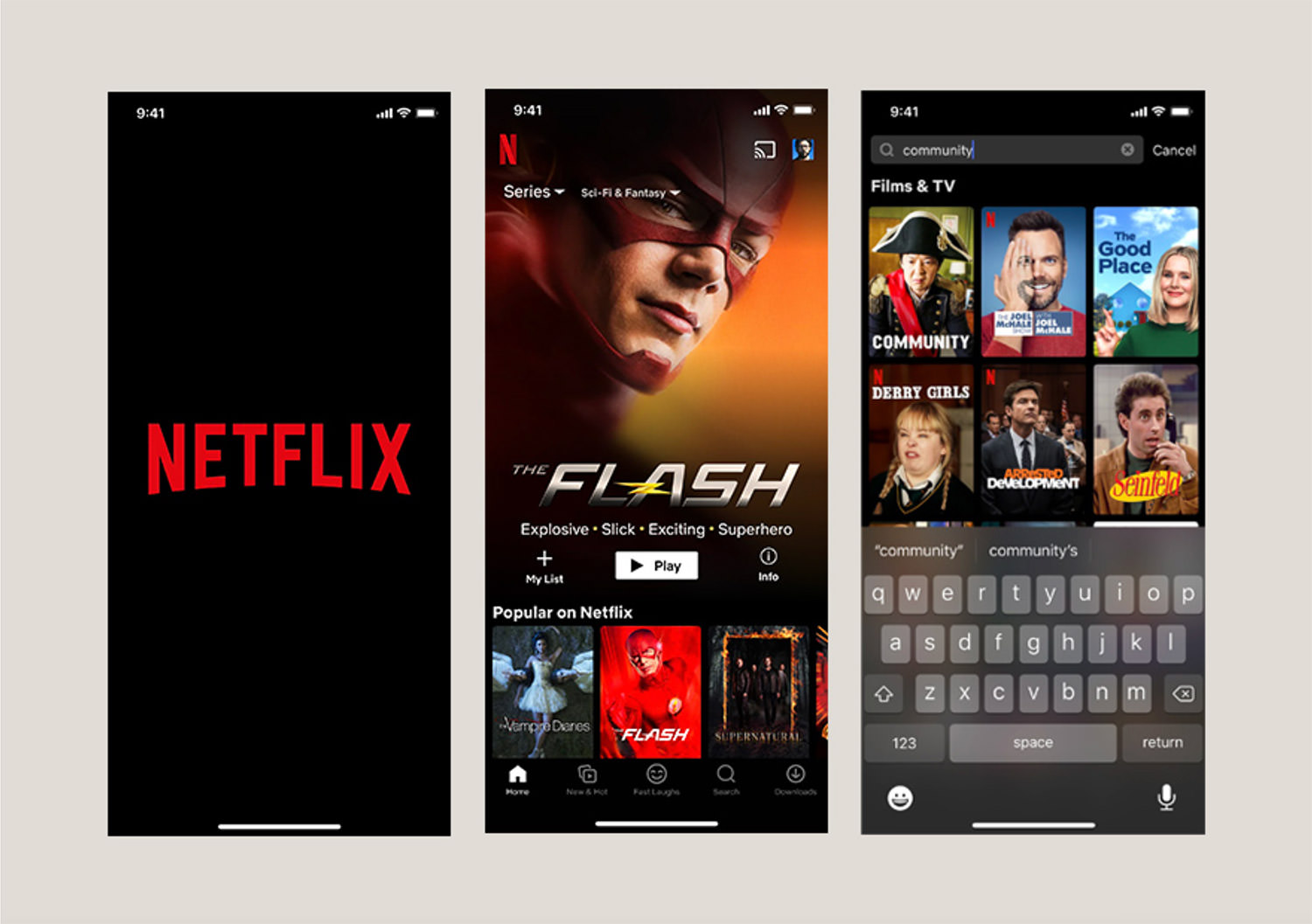
We all know and love Netflix, right? The streaming app has been using dark design since 2017 to give its users a visually stunning experience. It helps create a sense of intimacy and creates a more immersive experience by reducing distractions.

22. Fintech Mobile Dark
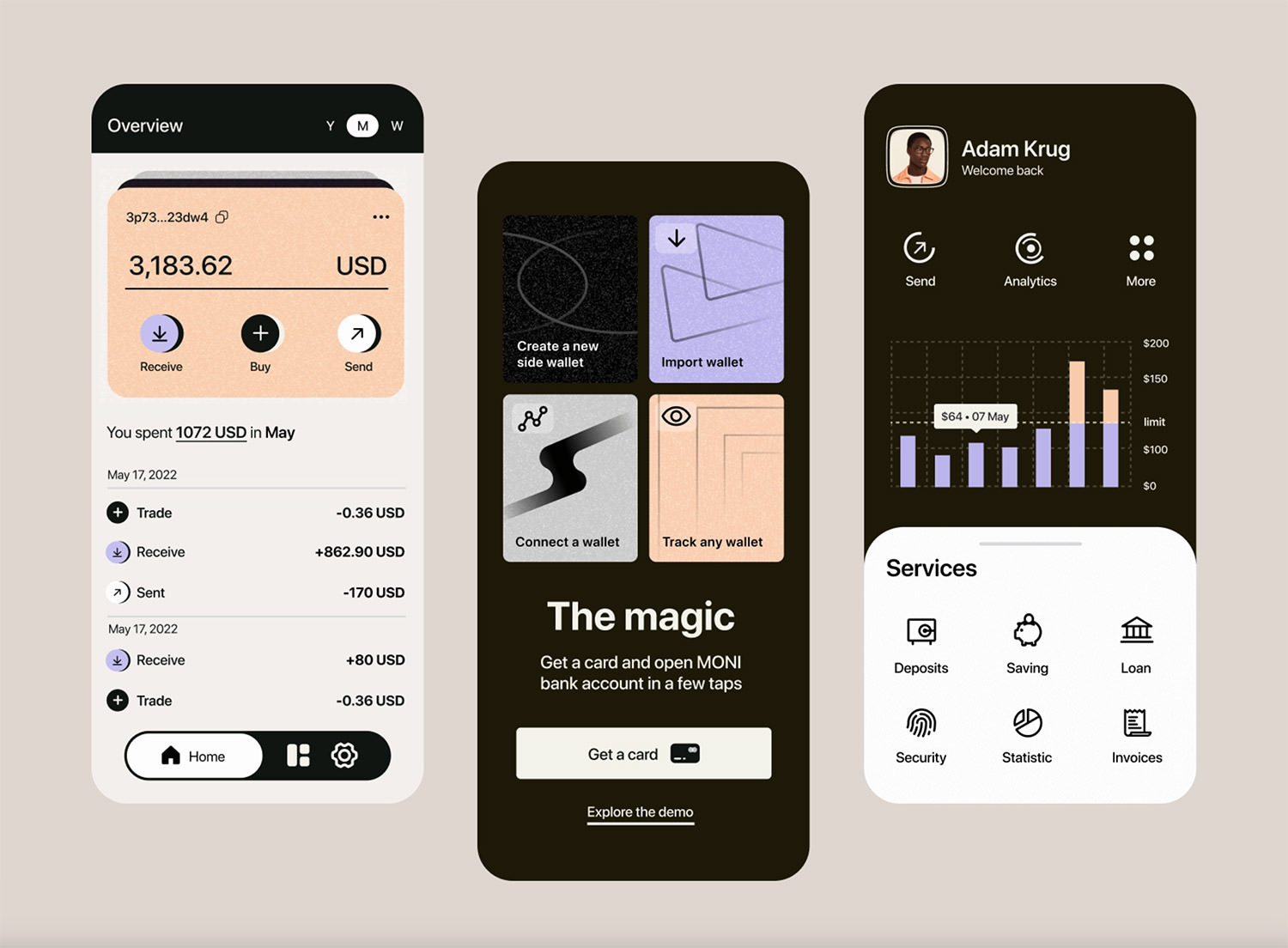
Last but not least, the final shot is a dark UI design made by Andrew Jr. This modern approach is what every designer should strive for in 2023. Simple and clever user experience with thin lines, round corners, and unique icons.

Bottom Line
That’s it guys. I hope you now feel inspired and ready to create a usable, dark-mode app design that your clients will adore. Keep in mind that one of the main advantages of a dark UI design is that is less likely to cause eye strain and fatigue when viewing large amounts of text or images.
If I am to give a piece of advice, it would be to make the process as easy and straightforward as possible and to try your hardest to give it a magical touch.
