--colors: red, blue, green, purple;
Even cooler is being able to change an index variable to select only the color we need from the array. I know this idea may sound impossible, but it is possible — with some limitations, of course, and we’ll get to those.Enough suspense. Let’s jump straight into the code!
An Array Of Two Colors
We will first start with a basic use case with two colors defined in a variable:
--colors: black, white;
For this one, I will rely on the new color-mix() function. MDN has a nice way of explaining how the function works:
The
color-mix()functional notation takes two <color> values and returns the result of mixing them in a given colorspace by a given amount.
The trick is not to use color-mix() for its designed purpose — mixing colors — but to use it instead to return one of the two colors in its argument list.
:root { --colors: black, white; /* define an array of color values */ --i: 0; --_color: color-mix(in hsl, var(--colors) calc(var(--i) * 100%));
} body { color: var(--_color);
}
So far, all we’ve done is assign the array of colors to a --colors variable, then update the index, --i, to select the colors. The index starts from 0, so it’s either 0 or 1, kind of like a Boolean check. The code may look a bit complex, but it becomes clear if we replace the variables with their values. For example, when i=0:
--_color: color-mix(in hsl, black, white 0%);
This results in black because the amount of white is 0%. We mixed 100% black with 0% white to get solid black. When i=1:
--_color: color-mix(in hsl, black, white 100%);
I bet you already know what happens. The result is solid white because the amount of white is 100% while black is 0%.Think about it: We just created a color switch between two colors using a simple CSS trick. This sort of technique can be helpful if, say, you want to add a dark mode to your site’s design. You define both colors inside the same variable.
See the Pen [A color switch using color-mix()](https://codepen.io/t_afif/pen/XWPGWPp) by Temani Afif.
In that demo, I only update one variable, --i, to switch between dark and light modes.If you are wondering what the hsl in the color-mix() function is doing, it’s the method used to mix the two colors. In our case, it serves no purpose since we are not actually mixing colors. So, you can use any method here, whether sRGB, HSL, OKLCH, OKLAB, or whatever you would like. Whatever it is, don’t forget it because it is a required value in color-mix().

An Array Of N Colors
Let’s move to the exciting part. I’ll create a multi-value array of colors and variables for it:
--colors: red, blue, green, purple; /* color array */
--n: 4; /* length of the array */
--i: 0; /* index of the color [0 to N-1] */
Notice the variable, --n, which is new. I’m using it to define the number of colors in the array, i.e., its length. The index variable is largely the same as before, but it can go up to N-1 to select the needed color.I’m going to change things up for you and create a linear gradient background instead of using color-mix(). Anyone who knows me well is totally not surprised by this as I reach for gradients all the time.
background-image: linear-gradient(var(--colors));
Here’s the gradient that renders. Nothing complex so far.
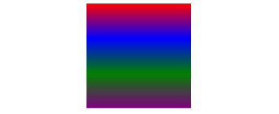
linear-gradient. (Large preview)The trick is manipulating the gradient to extract the colors based on the index. By definition, a gradient transitions between colors, but we have at least a few pixels of the actual colors defined in the array while we have a mixture or blend of colors in between them. At the very top, we can find red. At the very bottom, we can find purple. And so on.What if we increase the size of the gradient to something really big?
See the Pen [Increasing gradient size](https://codepen.io/t_afif/pen/bGQqWyw) by Temani Afif.
Did you see that? By increasing the height of the gradient, it’s like we are zooming into the red color. We only see the red portion while the rest of the gradient is clipped out.What if we increase the gradient by a factor of infinity? Yes, we can do that in CSS!
background-image: linear-gradient(var(--colors));
background-size: 100% calc(1px * infinity);
See the Pen [Infinity gradient size](https://codepen.io/t_afif/pen/NWEpjQd) by Temani Afif.
Now the box is solid red! In other words, we’ve selected red from the gradient of colors that are defined in the --colors array. If we want to change color, we adjust the position of the gradient.By default, the gradient is located at the top-left edge of the element, 0 0. That’s why we only see the top color, red. Now we can use the index variable, --i, to adjust the gradient’s position and get whatever color we want from the array.
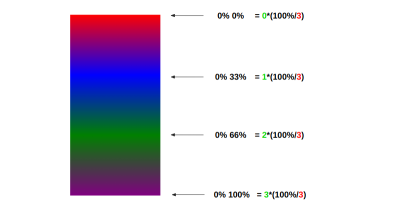
background-position: 0 calc(var(--i) * 100% / (var(--n) - 1));
Here’s the complete code:
.box { --colors: red, blue, green, purple; /* color array */ --n: 4; /* length of the array */ --i: 0; /* index of the color [0 to N-1] */ background: linear-gradient(var(--colors)) no-repeat 0 calc(var(--i)*100%/(var(--n) - 1)) /* position */ /100% calc(1px*infinity); /* size */
}
Note: I used no-repeat in the background property. That keyword should be unnecessary, but for some reason, it’s not working without it. It might be that browsers cannot repeat gradients that have an infinite size.The following demo illustrates the trick:
See the Pen [Colors array using only CSS](https://codepen.io/t_afif/pen/KKrNYyp) by Temani Afif.
Cool, right? We implemented an array of colors in CSS! And the code is not that complex. A simple background trick and a few variables are all we needed to make it happen.
Let’s Improve Indexing
Let’s push the limit a little and improve our work. In the previous example, the index, --i, is limited to the range [0 N-1], which makes sense. Any value outside that range will result in no color. What if we remove this restriction and allow the index to take any value?Check this out:
See the Pen [Colors array using only CSS II](https://codepen.io/t_afif/pen/QWJpyGY) by Temani Afif.
Go ahead and play with the demo. You can specify any integer — even a negative one — and the browser will perform a modulo operation that converts the value in the [0 N-1] range. For example, 21 mod 4 = 1, resulting in the second color value in the array; -5 mod 4 = 3, which produces the fourth color value in the array.In reality, the browser is not doing any mod operation, but I use a different implementation using a conical gradient that simulates a modulo operation:
background: conic-gradient( from calc((var(--i) + 1) * -1turn / var(--n)), var(--colors) 0,var(--colors)) top/calc(1px * infinity) calc(1px * infinity) no-repeat;
First, we define the conic gradient with the colors from the array:
background: conic-gradient(var(--colors) 0,var(--colors))
Note that the variable is used twice. I did that to ensure the first color is the same as the last one so there is continuity in the coloration.That code basically boils down to this conical gradient background:
background: conic-gradient(red, blue, green, purple 0, red, blue, green, purple)
By adding 0 to the last color (purple) and leaving everything else as-is, it’s like those other colors before purple don’t exist. That means the gradient is equivalent to this:
background: conic-gradient(purple 0, red, blue, green, purple)
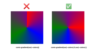
After that, we can make our gradient very big by, once again, multiplying it by infinity. This time, infinity calculates the gradient’s width and height.
background-size: calc(1px * infinity) calc(1px * infinity);
We place the gradient at the top to zoom in on the top color:
background-position: top;
Then we rotate the gradient to select the color we want:
from calc((var(--i) + 1) * -1turn / var(--n))
It’s like having a color wheel where we only display a few pixels from the top.
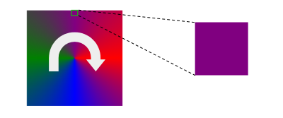
Since what we have is essentially a color wheel, we can turn it as many times as we want in any direction and always get a color. This trick allows us to use any value we want for the index! After a full rotation, we get back to the same color.
See the Pen [Colors array using only CSS II](https://codepen.io/t_afif/pen/QWJpyGY) by Temani Afif.
Note that CSS does have a mod() function. So, instead of the conical gradient implementation, we can also update the first method that uses the linear gradient like this:
.box { --colors: red, blue, green, purple; /* color array */ --n: 4; /* array length */ --i: 0; /* index */ --_i: mod(var(--i), var(--n)); /* the used index */ background: linear-gradient(var(--colors)) no-repeat 0 calc(var(--_i) * 100% / (var(--n) - 1)) /* position */ / 100% calc(1px * infinity); /* size */
}
I didn’t test the above code because support for mod() is still low for such a function. That said, you can keep this idea somewhere, as it might be helpful in the future and is probably more intuitive than the conic gradient approach.
What Are The limitations?
First, I consider this approach more of a hack than a CSS feature. So, use it cautiously. I’m not totally sure if there are implications to multiplying things by infinity. Forcing the browser to use a huge gradient can probably lead to a performance lag or, worse, accessibility issues. If you spot something, please share them in the comments so I can adjust this accordingly.Another limitation is that this can only be used with the background property. We could overcome this with other tricks, like using background-clip: text to manipulate text color. But since this uses gradients, which are only supported by specific properties, usage is limited.The two-color method is safe since it doesn’t rely on any hack. I don’t see any drawbacks to using it on real projects.
Wrapping Up
I hope you enjoyed this little CSS experimentation. We went from a simple two-color switch to an array of colors without adding much code. Now if someone tells you that CSS isn’t a programming language, you can tell them, “Hey, we have arrays!”Now it’s your turn. Please show me what you will build using this trick. I will be waiting to see what you make, so share below!

(gg, yk)


