In this two-part series of articles, Hannah Milan covers the best practices when using various accessible text over images techniques for designing your web and mobile app content. These practices can help you to make the text over images more accessible while retaining an aesthetically pleasing look. Get ready to deep-dive through the subtle changes in your design, such as the text’s position, size, and background style, and explore the importance of using real text for accessibility purposes, as opposed to using images of text.What is the text over images design pattern? How do we apply this pattern to our designs without sacrificing legibility and readability?The text over images design pattern is a design technique used to place text on top of images. It is often used to provide information about the image or to serve as the main website navigation. However, this technique can quickly sacrifice legibility and readability if there is not enough contrast between the text and the image. To prevent this, designers need to ensure that the text and the image have a high enough contrast ratio to be legible and readable. Additionally, designers should also make sure the text is positioned in the right place, away from any image elements that might cause confusion, distraction, or make it difficult to read.

“Because images play such an important role, often designers end up placing text over an image to leverage the attention-grabbing aspect of the photo while providing text-based content to communicate actual information. However, these endeavors commonly backfire, usually when the contrast between the text and the background is too low.”— Aurora Harley, “Ensure High Contrast for Text Over Images” (NN/g Nielsen Group)

Before going forward, here are some useful resources (on how you can apply these techniques in practice with HTML/CSS) that are worth checking out:

How To Design A Text Over An Image

Admittedly, when I was starting my design career, and I had very little accessibility knowledge, one of the main things I used in my designs was the text over images design pattern, without me knowing that I was hurting my users who have low vision.

“A picture says a thousand words. But sometimes, images alone won’t work. This is why typography still proves to be a vital aspect of design despite the focus on more visual content. Remember that the need for visual content does not tell you to stop adding text to your designs — it simply reminds you to do so in the most tasteful and stylish way possible. And, of course, readability should not be sacrificed in the name of design. You can’t add text that people can barely understand, then argue that it’s a piece of art. Sending a message that cannot be deciphered defies the purpose of what you’re doing.”— Igor Ovsyannykov, “10 Typography Tricks to Make Your Text Much More Readable”

Yet accessibility is a key aspect of design, and working with typography is one of the cornerstones of UX design. There are many typography principles that will help you create user-friendly designs. In the following sections of the article, you will learn more about how you can improve your design without sacrificing the accessibility aspect and how to combine text and images better.

According to WCAG Success Criterion 1.4.3, make sure that your text on images should meet the minimum contrast of

  • 3:1 for large text (text bigger than 18 pt normal, or text bigger than 14 pt bold);
  • 4.5:1 for body text (text lower than 18 pt normal, or text lower than 14 pt bold).

Ensure that a minimum visual contrast ratio of 4.5:1 is maintained between the text and its background. This minimum contrast ratio should also be maintained in the case of images of text.— “Understanding Success Criterion 1.4.3: Contrast (Minimum),” W3.org

Feature Panel

Using An Overlay Technique Over The Entire Image

Overlays are colored layers such as overlay light, overlay dark, dark gradients, or colored overlays. As a general rule, overlays are used to make images stand out less or to act as a background for the text so that it has better readability and contrast.
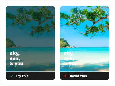
Try This and Avoid This for Accessible Text Over Images design techniques, with the left side showing an example of what to try such as using a dark overlay over a photo and white text on top, and the right side showing an example of what to avoid (white text directly over a photo). The text displayed over the image reads ‘sky, sea, & you.’
Overlays are used to make images stand out less or to act as a background for the text. In the example on the left, the contrast is much better, while in the example on the right, the text is barely readable. (Image credit: Photo by dharmendra sahu on Unsplash) (Large preview)

Examples From The Wild

Strong.app landing webpage with a headline saying ‘Think less. Lift more.’ and with the subheading ‘Strong is the simplest, most intuitive workout tracking experience. Trusted over by 3 million users worldwide.’ At the bottom are the Download on the App Store logo and Get it on Google Play logo
Strong.app uses a linear colored overlay gradient to increase the contrast ratio between the image and the headlines. (Large preview)
Hero image of Huston Engineering with text saying ‘MEP ENGINEERING FIRM. YOUR SYSTEMS. OUR REPUTATION.’ over a red background overlay
Hero image of the Huston Engineering that uses a full colored overlay to better highlight the text. (Large preview)
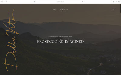
A screenshot of the Della Vite website. White letters ‘PROSECCO RE-IMAGINED’ in the center, on a dark background
The Della Vite website uses a very dark overlay over a photo, with white colored text with plenty of contrast. (Large preview)

Text With Scrim Overlay

The scrim design technique uses a semi-transparent, lightweight, and semi-opaque gradient layer that helps text appear more readable against various backgrounds.According to Google Material Design, “Scrims are temporary treatments that can be applied to Material surfaces for the purpose of making content on a surface less prominent.” They help direct user attention to other parts of the screen, away from the surface receiving a scrim.

Scrims can be applied in a variety of ways, including the following:

  • Darkening or lightening the surface and its content.
  • Reducing the opacity of the surface and its content.

Multiple surfaces on a screen at a time can display scrims. Scrims can appear at any elevation, whether in the foreground or background.— Google Material Design

Furthermore, you can explore this technique by using different colors besides black or white colored layers.
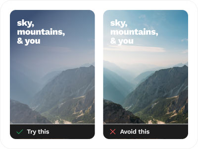
Try This and Avoid This for Accessible Text Over Images design techniques. The left side contains an example of what to try to make accessible text over images, such as using a scrim design technique that uses a semi-transparent or semi-opaque gradient. The right side shows an example of what to avoid. The text displayed over the image reads ‘sky, mountains, & you’ and is positioned in both examples at the top left corner
The left side shows a scrim design technique with a semi-transparent gradient. The text in this example has much better contrast than the one on the right. (Image credit: Photo by Ales Krivec on Unsplash) (Large preview)

Examples From The Wild

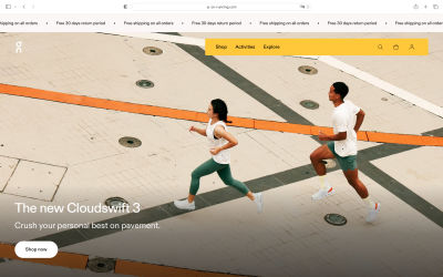
On-running landing hero page. The hero image is a man and a woman running together using on-running shoes. The text is saying ‘The new Cloudswift 3’, and there’s a sub-heading that says ‘Crush your personal best on the pavement’ along with a call-to-action button ‘Shop now’ in black text on a white background
On-running’s homepage with a hero image that uses a scrim overlay effect to highlight the text over the image. (Large preview)
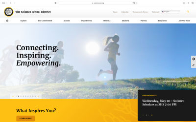
Screenshot of the Solanco School District website that uses the scrim overlay effect on their hero image to improve the readability and legibility of the headline that says ‘Connecting. Inspiring. Empowering.’
Clever way of using scrim overlay as you can see on the Solanco School District website: it uses a subtle overlay from left to right. (Large preview)
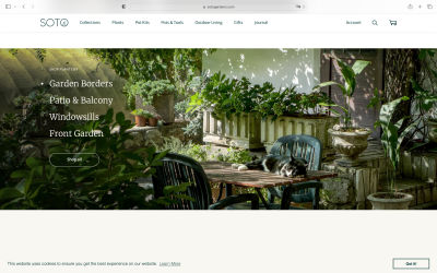
 Soto Gardens website’s header image uses a scrim overlay technique to make the navigation more readable
Another example of scrim overlay is Soto Gardens website. (Large preview)
  • Scrim That Figma Plugin
    Quickly add a scrim over a selected layer in Figma Design with the Scrim That plugin with just one click.

Strips/Highlight Technique

The strips/highlight is one of the simplest design techniques that you can apply to your design. Add a semi-transparent black (or dark-colored) rectangle strip over the image along with your text, or you can be bolder and use different colors instead. But always make sure that the colors you selected for the fonts and the graphic elements have a lot of contrast against the background!
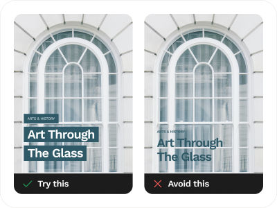
Try This and Avoid This for Accessible Text Over Images design techniques, with the left side containing an example of what to try such as using a strips/highlight: simply add a solid or semi-transparent rectangle strip over the image along with the text, and the right side showing an example of what to avoid. The text reads ‘Arts & History’ in the first strip and ‘Art Through The Glass’ in the second strip
On the left is the strips/highlight technique: just add a solid-color or semi-transparent rectangle strip over an image along with the text on top of it, and there will always be plenty of contrast. (Image credit: Photo by Imani Bahati on Unsplash) (Large preview)

Examples From The Wild

Mode’s website uses the strip technique to cleverly embed their main headline along with the originally shaped strip. The screenshot shows a dark green background, with the dark text ‘Business Intelligence built around data teams’ on top of a light green strip, with plenty of contrast between the strip background color and the text color
The Mode website uses the strip technique very cleverly along with their main headline. (Large preview)
A screenshot of Cantos website that uses a strip overlay technique over the images and video reels
The Cantos website uses a gradient strip technique over the image and the video reels, to better highlight the text of the description of the hero image and of the video reels. (Large preview)
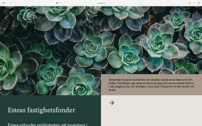
A screenshot of Estea website that uses the strip design technique over images to improve their product descriptions
Another example of clever use of the strip technique that not only works for headings and tiles but also for long descriptions and paragraphs as you can see here on the Estea website. (Large preview)
  • Google Material Design — Legibility Standards
    All text should be legible and meet accessibility standards. The Web Content Accessibility Guidelines (WCAG 2.0) level AA requires a 4.5:1 color contrast between text and background for normal text and 3:1 for large text. To learn more about color, contrast, and accessibility design, read this chapter on Material Design Accessibility.
  • “Accessible Text on Images: Nail the Contrast Ratio”, Rodney Lab
    Creating accessible text on images on a website page is not easy. First, there are all the usual accessibility concerns when adding an image to your site. For example, you need to make sure the image has an alt text which describes the image well for partially sighted visitors. But then, you also need to remember to leave the alt text empty if the image is included for decorative purposes only. Next, as with any other text on your site, you need to make sure that the contrast level between the text color and the background color is high enough. And there’s more! This article dives into all these little details.
  • Web Accessibility Guidelines v1.0 (Carnegie Museums of Pittsburgh)
    Find colors that provide maximum contrast, including enough contrast between content and the background, so that text and non-decorative images are legible for anyone with low vision or color deficiencies. Best practices include: taking care of the 4.5:1 (3:1) ratio, (not) using only color as an indicator, and taking into account color blindness.

Find And Use That Space (Copy Space)

Yes, use that space to position your text, but first, make sure the space is passing the minimum contrast ratio. Space provides the perfect location for your text, especially when you balance and harmonize all the elements between the image and text.Copy space is an area of an image that is less busy and usually has enough contrast to give you space to write or put your text on.
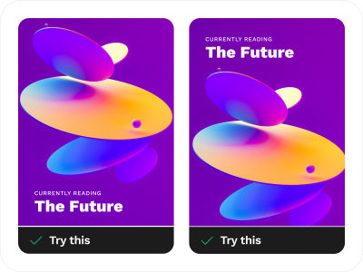
Try This for Accessible Text Over Images design technique examples of what to try such as positioning of the text over the empty space of the image. The text reads ‘Currently Reading’ and ‘The Future.’
Copy space design technique where the text is positioned in an empty space of the image. (Image credit: Photo by Milad Fakurian on Unsplash) (Large preview)

Examples From The Wild

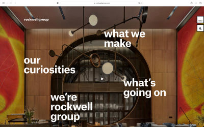
A screenshot of the Rockwell Group website header image that uses the Copy Space design technique to place the text
The Rockwell Group website uses the Copy space design technique where texts are carefully laid out over the empty and passable contrast ratio over text. (Large preview)
A screenshot of Green IT solution website hero image that uses the Copy Space design technique over the image. Their headline is positioned front and center, surrounding other supporting illustration elements such as keyboards, laptop fan, and various other IT devices
The Green IT Solution website position their headline text in front and center so that it is clear and easy to read. (Large preview)
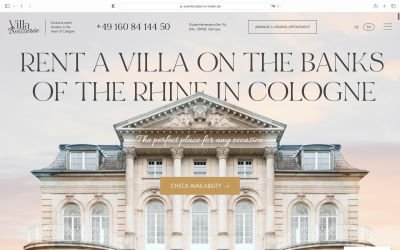
Villa Boisserée website uses the top empty space of the hero image to position their headline that reads ‘Rent a villa on the banks of the Rhine in Cologne.’
The text headline placement of Villa Boisserée placed over the image that makes the website aesthetically elegant. (And there’s also the little detail where the photo of the house slightly overlaps the letters in the title.) (Large preview)
  • “Using Space to Create a Simple and Effective Design,” Carrie Cousins
    Sometimes the most effective design technique involves nothing at all, and it is quite intentional. Space can be one of the greatest tools in your design kit. It can make text easier to read, bring focus to certain parts of the design and help create an overall mood or feel. In this article, you will see some great uses of space and how they contribute to both simple and effective design schemes for different websites.
  • “The Secret to Commercial Photography: Copy Space,” Great Escape Publishing
    Commercial photography is everywhere in our lives. Every time you drive down the highway with its rows of billboards, leaf through the glossy pages of a magazine, or visit a website with banner advertisements, you see commercial stock photography. This article explains one very important concept that helps photos sell: copy space. Copy space is an area of an image that is less busy, which means an advertiser can add text without obscuring critical parts of the photograph and choosing a stock photo becomes more manageable when the photographer has copy space in mind from the get-go.

Text Over Blurred Background Effect Of The Entire Image

Blurring an image with a variety of blurred background styles, such as blurring the entire image, or adding a blur effect to highlight only the main subject, can bring focus into your text layered on top of the image, tone down the “busy” feeling of the image, and also add more dimension and depth to the visuals.The blurred background design technique is widely used for hero headers when combined with a bold, impactful typeface.
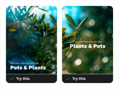
Try This and Avoid This for Accessible Text Over Images design techniques with Try This examples that use an entire image as a blurred image/background effect. On the left side, the texts are positioned at the bottom, and on the right side, the texts are positioned in the middle: ‘Explore our collection’ and ‘Pots & Plants.’
Try This example of how to use a blurred background effect on the entire image to make your text more readable and legible. (Image credit: Photo by Tyler Casey on Unsplash) (Large preview)

Examples From The Wild

A screenshot of the HLK agency’s website, which shows the blurred image design technique. The website’s headline is in the middle, over the blurred image. It reads, ‘Sometimes the best way to add value is to subtract.’
When you have a busy image with a non-passable empty space for your text, you can blur the entire image and position your text/headline on top, such as in this example from the HLK agency website. (Large preview)
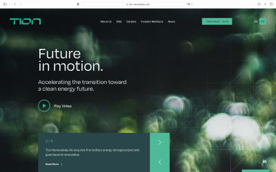
A screenshot of the Tion Renewables website that uses the blurred entire image and Copy Space design technique to position the website’s main heading and description: ‘Future in motion,’ ‘Accelerating the transition toward a clean energy future.’
The Tion Renewables website uses the blurred image design technique and the website heading is positioned in the empty space which has more contrast. Combining two techniques helps your text be even more accessible to everyone. (Large preview)

Conclusion

Thank you for joining me on this accessibility journey. So far, we covered five key techniques when designing text over images: using an overlay over the entire image, text with scrim overlay, strips/highlight, copy space, and text over blurred background effect. In the following article of the series, we will review five more — frame the image, soft-colored gradients, text styles and text position, solid color shapes, and use of colored backgrounds — and I will also share with you a few additional useful tools and resources. Stay tuned!

Smashing Editorial
(yk)

Similar Posts