The idea of a single website reaching millions of people worldwide is thrilling. However, in practice, it’s often the case that a website may be popular in some countries but not in others, unless it’s a global sensation. So, is it possible to design a website that appeals to various countries?
Yes, it is. By adhering to certain fundamental guidelines, you can increase the likelihood of your website attracting readers from different linguistic backgrounds.
1. Clarify Your Website’s Purpose
One of the biggest mistakes a content provider can make is to venture into various markets with a product that lacks a clear identity and, as a result, fails to communicate a precise message.


If your website’s purpose isn’t immediately apparent, it’s unlikely that international internet users will invest time trying to decipher it. Instead, they’ll likely navigate away quickly. Therefore, it’s crucial that visitors can grasp the core concept of your website within the first 30 seconds of their visit.
2. Identify Your Target Markets
After you’ve clearly defined your product or service, the next step is to determine which markets you want to reach.
For instance, if your website focuses on French wine or Persian carpets, conducting market research can reveal valuable insights, such as the countries where your potential readers reside. Alternatively, you might decide to be a trailblazer by entering a market that traditionally hasn’t shown much interest in your type of content or product. However, if you choose this path, ensure that you’re taking a calculated risk.
3. Use Simple Language
It’s crucial to use simple language on your website to ensure it’s easily understood by a global audience. This applies to both single-language websites (often English) and multi-lingual ones. Using clear, non-idiomatic English that avoids jargon or wordplay makes your content more accessible to those who don’t speak English as their first or second language.


Design Multilingual Website: A Beginner’s Guide
The ‘look and feel’ of a website is the cornerstone of any successful online venture. But the very… Read more
Even if your website offers content in multiple languages, starting with a text written in plain English can simplify and reduce the cost of translation. The key is to make your content as straightforward and universally understandable as possible.gns and messages chosen by Philips clearly demonstrate how design choices are made based on the cultural contexts of the target audience.
5. Selecting the Appropriate Color
Choosing the right color for a website is a significant decision. It’s common knowledge that colors can greatly impact our instinctive reactions to various things like locations, products, and even people. For instance, many banks opt for a blue color scheme for their brand because it conveys a sense of trust. Conversely, we wouldn’t typically paint our bedrooms black or bright red, as these colors are not conducive to relaxation.
How to Choose a Color For Your Website
Your website’s color scheme is a vital UI element that ensures positive visual appeal leading to a good… Read more
However, when designing a website intended for international markets, there are additional factors to consider. Colors can have varying interpretations across different cultures.


In Western countries, black is often associated with death, evil, and mourning, but in China, it’s the color traditionally worn by young boys. Similarly, while white symbolizes marriage, peace, and medical assistance in Western culture, it represents death and mourning in China.
Therefore, choosing the right color isn’t just about aesthetics, it’s also about the implicit messages conveyed.
6. Translation and Text Length
When your website targets international audiences, it often necessitates providing your content in multiple languages.
This scenario presents several crucial decisions. The first and perhaps most important one pertains to the method of translation: automated versus human translator.
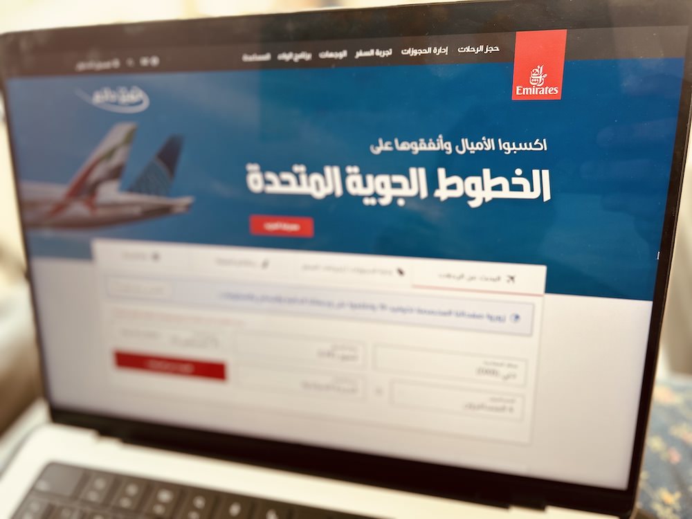

Opting for an automated translation, such as the built-in translation bar in Google Chrome, offers two main benefits: speed and cost-effectiveness. However, this approach may lead to errors and unintentional humor. Employing a proficient human translator can mitigate these issues, but it may increase your costs.
There are more affordable alternatives available, such as freelance platforms like www.peopleperhour.com or translation websites like www.proz.com, which offer competitive rates. Another potential solution is to initially translate only certain sections of your website, leaving the rest in your primary language.
Remember, when content is translated into another language, the length of the text often changes. Therefore, it’s advisable to keep text separate from graphics. For this purpose, using Cascading Style Sheets (CSS) is highly recommended as it allows content to be separated from page design. Additionally, Unicode is a useful tool that enables you to switch between over 90 languages and thousands of characters.
Lastly, it’s important to note that not all countries or regions have high-speed broadband connections. To accommodate these users, it’s advisable to minimize the use of Flash and heavy graphics.
7. Local Website Promotion
Social media remains a cost-effective method for website promotion. However, when your target audience is in a different country, you may discover that there are more options beyond Facebook and Twitter.
Various countries have their own popular social platforms that can be utilized for website promotion. You can choose from a variety of these platforms by referring to the world map of Social Networks.
8. Pay Attention to Your Communication Tone
Another important aspect to consider is the tone of communication. Beyond language differences, different cultures often adopt distinct tones. For instance, an American website is likely to employ a more direct and approachable style compared to an Arab or Japanese one.


Given the potential for cultural misunderstandings, it’s advisable to maintain a polite and respectful tone when addressing people from other countries. This approach helps to avoid any unintended offense due to overly informal communication.
Conclusion
Remembering these points will help set your international venture on the right path. When dealing with products that cross cultural boundaries, it’s crucial to empathize with your clients. Try to see things from their perspective and be mindful of their viewpoints. This sensitivity will go a long way in ensuring successful cross-cultural interactions.

