A lot of contemporary usability evaluation relies on easily measurable and readily available metrics like conversion rates, task success rates, and time on task, even though it’s questionable how well these are suited for reliably capturing a concept as complex as usability in its entirety.
The same holds for user experience. When an instrument is used to measure usability, e.g., in controlled user studies or via live intercepts, it’s often the simple single ease question, which is generally not a bad choice, but has its limits.
Note: For more information on usability evaluation, you can check the article “Current Practice in Measuring Usability: Challenges to Usability Studies and Research” by Kasper Hornbæk and “Growth Marketing Considered Harmful” by Maximilian Speicher.
Ultimately, when you intend to precisely and reliably measure the usability of a digital product, there’s no way around a scientifically well-founded instrument or, in everyday terms, a “questionnaire.” The most famous one is probably SUS, the System Usability Scale, but there are also some others around. Two examples are UMUX, the Usability Measure for User Experience, and SUMI, the Software Usability Measurement Inventory.
To join this party, in this article, we introduce Inuit (the Interface Usability Instrument), a new usability questionnaire. We will share how and why it was developed and how it’s different from the questionnaires mentioned above.
To immediately cut to the chase: With a scale from 1 (“completely disagree”) to 5 (“completely agree”), Inuit looks as follows. The parts in square brackets can be adapted to your specific interface, e.g., products in an online shop, articles on a news website, or results in a search engine.
| Q1 | I found [the information] I was looking for. |
| Q2 | I could easily understand [the provided information]. |
| Q3 | I was confused using [the interface]. |
| Q4 | I was distracted by elements of [the interface]. |
| Q5 | Typography and layout added to readability. |
| Q6 | There was too much information presented in too little space. |
| Q7 | [My desired information] was easily reachable. |
The Inuit metric (a score between 0 to 100, analogous to SUS) can then be calculated as follows:
(Q1 + Q2 + Q5 + Q7 – Q3 – Q4 – Q6 + 11) * 100⁄28
Why 11 and 28?
We have seven items rated on a scale from 1 to 5, but for some (Q1, Q2, Q5, Q7), 5 is the best rating, and for some (Q3, Q4, Q6), 1 is the best rating. Hence, we need to subtract the latter from 6 when we add up everything: Q1 + Q2 + Q5 + Q7 + (6-Q3) + (6-Q4) + (6-Q6) = Q1 + Q2 + Q5 + Q7 – Q3 – Q4 – Q6 + 18. This gives us an overall score between 7 and 35.
Now, we want to normalize this to a score between 0 and 100. For this, we first subtract 7 for a score between 0 and 28: Q1 + Q2 + Q5 + Q7 – Q3 – Q4 – Q6 + 18 – 7 = Q1 + Q2 + Q5 + Q7 – Q3 – Q4 – Q6 + 11. Finally, for a score between 0 and 100, we need to divide everything by 28 and multiply by 100: (Q1 + Q2 + Q5 + Q7 – Q3 – Q4 – Q6 + 11) * 100/28.
You might have noticed that compared to, e.g., SUS with 10, Inuit consists of only 7 questions. Apart from that, it has two more advantages:
- Inuit has been designed to provide training data for machine-learning models that can then automatically predict usability from user interactions or web analytics data.
- Its items (i.e., the questions) are diagnostic, at least to a certain degree. This means you see what’s wrong with your interface simply by looking at the results from the questionnaire. Have a bad rating for readability (Q5)? You should make the text in your interface more readable.
Now, at this point, you can either accept all this and simply get going with Inuit to measure the usability of your digital product (we’d be delighted). Or, if you’re interested in the details, you’re very welcome to keep reading (we’d be even more delighted).

“So, Why Did You Develop Yet Another Usability Questionnaire?”
You probably already guessed that Inuit wasn’t developed just for fun or because there aren’t enough questionnaires around. But to answer this, we have to reach back a bit.
In 2014, Max was a Ph.D. student busy working on his dissertation. The goal of it all was to find a way to determine the usability of an interface automatically from users’ interactions, such as what they do with the mouse cursor and how they scroll, rather than making participants in a user study fill out pages and pages of questions. Additionally, the cherry on top should be to also automatically propose optimizations for the interface (e.g., if user interactions suggest the interface is not readable, make the text larger).
To be able to achieve this, however, it was first necessary to determine if and how well certain interactions (mouse cursor movements, mouse cursor speed, scrolling behavior, and so on) predict the usability — or rather its individual aspects — of an interface. This meant collecting training data through users’ interactions with an interface and their usability assessments of that interface. Then, one could investigate how well (combinations of) tracked interactions predict (aspects of) usability using regression and/or machine-learning models. So far, so good, as far as the theory is concerned.
In practice, one important decision that would have huge implications for the project was how to collect the usability assessments mentioned above when gathering the training data. Since usability is a latent variable, meaning it can’t be observed directly, a proper instrument (i.e., a questionnaire) is necessary to assess it. And the most famous one is undeniably the System Usability Scale (SUS). It should’ve been an obvious choice, shouldn’t it?
A closer look showed that, while SUS would be perfectly well suited to train statistical models to infer usability from interactions, it simply wasn’t the perfect fit. This was the case mainly for two reasons:
- First, many questions contained in SUS (“I think that I would like to use this system frequently,” “I found the various functions in this system were well integrated,” and “I felt very confident using the system,” among others) describe the effects of good or bad usability — users feel confident because the system is well usable and so on. But they don’t describe the aspects of usability that cause them, e.g., bad understandability. This makes it difficult to know what should be done to make it better. What exactly should we change to make users feel more confident? The questions are not diagnostic or “actionable” and require further qualitative research to uncover the causes of bad ratings. It’s the same for UMUX and SUMI.
- Second, with just 10 items, SUS is already a very small questionnaire. However, the fewer items, the less friction and the more motivated users are to actually answer. So, is ten really the minimum, or would a proper questionnaire with fewer items be possible?
With these considerations in mind, Max went on and ultimately developed Inuit, the instrument presented in the introduction. He ended up with seven items that were better suited for the needs of his Ph.D. project and more actionable than those of SUS.
“How do you know this actually measures usability?”
Inuit was developed in a two-step process. The first step was a review of established guidelines and checklists with more than 250 rules for good usability, which were filtered based on the requirements above and resulted in a first draft for the new usability instrument. This draft was then discussed and refined in expert interviews with nine usability professionals.
The final draft of Inuit, with the seven factors informativeness (Q1), understandability (Q2), confusion (Q3), distraction (Q4), readability (Q5), information density (Q6), and reachability (Q7), was evaluated using a confirmatory factor analysis (CFA).
CFA is a method for assessing construct validity, which means it “is used to test whether measures of a construct are consistent with a researcher’s understanding of the nature of that construct” or “to test whether the data fit a hypothesized measurement model.”
— Wikipedia
Put very simply, by using a CFA, we can check how well a theory matches the practice. In our case, the “construct” or “hypothesized measurement model” (theory) was Inuit, and the data (practice) came from a user study with 81 participants in which four news websites were evaluated using an Inuit questionnaire.
In a CFA, there are various metrics that show how well a construct fits the data. Two well-established ones are CFI, the comparative fit index, and RMSEA, the root mean square error of approximation — both range from 0 to 1.
For CFI, 0.95 or higher is “accepted as an indicator of good fit” (Wikipedia). Inuit’s value was 0.971. For RMSEA, “values less than 0.05 are good, values between 0.05 and 0.08 are acceptable” (Kim et al.). Inuit’s value was 0.063. This means our theory matches the practice, or Inuit’s questions do indeed measure usability.
Case Study #1
Inuit was first put into practice in 2014 at Unister GmbH, which at that time ran travel search engines like fluege.de and reisen.de, and was developing an entirely new semantic search engine. The results page of this search engine, named BlueKiwi, was evaluated in a user study with 81 participants using Inuit.
In this first study, the overall score averaged across all participants was 59.9. Ratings were especially bad for informativeness (Q1), information density (Q6), and reachability (Q7). Based on these results, BlueKiwi’s search results page was redesigned.
Among other things, the number of advertisements was reduced (better reachability), search results were displayed more concisely (better informativeness), and everything was more clearly aligned and separated (better information density). See the figure below for the full list of changes.
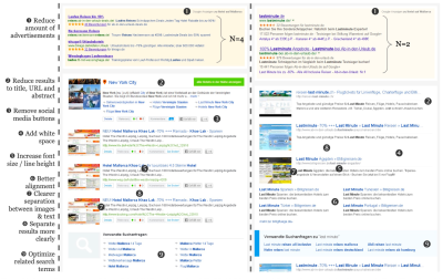
After the redesign, we ran another study, in which the overall Inuit score increased to 67.5 (+11%), with improvements in every single one of the seven items.
“Why Wait 9 Years To Write This Article?”
There were various factors at play. One was what’s called the research–practice gap. It’s often difficult for academic work to gain traction outside the academic community. One reason for this is that work that is part of a Ph.D. project is often a little neglected after it has served its purpose — being published in a research paper, included in a thesis, and presented at a Ph.D. defense — which is pretty much exactly what happened to Inuit.
Case Study #2
Another factor, however, was that we wanted to put the instrument into practice in a real-world industry setting over a longer period of time first, and we got the chance to do that only relatively recently.
We ran a longitudinal study over a period of almost two years in which we ran quarterly benchmarks of multiple e-commerce websites using both SUS and Inuit, with a total of 6,368 users. The results of these benchmarks were included in the dashboard of product KPIs and regularly shared with the team of 6 product managers. After roughly two years of conducting and sharing benchmarks, we interviewed the product managers about their use of the data, challenges, wishes, and potential for improvement.
What a high-level analysis showed was that all of the product managers, in one way or another, described Inuit as more intuitive to understand, less abstract, and more actionable compared to SUS when looking at both instruments as a whole.
They found most of Inuit’s items more specific and easier to interpret and, therefore, more relevant from a product manager’s perspective. SUS, in contrast, was described as, e.g., “good for [the] overall score” and the bird’s eye view. Virtually all product managers, however, wished for even more specific insights into where exactly on the website usability problems occur. One suggested building an optimal instrument by combining certain items from both SUS and Inuit.
As part of the analysis, we computed Cronbach’s α for Inuit (based on 3190 answers) as well as SUS (based on 3178 answers).
Cronbach’s α is a statistical measure for the internal consistency of an instrument, which can be interpreted as “the extent to which all of the items of a test measure the same latent variable [i.e., usability].”
— Wikipedia
Values of 0.7 or above are generally deemed acceptable. Inuit reached a value of 0.7; SUS a value of 0.8.
To top things off, Inuit and SUS showed a considerable (Pearson’s r = 0.53) and highly significant (p < 0.001) correlation when looking at overall scores aggregated over the different e-commerce websites and tasks the study participants had to complete.
In layman’s terms, When the SUS score goes up, the Inuit score goes up; when the SUS score goes down, the Inuit score goes down. Both questionnaires measure the same thing (with a very, very rough approximation of INUIT = 0.6 × SUS + 17).
Since these first results were so encouraging, we decided to write this general, more practice-oriented overview article about Inuit now. A deeper analysis of our big dataset, however, is yet to be conducted, and our current plan is to report findings in much more detail separately.
“Why Do You Think Inuit Is Better Than SUS?”
We don’t think so (or that it’s better than any scientifically founded usability instrument, for that matter). There are many ways to measure the same latent variable, in this case, usability. Both questionnaires, SUS and Inuit, have proven that they can measure the usability of an interface. Still, they were developed in different contexts and with different goals and requirements in mind.
So, to address the question of when it’s better to use which, as true researchers, we have to say “it depends” (annoying, isn’t it?).
SUS, which has been around since the 1990s, is probably the most popular and well-established usability instrument. It’s been studied and validated over and over, which Inuit, of course, can’t compete with yet and still has a long way to go. If the goal is to compare scores at a high level and even tap into public benchmark numbers for orientation, SUS would be preferable.
However, by design, Inuit has two advantages over SUS:
- Inuit has only seven items and is still a “complete” usability instrument.
30% fewer questions can be a major factor when it comes to motivating users to fill out a questionnaire. Assuming that a big part of remote online studies is done quickly in passing and with short attention spans, designing efficient studies that generate reliable output and minimize effects like participant fatigue can be a major challenge for researchers. - Inuit’s items have been specifically designed to be more actionable for practitioners and lend themselves better to manual analysis and inferring potential interface optimizations.
As we’ve learned in our second case study, talking to actual product managers revealed that for them, the results of a usability assessment should always be as specific as possible. Comparing the items of both, Inuit points to more concrete areas to improve than SUS, which was perceived as rather vague.
“Where Can I Use Inuit?”
Generally, in any scenario that involves an interface and a task — either defined by you or the user themselves. In the studies mentioned and described above, we could demonstrate that Inuit works well in controlled as well as natural-use settings and with news websites, search engines, and e-commerce shops.
Now, of course, we can’t evaluate Inuit with any possible kind of interface, and that is part of the reason for this article. Inuit has been around and publicly available since 2014, and we have no idea if and how it has been used by other researchers, but if you do, please let us know about it. We’d be thrilled to hear about your experience and results.
The questions presented at the beginning of the article are relatively focused on finding information because that’s where Inuit is historically coming from and because most of the things users do involve the finding of information of some kind. (Please keep in mind that information doesn’t have to be text. On the contrary, most information is non-textual.) But those questions can be adapted as long as they still reflect the underlying aspects of usability, which are informativeness, understandability, confusion, distraction, readability, information density, and reachability.
Say, for instance, you want to evaluate a module from an e-learning course, e.g., in the form of an annotated video with a subsequent quiz. To accommodate the task at hand, Q1 could be rephrased to “I had all the information necessary to complete the module” and Q7 to “All the information necessary to complete the module was easily reachable.”
Conclusion
There are plenty of usability questionnaires out there, and we have added a new one to the pool — Inuit. Why? Because sometimes, you find yourself in a situation where none of the existing questionnaires is the perfect fit. Inuit has been designed to be more diagnostic than existing usability instruments like, e.g., SUS and for use with machine learning, all the while asking fewer questions than other questionnaires. So, if any of this seems relevant to your use cases or context of work, why not give it a try?
From a scientific and statistical point of view, in a confirmatory factor analysis (CFA), Inuit has demonstrated that its questions do indeed measure usability. On top of that, it’s consistent and correlates well with SUS, based on data from a large-scale, longitudinal user study.
Note: If you want to dive deeper into the science behind Inuit, e.g., how exactly the items/questions were chosen, you can read the corresponding research paper “Inuit: The Interface Usability Instrument,” which was presented at the 2015 HCI International Conference. If you want to learn more about how Inuit can be used to train machine-learning models, read “Ensuring Web Interface Quality through Usability-Based Split Testing.” And finally if you want to see how Inuit can be used as the basis for a tool that automatically proposes optimizations for an interface, you can refer to “S.O.S.: Does Your Search Engine Results Page (SERP) Need Help?” which was presented at the 2015 ACM Conference on Human Factors in Computing Systems.
References
- “SUS: A ‘Quick and Dirty’ Usability Scale,” John Brooke (Usability evaluation in industry)
- “Confirmatory and exploratory factor analysis for validating the phlegm pattern questionnaire for healthy subjects,” Kim, Hyunho, Boncho Ku, Jong Yeol Kim, Young-Jae Park, and Young-Bae Park (Evidence-Based Complementary and Alternative Medicine)
- SUMI Questionnaire Homepage, Jurek Kirakowski
- “10 Things to Know about the Single Ease Question (SEQ),” Jeff Sauro (MeasuringU)
- “Measuring Usability: From the SUS to the UMUX-Lite,” Jeff Sauro (MeasuringU)
- “Ensuring web interface quality through usability-based split testing,” Speicher, Maximilian, Andreas Both, and Martin Gaedke (International Conference on Web Engineering)
- “Inuit: the interface usability instrument,” Speicher, Maximilian, Andreas Both, and Martin Gaedke (Design, User Experience, and Usability: Design Discourse)
- “S.O.S.: Does Your Search Engine Results Page (SERP) Need Help?,” Speicher, Maximilian, Andreas Both, and Martin Gaedke (Proceedings of the 33rd Annual ACM Conference on Human Factors in Computing Systems)
- “Conversion rate & average order value are not UX metrics,” Maximilian Speicher (UX Collective)
- “So, How Can We Measure UX?,” Maximilian Speicher (ACM Interactions)
- “Growth Marketing Considered Harmful,” Maximilian Speicher
- “Current Practice In Measuring Usability: Challenges to Usability Studies and Research,” Kasper Hornbæk
- Latent variable, Wikipedia
- Confirmatory factor analysis, Wikipedia
- Internal consistency, Wikipedia

(yk)
