clamp() function is often paired with viewport units for “fluid” font sizing that scales the text up and down at different viewport sizes. As common as this technique is, several voices warn that it opens up situations where text can fail WCAG Success Criterion 1.4.4, which specifies that text should scale up to at least 200% when the user’s browser reaches its 500% maximum zoom level. Max Barvian takes a deep look at the issue and offers ideas to help address it.
You may already be familiar with the CSS clamp() function. You may even be using it to fluidly scale a font size based on the browser viewport. Adrian Bece demonstrated the concept in another Smashing Magazine article just last year. It’s a clever CSS “trick” that has been floating around for a while.
But if you’ve used the clamp()-based fluid type technique yourself, then you may have also run into articles that offer a warning about it. For example, Adrian mentions this in his article:
“It’s important to reiterate that using
remvalues doesn’t automagically make fluid typography accessible for all users; it only allows the font sizes to respond to user font preferences. Using the CSSclampfunction in combination with the viewport units to achieve fluid sizing introduces another set of drawbacks that we need to consider.”
Here’s Una Kravets with a few words about it on web.dev:
“Limiting how large text can get with
max()orclamp()can cause a WCAG failure under 1.4.4 Resize text (AA), because a user may be unable to scale the text to 200% of its original size. Be certain to test the results with zoom.”
Trys Mudford also has something to say about it in the Utopia blog:
“Adrian Roselli quite rightly warns that clamp can have a knock-on effect on the maximum font-size when the user explicitly sets a browser text zoom preference. As with any feature affecting typography, ensure you test thoroughly before using it in production.”
Mudford cites Adrian Roselli, who appears to be the core source of the other warnings:
“When you use
vwunits or limit how large text can get withclamp(), there is a chance a user may be unable to scale the text to 200% of its original size. If that happens, it is WCAG failure under 1.4.4 Resize text (AA) so be certain to test the results with zoom.”
So, what’s going on here? And how can we address any accessibility issues so we can keep fluidly scaling our text? That is exactly what I want to discuss in this article. Together, we will review what the WCAG guidelines say to understand the issue, then explore how we might be able to use clamp() in a way that adheres to WCAG Success Criterion (SC) 1.4.4.
WCAG Success Criterion 1.4.4
Let’s first review what WCAG Success Criterion 1.4.4 says about resizing text:
“Except for captions and images of text, text can be resized without assistive technology up to 200 percent without loss of content or functionality.”
Normally, if we’re setting CSS font-size to a non-fluid value, e.g., font-size: 2rem, we never have to worry about resizing behavior. All modern browsers can zoom up to 500% without additional assistive technology.
So, what’s the deal with sizing text with viewport units like this:
h1 { font-size: 5vw;
}
Here’s a simple example demonstrating the problem. I suggest viewing it in either Chrome or Firefox because zooming in Safari can behave differently.
See the Pen [vw-based font-size scaling [forked]](https://codepen.io/smashingmag/pen/MWLaqRX) by Maxwell Barvian.
If you click the zoom buttons in the demo’s bottom toolbar, you’ll notice that although the page zoom level changes, the text doesn’t get smaller. Nothing really changes, in fact.
The issue is that, unlike rem and px values, browsers do not scale viewport-based units when zooming the page. This makes sense when thinking about it. The viewport itself doesn’t change when the user zooms in or out of a page. Where we see font-size: 1rem display like font-size: 0.5rem at a 50% zoom, font-size: 5vw stays the same size at all zoom levels.
Herein lies the accessibility issue. Font sizes based on vw — or any other viewport-based units for that matter — could potentially fail to scale to two times their original size the way WCAG SC 1.4.4 wants them to. That’s true even at 500%, which is the maximum zoom level for most browsers. If a user needs to zoom in at that scale, then we need to respect that for legibility.
Back To clamp()
Where does clamp() fit into all of this? After all, many of us don’t rely solely on vw units to size type; we use any of the many tools that are capable of generating a clamped function with a rem or px-based component. Here’s one example that scales text between 16px and 48px when the viewport is between 320px and 1280px. I’m using px values for simplicity’s sake, but it’s better to use rem in terms of accessibility.
h1 { font-size: clamp(16px, 5.33px + 3.33vw, 48px)
}
Try zooming into the next demo to see how the text behaves with this approach.
See the Pen [clamp()ed font-size [forked]](https://codepen.io/smashingmag/pen/poGjOXL) by Maxwell Barvian.
Is this font size accessible? In other words, if we zoom the page to the browser’s 500% maximum, does the content display at least double its original size? If we open the demo in full-page view and resize the browser width to, say, 1500px, notice what happens when we zoom in to 500%.

The text only scales up to 55px, or 1.67 times its original size, even though we zoomed the entire page to five times its original size. And because WCAG SC 1.4.4 requires that text can scale to at least two times its original size, this simple example would fail an accessibility audit, at least in most browsers at certain viewport widths.
Surely this can’t be a problem for all clamped font sizes with vw units, right? What about one that only increases from 16px to 18px:
h1 { font-size: clamp(16px, 15.33px + 0.208vw, 18px);
}
The vw part of that inner calc() function (clamp() supports calc() without explicitly declaring it) is so small that it couldn’t possibly cause the same accessibility failure, right?

Sure enough, even though it doesn’t get to quite 500% of its original size when the page is zoomed to 500%, the size of the text certainly passes the 200% zoom specified in WCAG SC 1.4.4.
So, clamped viewport-based font sizes fail WCAG SC 1.4.4 in some cases but not in others. The only advice I’ve seen for determining which situations pass or fail is to check each of them manually, as Adrian Roselli originally suggested. But that’s time-consuming and imprecise because the functions don’t scale intuitively.
There must be some relationship between our inputs — i.e., the minimum font size, maximum font size, minimum breakpoint, and maximum breakpoint — that can help us determine when they pose accessibility issues.
Thinking Mathematically
If we think about this problem mathematically, we really want to ensure that z₅(v) ≥ 2z₁(v). Let’s break that down.
z₁(v) and z₅(v) are functions that take the viewport width, v, as their input and return a font size at a 100% zoom level and a 500% zoom level, respectively. In other words, what we want to know is at what range of viewport widths will z₅(v) be less than 2×z₁(v), which represents the minimum size outlined in WCAG SC 1.4.4?
Using the first clamp() example we looked at that failed WCAG SC 1.4.4, we know that the z₁ function is the clamp() expression:
z₁(v) = clamp(16, 5.33 + 0.0333v, 48)
Notice: The vw units are divided by 100 to translate from CSS where 100vw equals the viewport width in pixels.
As for the z₅ function, it’s tempting to think that z₅ = 5z₁. But remember what we learned from that first demo: viewport-based units don’t scale up with the browser’s zoom level. This means z₅ is more correctly expressed like this:
z₅(v) = clamp(16*5, 5.33*5 + 0.0333v, 48*5)
Notice: This scales everything up by 5 (or 500%), except for v. This simulates how the browser scales the page when zooming.
Let’s represent the clamp() function mathematically. We can convert it to a piecewise function, meaning z₁(v) and z₅(v) would ultimately look like the following figure:

z₁(v)). (Large preview)
z₅(v)). (Large preview)We can graph these functions to help visualize the problem. Here’s the base function, z₁(v), with the viewport width, v, on the x-axis:
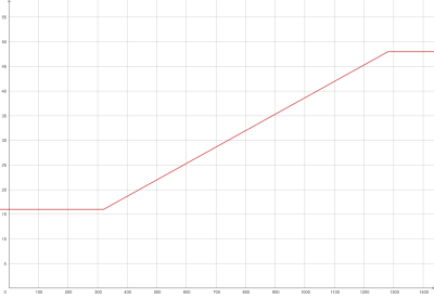
This looks about right. The font size stays at 16px until the viewport is 320px wide, and it increases linearly from there before it hits 48px at a viewport width of 1280px. So far, so good.
Here’s a more interesting graph comparing 2z₁(v) and z₅(v):
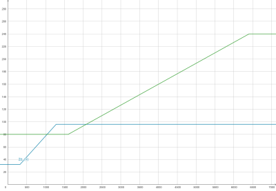
2z₁(v) (in teal) and z₅(v) (in green). (Large preview)Can you spot the accessibility failure on this graph? When z₅(v) (in green) is less than 2z₁(v) (in teal), the viewport-based font size fails WCAG SC 1.4.4.
Let’s zoom into the bottom-left region for a closer look:
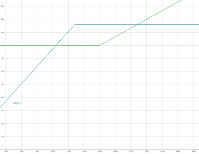
This figure indicates that failure occurs when the browser width is approximately between 1050px and 2100px. You can verify this by opening the original demo again and zooming into it at different viewport widths. When the viewport is less than 1050px or greater than 2100px, the text should scale up to at least two times its original size at a 500% zoom. But when it’s in between 1050px and 2100px, it doesn’t.
Hint: We have to manually measure the text — e.g., take a screenshot — because browsers don’t show zoomed values in DevTools.
General Solutions
For simplicity’s sake, we’ve only focused on one clamp() expression so far. Can we generalize these findings somehow to ensure any clamped expression passes WCAG SC 1.4.4?
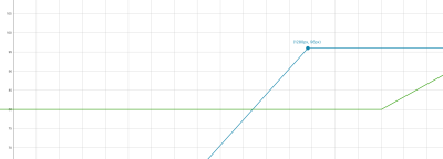
Let’s take a closer look at what’s happening in the failure above. Notice that the problem is caused because 2z₁(v) — the SC 1.4.4 requirement — reaches its peak before z₅(v) starts increasing.
When would that be the case? Everything in 2z₁(v) is scaled by 200%, including the slope of the line (v). The function reaches its peak value at the same viewport width where z₁(v) reaches its peak value (the maximum 1280px breakpoint). That peak value is two times the maximum font size we want which, in this case, is 2*48, or 96px.
However, the slope of z₅(v) is the same as z₁(v). In other words, the function doesn’t start increasing from its lowest clamped point — five times the minimum font size we want — until the viewport width is five times the minimum breakpoint. In this case, that is 5*320, or 1600px.
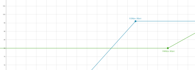
Thinking about this generally, we can say that if 2z₁(v) peaks before z₅(v) starts increasing, or if the maximum breakpoint is less than five times the minimum breakpoint, then the peak value of 2z₁(v) must be less than or equal to the peak value of z₅(v), or two times the maximum value that is less than or equal to five times the minimum value.
Or simpler still: The maximum value must be less than or equal to 2.5 times the minimum value.
What about when the maximum breakpoint is more than five times the minimum breakpoint? Let’s see what our graph looks like when we change the maximum breakpoint from 1280px to 1664px and the maximum font size to 40px:
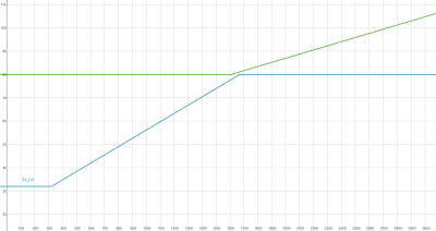
Technically, we could get away with a slightly higher maximum font size. To figure out just how much higher, we’d have to solve for z₅(v) ≥ 2z₁(v) at the point when 2z₁(v) reaches its peak, which is when v equals the maximum breakpoint. (Hat tip to my brother, Zach Barvian, whose excellent math skills helped me with this.)
To save you the math, you can play around with this calculator to see which combinations pass WCAG SC 1.4.4.
Conclusion
Summing up what we’ve covered:
- If the maximum font size is less than or equal to 2.5 times the minimum font size, then the text will always pass WCAG SC 1.4.4, at least on all modern browsers.
- If the maximum breakpoint is greater than five times the minimum breakpoint, it is possible to get away with a slightly higher maximum font size. That said, the increase is negligible, and that is a large breakpoint range to use in practice.
Importantly, that first rule is true for non-fluid responsive type as well. If you open this pen, for example, notice that it uses regular media queries to increase the h1 element’s size from an initial value of 1rem to 3rem (which violates our first rule), with an in-between stop for 2rem.
If you zoom in at 500% with a browser width of approximately 1000px, you will see that the text doesn’t reach 200% of its initial size. This makes sense because if you were to describe 2z₁(v) and z₅(v) mathematically, they would be even simpler piecewise functions with the same maximum and minimum limitations. This guideline would hold for any function describing a font size with a known minimum and maximum.
In the future, of course, we may get more tools from browsers to address these issues and accommodate even larger maximum font sizes. In the meantime, though, I hope you find this article helpful when building responsive frontends.

(gg, yk)
