In my previous article, we tackled ribbons in CSS. The idea was to create a classic ribbon pattern using a single element and values that allow it to adapt to however much content it contains. We established a shape with repeating CSS gradients and tailor-cut the ribbon’s ends with clip-path() to complete the pattern, then used it and wound up with two ribbon variations: one that stacks vertically with straight strands of ribbons and another that tweaks the shape by introducing pseudo-elements.
See the Pen [Responsive multi-line ribbon shapes](https://codepen.io/t_afif/pen/LYMjNoo) by Temani Afif.
Ready to step things up a bit? This time, we will create ribbons out of more complex shapes based on ones found in my collection of single-element CSS ribbons. We’re making adjustments to the basic shape we made before. Instead of perfectly straight strands of ribbon, we’re making angled cuts out of the shape.
See the Pen [Responsive multi-line ribbon shapes](https://codepen.io/t_afif/pen/NWeYwBK) by Temani Afif.
The Basic Setup
Once again, all we are working with is a single element in the HTML:
<h1>Your content here</h1>
We are also going to rely on gradients to create the repetition, but the newcomer, this time, will be a CSS mask. Using masks is the key to creating such complex designs.
Let’s not forget the use of the lh unit. It gives us the height of one line, which is an important metric. We can already start by defining our first gradient, which is similar to the one we used in the previous article:
h1 {
  --c: #d81a14;
  background: linear-gradient(var(--c) 80%, #0000 0) 0 .1lh / 100% 1lh;
}
You’ll notice immediately that this gradient is different from the one we established in the last article. That’s because we’re covering 80% (instead of 70%) of the space before making a hard color stop to full transparency for the remaining 20% of space. That’s why we’re offsetting the gradient by .1lh on the background.

If you are wondering why I am using 80%, then there is no particular logic to my approach. It’s because I found that covering more space with the color and leaving less space between lines produces a better result for my eye. I could have assigned variables to control the space without touching the core code, but there’s already more than enough complexity going on. So, that’s the reasoning behind the hard-coded value.

Styling The First Ribbon
We’ll start with the red ribbon from the demo. This is what we’re attempting to create:
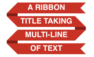
It may look complex, but we will break it down into a combination of basic shapes.
Stacking Gradients
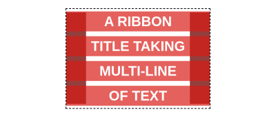
Let’s start with the gradient configuration, and below is the result we are aiming for. I am adding a bit of transparency to better see both gradients.
h1 {
  --c: #d81a14;

  padding-inline: .8lh;
  background:
    /* Gradient 1 */
    linear-gradient(var(--c) 80%, #0000 0)
      0 .1lh / 100% 1lh,
    /* Gradient 2 */
    linear-gradient(90deg, color-mix(in srgb, var(--c), #000 35%) 1.6lh, #0000 0)
      -.8lh 50% / 100% calc(100% - .3lh) repeat-x;
}
We already know all about the first gradient because we set it up in the last section. The second gradient, however, is placed behind the first one to simulate the folded part. It uses the same color variable as the first gradient, but it’s blended with black (#000) in the color-mix() function to darken it a smidge and create depth in the folds.
The thing with the second gradient is that we do not want it to reach the top and bottom of the element, which is why its height is equal to calc(100% - .3lh).
Note the use of padding in the inline direction, which is required to avoid text running into the ribbon’s folds.
Masking The Folded Parts
Now, it’s time to introduce a CSS mask. If you look closely at the design of the ribbon, you will notice that we are cutting triangular shapes from the sides.
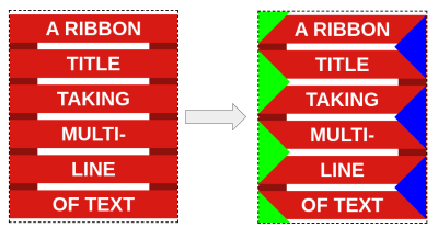
We have applied a triangular shape on the left and right sides of the ribbon. Unlike the backgrounds, they repeat every two lines, giving us the complex repetition we want.
Imagine for a moment that those parts are transparent.
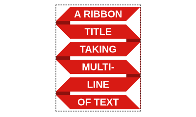
That will give us the final shape! We can do it with masks, but this time, let’s try using conic-gradient(), which is nice because it allows us to create triangular shapes. And since there’s one shape on each side, we’ll use two conical gradients — one for the left and one for the right — and repeat them in the vertical direction.
mask:
  conic-gradient(from 225deg at .9lh, #0000 25%, #000 0)
    0 1lh / 50% 2lh repeat-y,
  conic-gradient(from 45deg at calc(100% - .9lh), #0000 25%, #000 0)
    100% 0 / 50% 2lh repeat-y;
Each gradient covers half the width (50%) and takes up two lines of text (2lh). Also, note the 1lh offset of the first gradient, which is what allows us to alternate between the two as the ribbon adapts in size. It’s pretty much a zig-zag pattern and, guess what, I have an article that covers how to create zig-zag shapes with CSS masks. I highly recommend reading that for more context and practice applying masks with conical gradients.
Masking The Ribbon’s Ends
We are almost done! All we are missing are the ribbon’s cut edges. This is what we have so far:
See the Pen [First ribbon shape](https://codepen.io/t_afif/pen/XWOrNaa) by Temani Afif.
Notice that the cutout parts of the ribbon are hidden by the mask. We need to add more gradients to the mask to see them. Let’s start with the one at the top of the ribbon, as illustrated below.

We can fill that in by adding a third gradient to the mask:
mask:
  /* New gradient */
  linear-gradient(45deg, #000 50%, #0000 0) 100% .1lh / .8lh .8lh no-repeat,

  conic-gradient(from 225deg at .9lh, #0000 25%, #000 0)
   0 1lh / 50% 2lh repeat-y,
  conic-gradient(from 45deg  at calc(100% - .9lh), #0000 25%, #000 0)
   100% 0 / 50% 2lh repeat-y;
That linear gradient will give us the missing part at the top, but we still need to do the same at the bottom, and here, it’s a bit tricky because, unlike the top part, the bottom is not static. The cutout can be either on the left or the right based on the number of lines of text we’re working with:
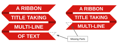
We will fill in those missing parts with two more gradients. Below is a demo where I use different colors for the newly added gradients to see exactly what’s happening. Use the resize handle to see how the ribbon adjusts when the number of lines changes.
See the Pen [Illustrating the full mask configuration](https://codepen.io/t_afif/pen/RwvboJO) by Temani Afif.
See that? The bottom part of the ribbon is positioned in such a way that it is obscured by the fold on the left side when there is an even number of lines and revealed when there is an odd number of lines. The reverse is true of the right side, allowing us to hide one side or the other as the number of lines changes.
If we make all the colors the same, the illusion is perfect!
See the Pen [Illustrating the full mask configuration](https://codepen.io/t_afif/pen/eYxBZdv) by Temani Afif.
We can optimize the code a little and replace the two bottom gradients with only one conical gradient, but that can lead to spacing glitches, so I won’t use it. Here is a demo to illustrate the idea, in case you are curious:
See the Pen [Illustrating the full mask configuration](https://codepen.io/t_afif/pen/mdvbpYK) by Temani Afif.
Putting It All Together
Here is everything we worked on in the first ribbon put together. It’s a lot of gradients, but now you know the purpose of each one.
h1 {
  --c: #d81a14;

  padding-inline: 1lh;
  mask:
    linear-gradient(45deg, #0000 50%, #000 0)
      0% calc(100% - .1lh) / .8lh .8lh no-repeat,
    linear-gradient(-45deg, #0000 50%, #000 0)
      100% calc(100% - .1lh) / .8lh .8lh no-repeat,
    linear-gradient(45deg, #000 50%, #0000 0)
      100% .1lh / .8lh .8lh no-repeat,
    conic-gradient(from 225deg at .9lh, #0000 25%, #000 0)
      0 1lh / 51% 2lh repeat-y,
    conic-gradient(from 45deg at calc(100% - .9lh), #0000 25%, #000 0)
      100% 0 / 51% 2lh repeat-y;
  background:
    linear-gradient(var(--c) 80%, #0000 0)
      0 .1lh / 100% 1lh,
    linear-gradient(90deg, color-mix(in srgb,  var(--c),#000 35%) 1.6lh, #0000 0)
      -.8lh 50% / 100% calc(100% - .3lh) repeat-x;
}
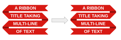
Before we move to the second ribbon, I have a challenge for you: Can you spot which values you would change to set the ribbon in the opposite shape? This will be your homework. You can always find the solution over at my ribbon collection, but give it a try using the final code above.
Styling The Second Ribbon
The second ribbon from the demo — the green one — is a variation of the first ribbon.
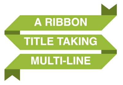
I am going a little bit faster this time around. We’re working with many of the same ideas and concepts, but you will see how relatively easy it is to create variations with this approach.
The first thing to do is to add some space on the top and bottom for the cutout part. I’m applying a transparent border for this. The thickness needs to be equal to half the height of one line (.5lh).
h1 {
  --c: #d81a14;

  border-block: .5lh solid #0000;
  padding-inline: 1lh;
  background: linear-gradient(var(--c) 80%, #0000 0) 0 .1lh / 100% 1lh padding-box;
}
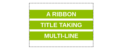
Note how the background gradient is set to cover only the padding area using padding-box.
Now, unlike the first ribbon, we are going to add two more gradients for the vertical pieces that create the folded darker areas.
h1 {
  --c: #d81a14;

  border-block: .5lh solid #0000;
  padding-inline: 1lh;
  background:
    /* Gradient 1 */
    linear-gradient(var(--c) 80%, #0000 0) 0 .1lh / 100% 1lh padding-box,
    /* Gradient 2 */
    linear-gradient(#0000 50%, color-mix(in srgb, var(--c), #000 35%) 0)
     0 0 / .8lh 2lh repeat-y border-box,
    /* Gradient 3 */
    linear-gradient(color-mix(in srgb, var(--c), #000 35%) 50%, #0000 0)
     100% 0 / .8lh 2lh repeat-y border-box;
}
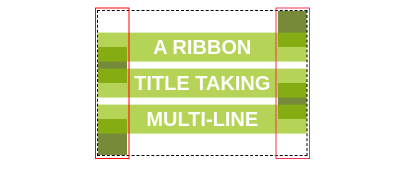
Notice how the last two gradients are set to cover the entire area with a border-box. The height of each gradient needs to equal two lines of text (2lh), while the width should be consistent with the height of each horizontal gradient. With this, we establish the folded parts of the ribbon and also prepare the code for creating the triangular cuts at the start and end of the ribbon.
Here is an interactive demo where you can resize the container to see how the gradient responds to the number of lines of text.
See the Pen [CodePen Home
Gradient configuration of the second ribbon](https://codepen.io/t_afif/pen/JjxPEdw) by Temani Afif.
Gradient configuration of the second ribbon by Temani Afif.
The next step is to mask the left and right sides of the ribbon using the same conical gradients that we set up for the red ribbons. We’ve already figured it out!
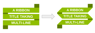
Applying only the conic gradients will also hide the cutout part, so I have to introduce a third gradient to make sure they remain visible:
mask:
  /* New Gradient */
  linear-gradient(#000 1lh, #0000 0) 0 -.5lh,
  /* Left Side */
  conic-gradient(from 225deg at .9lh, #0000 25%, #000 0)
   0 1lh / 51% 2lh repeat-y padding-box,
  /* Right Side */
  conic-gradient(from 45deg at calc(100% - .9lh), #0000 25%, #000 0)
   100% 0 / 51% 2lh repeat-y padding-box;
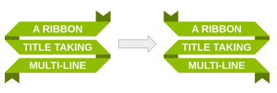
And the final touch is to use clip-path for the cutouts at the ends of the ribbon.

Notice how the clip-path is cutting two triangular portions from the bottom to make sure the cutout is always visible whether we have an odd or even number of lines.
This is how the final code looks when we put everything together:
h1 {
  --c: #d81a14;

  padding-inline: 1lh;
  border-block: .5lh solid #0000;
  background:
    linear-gradient(var(--c) 80%, #0000 0)
      0 .1lh / 100% 1lh padding-box,
    linear-gradient(#0000 50%, color-mix(in srgb,var(--c), #000 35%) 0)
      0 0 / .8lh 2lh repeat-y border-box,
    linear-gradient(color-mix(in srgb, var(--c), #000 35%) 50%, #0000 0)
      100% 0 / .8lh 2lh repeat-y border-box;
  mask:
    linear-gradient(#000 1lh, #0000 0) 0 -.5lh,
    conic-gradient(from 225deg at .9lh,#0000 25%,#000 0)
     0 1lh/51% 2lh repeat-y padding-box,
    conic-gradient(from 45deg at calc(100% - .9lh), #0000 25%, #000 0)
     100% 0 / 51% 2lh repeat-y padding-box;
  clip-path: polygon(0 0, calc(100% - .8lh) 0,
    calc(100% - .4lh) .3lh,
    100% 0, 100% 100%,
    calc(100% - .4lh) calc(100% - .3lh),
    calc(100% - .8lh) 100%, .8lh 100%, .4lh calc(100% - .3lh), 0 100%);
}
I challenged you to find a way to reverse the direction of the first ribbon by adjusting the gradient values. Try to do the same thing here!
It may sound difficult. If you need a lifeline, you can get the code from my online collection, but it’s the perfect exercise to understand what we are doing. Explaining things is good, but nothing beats practicing.
The Final Demo
Here is the demo once again to see how everything comes together.
See the Pen [Responsive multi-line ribbon shapes](https://codepen.io/t_afif/pen/NWeYwBK) by Temani Afif.
Wrapping Up
There we go, two more ribbons that build off of the ones we created together in the first article of this brief two-part series. If there’s only one thing you take away from these articles, I hope it’s that modern CSS provides us with powerful tools that offer different, more robust approaches to things we used to do a long time ago. Ribbons are an excellent example of a long-living design pattern that’s been around long enough to demonstrate how creating them has evolved over time as new CSS features are released.
I can tell you that the two ribbons we created in this article are perhaps the most difficult shapes in my collection of ribbon shapes. But if you can wrap your head around the use of gradients — not only for backgrounds but masks and clipping paths as well — you’ll find that you can create every other ribbon in the collection without looking at my code. It’s getting over that initial hurdle that makes this sort of thing challenging.
You now have the tools to make your own ribbon patterns, too, so why not give it a try? If you do, please share them in the comments so I can see your work!

(gg, yk)
