Today, one billion people are 60 years or older. That’s 12% of the entire world population, and the age group is growing faster than any other group. Yet, online, the needs of older adults are often overlooked or omitted. So what do we need to consider to make our designs more inclusive for older adults? Well, let’s take a closer look.
This article is part of our ongoing series on design patterns. It’s also a part of the video library on Smart Interface Design Patterns 🍣 and is available in the live UX training as well.
Make Users Feel Independent And Competent
When designing for older adults, we shouldn’t make our design decisions based on stereotypes or assumptions that are often not true at all. Don’t assume that older adults struggle to use digital. Most users are healthy, active, and have a solid income.

They might use the web differently than younger users, but that doesn’t mean we need to design a “barebones” version for them. What we need is a reliable, inclusive digital experience that helps everyone feel independent and competent.
Good accessibility is good for everyone. To make it happen, we need to bring older adults into our design process and find out what their needs are. This doesn’t only benefit the older audience but improves the overall UX — for everyone.
One Task At A Time and Error Messages
When designing for older users, keep in mind that there are significant differences in age groups 60–65, 65–70, 70–75, and so on, so explore design decisions for each group individually.
Older adults often read and analyze every word (so-called Stroop effect), so give them enough time to achieve a task, as well as control the process. So avoid disappearing messages so that users can close them themselves when they are ready or present only 1 question at a time in a form.

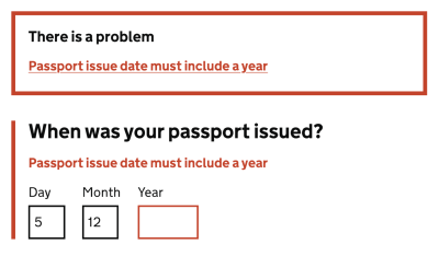
Older adults also often struggle with precise movements, so avoid long, fine drag gestures and precision. If a user performs an action, they didn’t mean to and runs into an error, be sure your error messages are helpful and forgiving, as older adults often view error messages as a personal failure.
As Peter Sylwester has suggested, sensory reaction times peak at about the age of 24 and then degrade slowly as we age. Most humans maintain fine motor skills and decent reaction times well into old age. Therefore, error messages and small updates and prompts should almost always be a consideration. One good way to facilitate reaction time is to keep errors and prompts close to the center of attention.
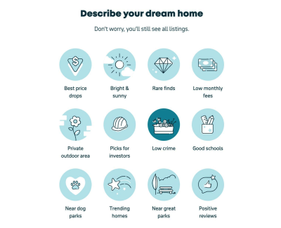
As always, when it comes to accessibility, watch out for contrast. Particularly, shades of blue/purple and yellow/green are often difficult to distinguish. When using icons, it is also a good idea to add descriptive labels to ensure everyone can make sense of them, no matter their vision.
- Avoid disappearing messages: let users close them.
- Avoid long, fine drag gestures and precision.
- Avoid floating labels and use static field labels instead.
- Don’t rely on icons alone: add descriptive labels.
- Ask for explicit confirmation for destructive actions.
- Add a “Back” link in addition to the browser’s “Back” button.
- In forms, present one question or one topic per screen.
- Use sufficient contrast (particularly shades of blue/purple and yellow/green can be hard to distinguish).
- Make error messages helpful and forgiving.
Wrapping Up
We should be careful not to make our design decisions based on assumptions that are often not true at all. We don’t need a “barebones” version for older users. We need a reliable, inclusive product that helps people of all groups feel independent and competent.
Bring older adults in your design process to find out what their specific needs are. It’s not just better for that specific target audience — good accessibility is better for everyone. And huge kudos to wonderful people contributing to a topic that is often forgotten and overlooked.
Useful Resources
Meet Smart Interface Design Patterns
If you are interested in similar insights around UX, take a look at Smart Interface Design Patterns, our 10h-video course with 100s of practical examples from real-life projects — with a live UX training starting March 8. Everything from mega-dropdowns to complex enterprise tables — with 5 new segments added every year. Jump to a free preview.

100 design patterns & real-life
examples.
10h-video course + live UX training. Free preview.

(yk, il)


