Fasten your seat belts, ladies and gentlemen, because Rolls-Royce just went full-rebrand on us and I’m about to present to you their new and improved brand identity.
Ah, Rolls-Royce. The British luxury car brand that we all know and adore.
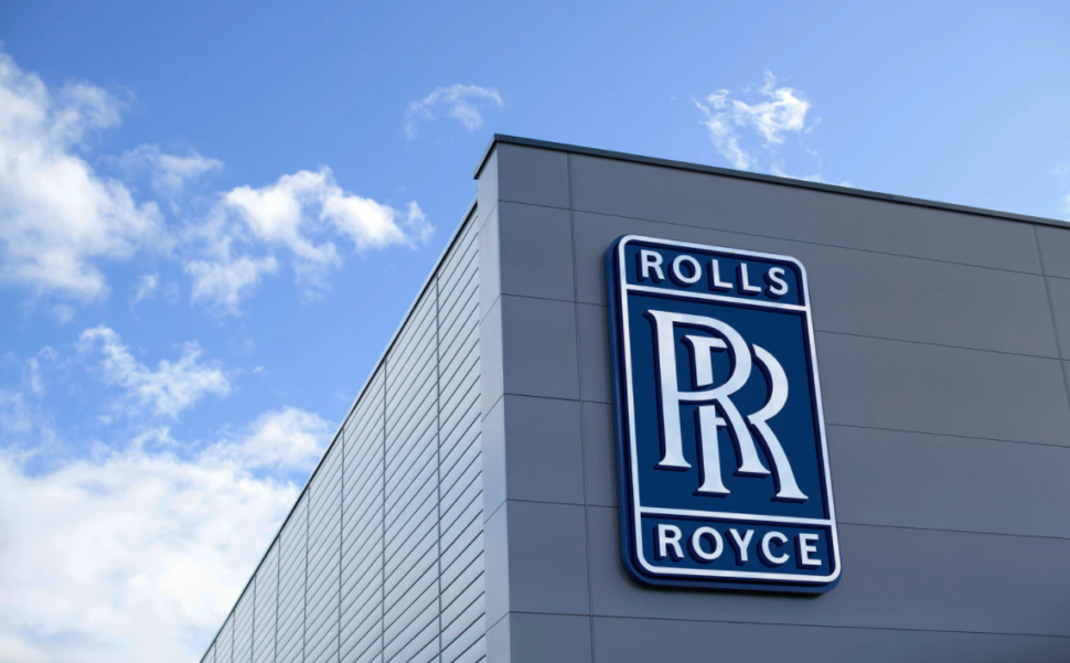
They have done a complete 180 and changed literally everything about their brand to please and draw in a younger generation.
Between a new typeface, color palette, new icon, and everything in between, we’re going to be covering it all today.
A Short History of Rolls-Royce
“Rolls-Royce is a pioneer in cutting-edge technologies that deliver the cleanest, safest, and most competitive solutions to meet the planet’s vital power needs.
The company was formed by Charles Rolls and Henry Royce in 1906, following a successful partnership in which the pair developed and sold cars.
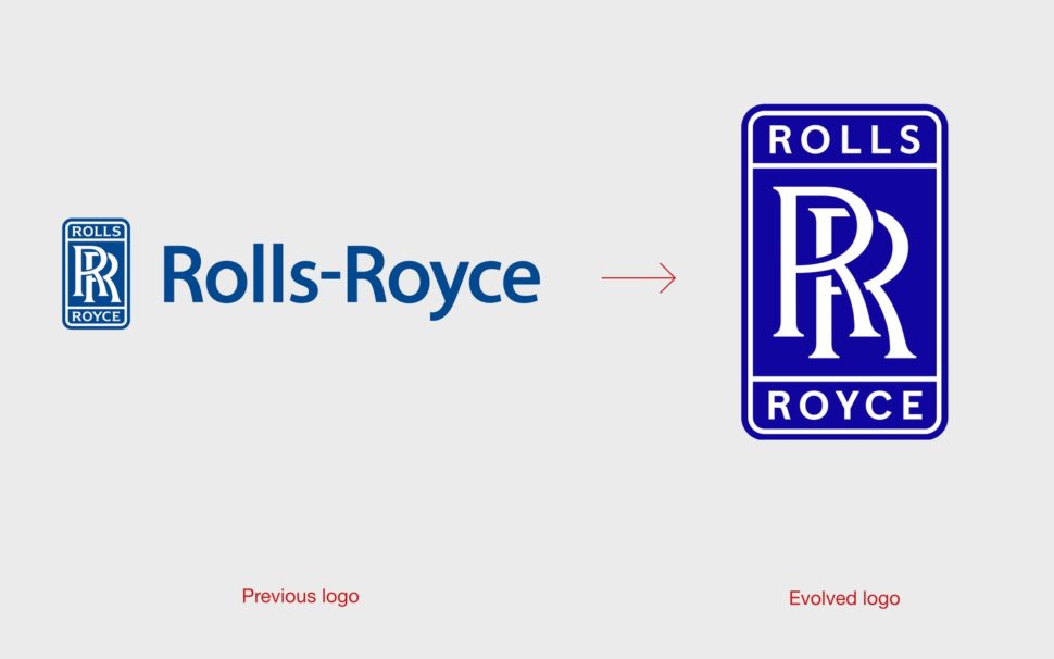
While the motor car business subsequently separated in 1973, Rolls-Royce remains one of the world’s leading names in engineering, innovating in civil and defence aerospace, power systems and nuclear technology.”
[source]
When Rolls-Royce decided that it was time to rebrand, they reached out to none other than Pentagram.
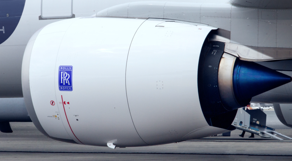
Although lots of things have changed regarding the Rolls-Royce rebranding, it is still immediately recognizable, which was important to leadership at RR.
The goal of this rebrand was “to bring coherence, clarity and flexibility to Rolls-Royce and its full suite of products and services”.
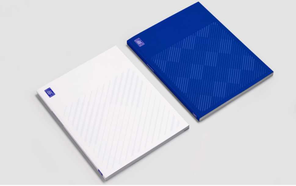
Not only does Rolls-Royce create stunning automobiles, but they create a number of things, such as amazing, high-end car accessories, luggage and bags.
So this new logo needed to be flexible and work for multiple platforms.
The New Rolls-Royce Symbol
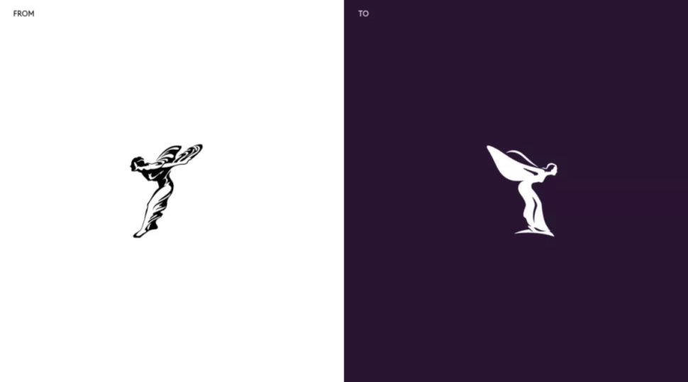
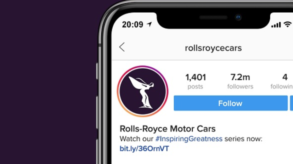
As you can see, the new Rolls-Royce symbol has been flipped so that it is now facing the right, and has been incredibly simplified, which as we have seen with many other brands, this has been the theme of 2020.
New Rolls-Royce Identity
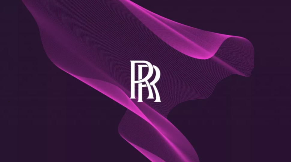
Now for the big-kicker.
From 1911 until now, the symbol of Rolls-Royce was on the bonnet of every Rolls-Royce.
But 2020 is the year of change, am I right?
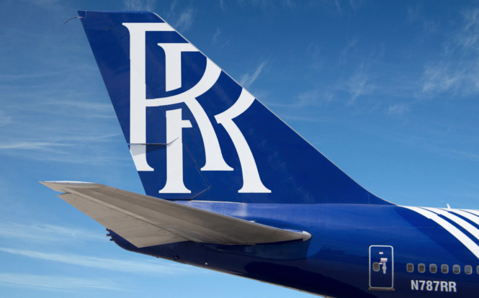
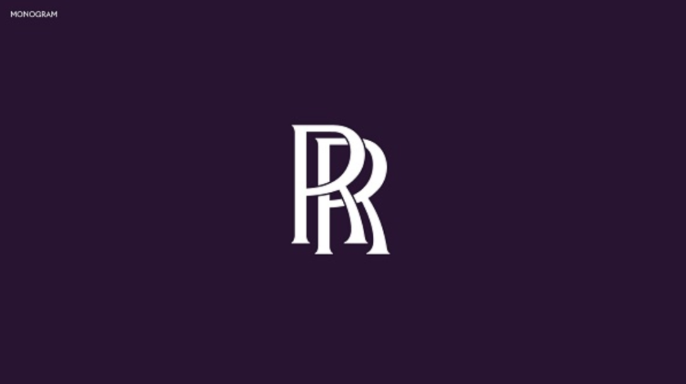
From now on, things have been simplified at Rolls-Royce and the identity of RR will now be symbolized as showed in the picture above.
A bold move, but I think it’s great that they are going for more of a minimalist approach.
Rolls-Royce New Color Pallette
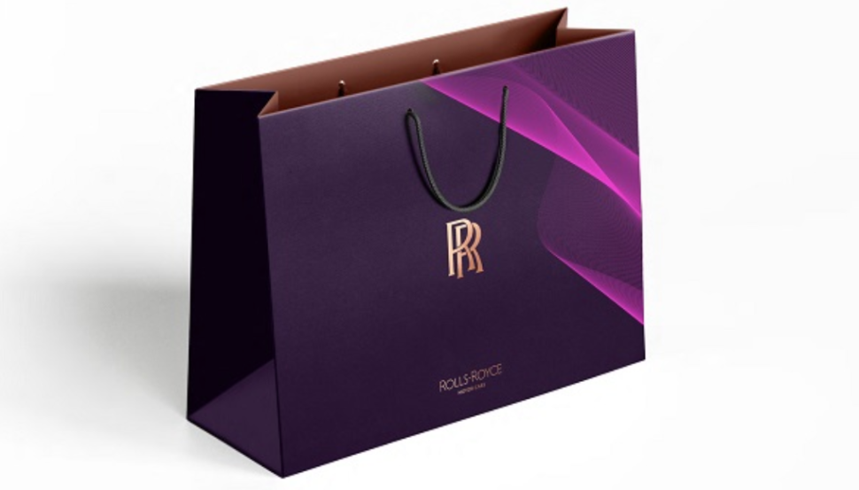
New new color pallete for Rolls-Royce consists of purple as the dominant color, with hints of pink and fluoro orange.
According to Willer, purple has always been associated with luxury, and it looks “softer, less masculine and harsh” than black. “It still has authority and elegance, but yet it’s broader not just to gender but culture”.
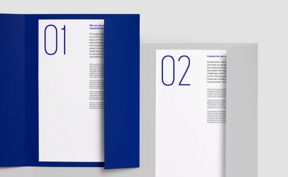
Rolls-Royce New Typeface
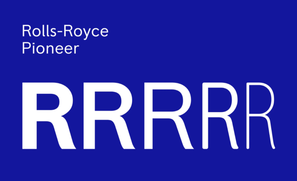
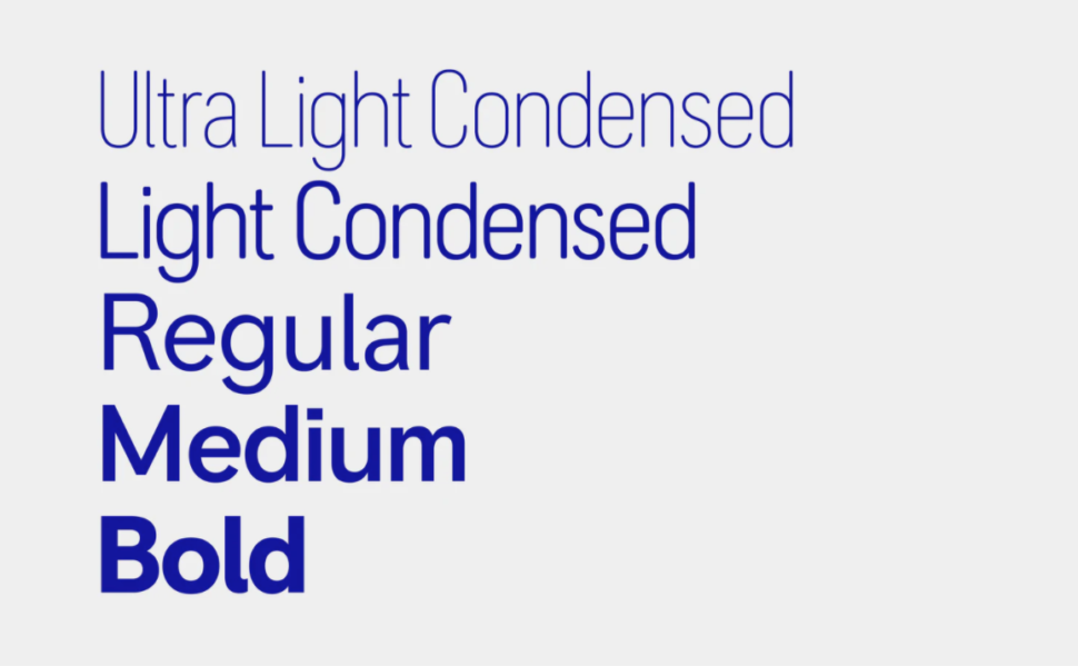
Final Thoughts
I really like this new look that Rolls-Royce adopted and I think it’s great in all aspects, but I do want to know what you guys think of it.
In your personal, professional opinion, what do you think of this rebrand?
Let us know in the comments below and of course…
Until next time,
Stay creative!
