Ask any web designer, and they’ll tell you about their personal views on white space. Numerous designers who embrace minimalism have utilized white space extensively in their web design content. They might assert, “Less is more,” having been trained to remove anything that does not directly and meaningfully contribute to the user experience.
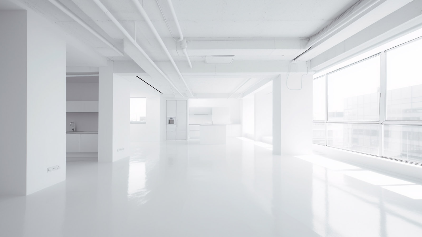

Behind the scenes, white space also reigns as a design philosophy, with clean, elegant code being the sought-after ideal for functional web design. However, I’ve observed that some designers don’t truly grasp what white space is, or how to interpret it in less obvious ways to fully leverage this concept.
5 Tips to Simplify Your Web Design
No matter how hard you try, you can’t make your work look like Apple’s. So what does a… Read more
The What And Why of White Space
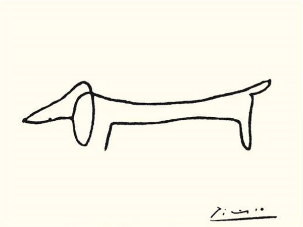
Early modernist painters were masters of white space, using the media of pencil and paint on canvas to elevate one essential idea, eliminating all else as unnecessary. When examining the sketches of artists such as Miró, Kandinsky, Mondrian, and especially Picasso, you will notice that the economy of form is often a key feature in their work.
White space emerged as a desirable feature in Western design (not merely an empty space to fill up with ornament or type) in the early part of the 20th century, at the peak of modernism. Artists and designers of the Bauhaus school in Germany united under the modernist idea of minimalism and had a profound effect on much of the art and design produced thereafter, continuing to influence creative professionals to this day.


The West has strongly embraced the feature of minimalist art and design in the last century or so. However, it’s crucial to highlight that Eastern art and design – specifically the art and architecture of East Asia – has delved into this concept for hundreds of years.
The late Apple mastermind Steve Jobs was heavily swayed by both the German Bauhaus aesthetic and the simplified forms and abundant use of white space characteristic of Japanese design.
Is White Space Really White?
In design, white space is, in essence, the absence of active design elements. It’s a common misconception that white space must, literally, be a) white and b) an open space.
Technically speaking, this is correct. However, most often, one can adopt a more figurative interpretation and still craft a “white space” as a non-active area.
Consider this: a blurred photo used as the background image on a website could be deemed “white space” under this broader definition, even if it’s neither white nor an empty space. Crucially, it’s not an active part of the site’s functionalityâÂÂit doesn’t demand anything from the user. In this context, “white space” is about creating areas within a design that are free from active elements and allow the design to breathe.


You can rest your eyes while looking off to the side at this blurry image, and it will have a similar effect on your brain as a pure white box.
Reducing Back to White Space
Communication is the fundamental goal of any design. When you work through the design process, you determine how best to communicate with your audience. Frivolous details that simply obstruct this main goal don’t contribute positively. There’s an inherent challenge in the design profession to continuously think about how to achieve more with less.
Add Item, Reduce Space
As humans, our natural inclination is to fill up empty space with clutter.
Consider a disorganized garage or a room in your home that’s been awaiting a thorough spring cleaning for years now. When you first moved into your house, that room was empty and pristine. There was no need to create space – it was already present. However, through the process of everyday living, you actually reduced the amount of space in that room. This same phenomenon can occur in a design if we aren’t vigilant.
White space in design isn’t something you begin with. Rather, it’s something that must be intentionally created or “reduced” from what you’ve put up on your screen. It’s like a precious clue in a detective novel, needing to be discovered and coaxed out of hiding to shine and fill your viewer’s minds with the tranquility of zen-like peace.
Seeking White Space
In the realm of culinary arts, a reduction refers to a thick, syrupy liquid that remains after a chef combines various ingredients in a pot and lets them simmer for an extended period. This can serve as a helpful analogy when considering design white space. Much like unearthing a scrumptious gravy or sauce on your computer screen after “simmering” a myriad of design elements together for hours on end.
Admittedly, I might be slightly infatuated with the concept of white space. However, the crucial point is that white space rarely just “appears.” As designers, it’s our responsibility to intentionally seek out white space.
Drawing A Blank
One of the most effective methods to hone your “white space muscle” is to maintain a sketchbook. It may seem daunting if you believe your drawing skills are not up to par, or fear that someone might stumble upon your less-than-perfect doodles. However, rest assured, it’s perfectly alright. Sketching, in the realm of design, is simply a tool to fully exploit the potential of brainstorming.
Brainstorming by physically illustrating potential solutions is, in my view, the key to simplifying your designs, akin to the process used by a chef or an amateur sleuth. I personally favor responding to design questions through sketches. For instance, “what would occur if I omitted this color?” or “would the outcome be superior if I removed that type family entirely?” More often than not, the answer to most “should I eliminate this” inquiries is a resounding “yes.”
It’s fascinating to observe that the more you sketch, the more adept you become at minimizing clutter in your designs. Consider how many times Picasso had to put pencil to paper to master the delicate equilibrium between representation and abstraction? While I’m not a Picasso biographer, I’d venture to guess that the number would be “a substantial amount of times.”

Going Back To Functions
The students of the original Bauhaus not only incorporated minimalist concepts like white space in their work, but also embraced it as part of their mindset. Walter Gropius, the founder of Bauhaus and a renowned architect, was instrumental in pioneering the widely accepted philosophy in modern architecture and design – “form follows function”. This belief primarily stemmed from the observation that there is inherent beauty in the simple functionality of an object.
This, however, does not imply that ornamentation is unnecessary. There are instances where you might need to incorporate floral patterns or attractive navigation buttons. Yet, learning to recognize and appreciate the fundamental function of something is a skill that can be acquired, just like creating intricate illustrations or UI features.
In Conclusion
White space is more of an abstract concept rather than a rigid rule. To clarify, it is simply the inactive space in a design and the soothing effect it has on the viewer. There are no established guidelines for its use. It is advisable to use your own judgment, experiment extensively, and foster your unique relationship with white space.


