Opportunity To Integrate Older people Into The Digital World
More and more aspects of life are conducted on digital platforms: interpersonal communication, banking, healthcare, personal consumption, and exercising one’s rights are just some of them. Therefore, digital platforms that are challenging to use for older people have a negative impact on their quality of life. It prevents them from accessing essential services and integrating equally into society.
According to the inclusive design approach, one should take into account the needs of as many users as possible without stigmatizing or excluding a specific group by designing niche products.
If you adopt this principle, you can design a digital platform that serves a wide range of people, not just those aged 65+. Usually, a service that meets the needs of people aged 65+ will serve other audiences as well.
Adopting Age-appropriate Navigation And Orientation Practices
Advancing age can also bring with it a decrease in the rate of information processing, whether in understanding, thinking, or remembering. Plus, the ability to ignore distractions, focus on one stimulus, and perform several complex actions simultaneously also decreases.Additionally, due to their age, some suffer from a decrease in executive functions that enable planning, executing, and delaying reactions. Therefore, there is a higher chance they will perform random actions such as clicking on unintended places, closing pages, or making errors when using apps. Some may have difficulty understanding that icons carry the same meaning across different apps or in dealing with situations that do not correspond with their expectations of the digital world. Despite such difficulties, it is essential to stress that the ability to learn from feedback — for example, via affirmations — does not diminish with age.
What Should We Do If We Want To Increase Their Engagement?
Here are a few guidelines to help you design a more inclusive product. Those guidelines can increase the usage of younger users but are highly crucial for older users:
Minimize The Number Of Required Actions And Create Shortcuts
Some people over 65 find it challenging to cope with information overload and multiple options.Proper information architecture and hierarchy will indicate what is important to the user and require less effort. We should ensure that the required actions appear immediately and easily so that the user does not have to search for them. Some important ones to mention are white space, content placement, space, language, number of actions, and others. Below are these and some others listed with explanations:
- White space
Reducing the number of elements on a screen, increasing the spacing between them, and retaining whitespace will make the screen feel less crowded and, therefore, clearer and more inviting. The added value is in the feeling of simplicity it creates. This improves the user’s sense of competence and ability to focus. Clear typography following one of the established typographic scales is relevant for websites, apps, and complex data systems.

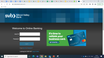
- Dialog box
A limited number of options prevents cognitive overload. Therefore, conduct a careful mapping of the digital platform, distilling out the most important actions and contents. - Central placement
The most important themes should be positioned at the center of the screen. - Large & spacious
The most important buttons should be enlarged and positioned prominently to allow immediate recognition. - Clear language
Topics should be clearly labeled, and the labels should be verified in usability testing. Complicated terms should be avoided since they might not be familiar to the target audience. - Limited number of actions
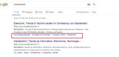
The number of steps (clicks and scrolls) necessary to achieve a goal should be minimized. - Shortcuts and multiple/redundant paths
Make it easy for users to reach their goals by providing multiple options, such as Quick Links, as seen in the example below.

What To Know About Navigation & Orientation?
Some people aged 65+ can experience a decline in memory recall. Some are also unfamiliar with the principles of the digital world. Therefore, to enhance their sense of control, the following principles should be adopted: rely on recognition, not memory; allow going back; design clear navigation keys; be consistent in design and operation; and provide indicators. Below we will discuss several principles to facilitate navigation.
- Recognition, not memory
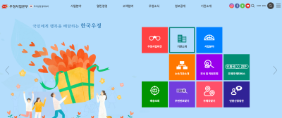
This principle means creating an interface where users do not have to use their memory to recall information. Instead, they will be asked to identify familiar and prominent components, such as quick access to previously visited pages or actions. The illustration below is an example of how Korea’s post office presents the main tasks on the main screen in a way that doesn’t require memory but recognition. Additional support is the use of color to help the users recognize how to navigate the site once they return to it.
- Indicators and feedback:
- Emphasize the performed actions: Use breadcrumbs to indicate which links or buttons the user has clicked on and their location.
- Create a conspicuous and permanent back icon that takes the user to a previous page/stage. This is in addition to the browser’s back and homepage icons.
- Clear and prominent navigation buttons: Emphasize navigation buttons and add text to explain their function.
- Consistency
Create an ongoing, consistent user experience using recurring items. Allow the users to learn the interface, generating a sense of success and building anticipation for the next stage. Pay attention to the location and design of fixed buttons that have the same function. - Progress
Create obvious hints, such as a progress bar, that help users to understand where they are in the process. - Success & mistakes
Highlight progress and successful actions. Additionally, indicate errors clearly and provide ways for easy recovery. - Contact Us
Choose a prominent location for the help options. Provide contact information using various channels, e.g., telephone number and email address.
Choosing components with an age-inclusive mindset can change our day-to-day decisions and allow us to create an easy-to-operate interface.
The following guidelines relate to changes in motor functions.
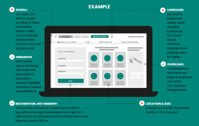
Creating An Interface That Is Easy To Operate
As age increases, it may be accompanied by difficulty in touching a specific spot accurately, regulating a click’s intensity, or performing quick actions, such as double-clicking. Therefore, the following principles should be ensured: space out the keys, avoid the need for a high degree of precision, avoid gestures requiring sensory regulation, and enable users to progress at their own pace.
- Large & spacious
Design large and well-spaced elements. - Individual pace:
- When creating pop-up/toast messages, allow users to initiate closing or at least leave the messages visible for longer for slower readers.
- Avoid menus that open on hover. Always use click-tap menus instead.
- Indication
Provide clear scroll indicators (e.g., side arrows). Reduce the need for precision: Avoid small clicking areas, mouse hovering, and double-clicking. - Ensure that the interface is responsive on all screens.
For touch screens:- Click actions should not rely on touch intensity or precision.
- Avoid, as much as possible, long strokes and drag gestures, and reduce scroll options. At the very least, provide clear indication and instruction, and offer alternatives, such as an arrow or button directing to specific places.
- Avoid the need for very precise actions, such as in small clicking areas, and try to keep to the minimum size for comfortable tapping/clicking of at least 44×44 px.
- Avoid actions requiring fine motor regulation such as spread, pinch, and rotate.
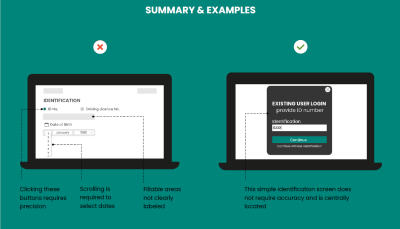
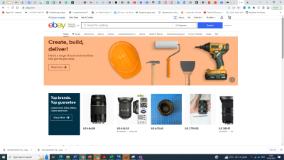
Let’s examine the homepage of three famous e-commerce websites in the eyes of an older user without going into details.
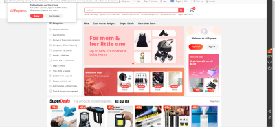
Aliexpress website, as seen in the image above, is a good example of an “unfriendly” website — it suffers from visual overload. Too many buttons and tags are emphasized, which makes it hard to focus older user attention. Moreover, given the visual overload, the side menu is easy to ignore, and many users will be required to use the search bar, which needs to be more dominant and rely on their recall of items, not recognition.On the Amazon website (see the image below), the size of each category image may be distracting, requiring the user to scroll a lot and challenging his ability to navigate.

In contrast with these previous sites, eBay does better regarding visual overload; the dominance of the search bar and even the menu placement make it easier for older users to navigate.
Wrapping Up
Every designer would probably state that they want their website and app to be inclusive, easy to navigate, and user-friendly. Yet, as we have seen in our examples above, we need to create awareness to integrate details that would make it easier for older users to navigate the Internet. As we age, all of us will experience longer reaction times, changes in selective attention, attention-splitting, and changes in our motor functions. Therefore, designing for an older audience will achieve the goals of having an inclusive, easy-to-navigate, and user-friendly for our future selves as well.To sum up, in order to create an easy operation and orientation of an interface, we should pay attention to the following:
- Large, spaced-out objects;
- Operation does not require fine gestures and precision;
- A minimum number of actions to achieve goals;
- The user should control the rate of progress;
- Reassuring notifications upon successful actions;
- Consistency of design and operation;
- Minimizing the number of choices the user must make;
- Highlighting the actions performed by the user.
The article is based on one of the chapters of the Log In guide. The guide was created within the framework of the National Initiative to Promote Digital Literacy Among Older Adults, which is a partnership between the Israel National Digital Agency and JDC-ESHEL.

(yk)
