linear() easing function on the horizon, the possibilities of what we can do to create natural-feeling animations and transitions in the future are greatly expanded. Jhey Tompkins looks at the current state of CSS easing in this article and demonstrates what we can expect from linear(), including handy tools to get your hands on it today.
To paraphrase a saying that has always stuck with me: “The best animation is that which goes unnoticed.” One of the most important concepts of motion design on the web is making motion “feel right.” At the same time, CSS has been fairly limited when it comes to creating animations and transitions that feel natural and are unobtrusive to the user experience.
Fortunately, that’s changing. Today, let’s look at new easing capabilities arriving in CSS. Specifically, I want to demonstrate the easing superpowers of linear() — a new easing function that is currently defined in the CSS Easing Level 2 specification in the Editor’s Draft. Together, we’ll explore its ability to craft custom easing curves that lead to natural-feeling UI movement.
The fact that linear() is in the Editor’s Draft status means we’re diving into something still taking shape and could change by the time it reaches the Candidate Recommendation. As you might imagine, that means linear() has limited support at this moment in time. It is supported in Chrome and Firefox, however, so be sure to bear that in mind as we get into some demos.
Before we jump straight in, there are a couple of articles I recommend checking out. They’ve really influenced how I approach UI motion design as a whole:
There are plenty of great resources for designing motion in UI, but those are two that I always keep within reach in my browser’s bookmarks, and they have certainly influenced this article.
The Current State Of Easing In CSS
We define CSS easing with either the animation-timing-function or transition-timing-function properties, depending on whether we are working with an animation or transition respectively.
Duration is all about timing, and timing has a big impact on the movement’s naturalness.
But, until recently, CSS has limited us to the following easing functions:
linear,steps,ease,ease-in,ease-out,ease-in-out,cubic-bezier().
For a refresher, check out this demo that shows the effect of different timings on how this car travels down the track.
See the Pen [Traditional CSS Easing Options [forked]](https://codepen.io/smashingmag/pen/PoXmRJQ) by Jhey.
The cubic-bezier() function has traditionally provided the most flexibility for creating easing with a little character. The site cubic-bezier.com is a great resource for creating bespoke easing functions. Otherwise, figuring out the exact curve values can be a chore.
This is the current state of easing in CSS. We’ll get to the shiny, new stuff in a bit. But first, I think it’s a good idea to revisit how easing functions influence easing behavior in curvatures.

Visualizing Easing Curves
We can visualize different easings with a graphical curve. The site easings.net does a good job of providing options that can be used with the cubic-bezier() timing function.
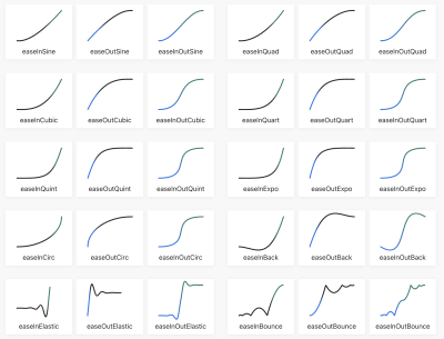
Easing curves can also be viewed in Chromium DevTools, allowing you to inspect any curve applied to a transition or animation.
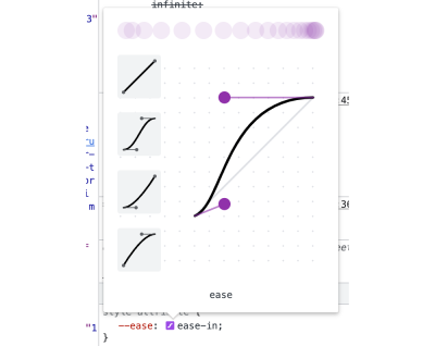
But what if you need something a little extra than what’s available? For example, what about a bounce? Or a spring? These are the types of easing functions that we are unable to achieve with a cubic-bezier() curve.
This is where the new linear() easing function comes into play, pioneered by Jake Archibald and defined in the CSS Easing Level 2 specification, which is currently in the Editor’s Draft. MDN describes it well:
The
linear()function defines a piecewise linear function that interpolates linearly between its points, allowing you to approximate more complex animations like bounce and elastic effects.
In other words, it’s a way to plot a graph with as many points as you like to define a custom easing curve. That’s pretty special and opens new possibilities we could not do before with CSS animations and transitions.
For example, the easing for a bounce could look like this:
:root { --bounce-easing: linear( 0, 0.004, 0.016, 0.035, 0.063, 0.098, 0.141 13.6%, 0.25, 0.391, 0.563, 0.765, 1, 0.891 40.9%, 0.848, 0.813, 0.785, 0.766, 0.754, 0.75, 0.754, 0.766, 0.785, 0.813, 0.848, 0.891 68.2%, 1 72.7%, 0.973, 0.953, 0.941, 0.938, 0.941, 0.953, 0.973, 1, 0.988, 0.984, 0.988, 1 );
}
Here’s how that looks in action:
See the Pen [Bounce Easing 🏀 [forked]](https://codepen.io/smashingmag/pen/KKbmeeQ) by Jhey.
A gentle reminder that browser support is limited to Chrome and Firefox, so be sure to view the demo in one of those browsers. We’re only waiting on Safari at the moment, so we’re almost there!
“I’m not working all that out.”
That easing example sure looks like a lot of numbers plucked straight out of thin air, doesn’t it? As far as complexity goes, we’re looking at something that’s as scary as cubic-bezier() at first glance. The good thing is, once you’ve defined an ease, you’re unlikely to have to touch it again… at least for a while. It’s pretty much a set-it-and-forget-it sort of thing.
But how do we get the numbers in the first place? Jake, the clever mind behind linear(), put together an online generator that does all the heavy lifting for us. In fact, I got the easing values for the bounce demo straight from Jake’s handy tool. Here is a permalink to the output.
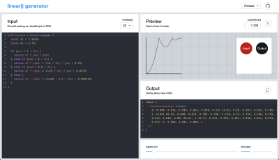
linear() generator app. (Large preview)Where’s All Of This Going?
For as long as I can remember, if I’ve needed some special easing for the work I’m doing, GreenSock has been my go-to solution. Its ease visualizer is one of my favorite examples of interactive documentation.
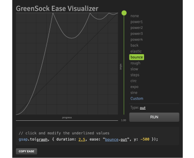
As soon as I heard about the linear() function, my mind went straight to: “How can I convert GreenSock eases to CSS?” Imagine how awesome it would be to have access to a popular set of eases that can be used directly in CSS without reaching for JavaScript.
GreenSock’s visualizer accepts JavaScript or an SVG path. So, my first thought was to open DevTools, grab the SVG paths from the visualizer, and drop them into the tool. However, I encountered a hurdle because I needed to scale down the path coordinates for a viewBox of 0 0 1 1. GreenSock’s visualizer has a viewBox set to 0 0 500 500. I wrote a function to convert the coordinates and reverse the path to go in the right direction. Then, I reached out to Jake with some questions about the generator. The code is available on GitHub.
In my head, I thought the SVG route made sense. But, then I created a path that wouldn’t work in the tool. So, I reached back out to Jake, and we both thought the issue was a bug in the tool.
Jake then asked, “Why do you need to go via SVG?”. His question was spot on! The JavaScript input for the tool expects an easing function. An easing function maps time to a progress value. And we can get the easing functions straight out of GreenSock and pass them to the generator. Jake managed to dig the back easing function out of the GreenSock GitHub repo and create the easing I was originally after.
Generating GSAP Eases For CSS
Now that I’ve given you a bunch of context, we have all the parts of the puzzle we need to make something that can convert GSAP easing to CSS code.
First, we extract the parts from Jake’s linear() generator tool into a script. The idea is to loop over a set of keys and generate a block of CSS with linear() easings. GreenSock has a lovely utility method called parseEase. It takes a string and returns the easing function. The accepted strings are the GreenSock easing functions.
const ease = gsap.parseEase('power1.in')
ease(0.5) // === 0.25
As this loops over an object with different easing functions, we can pass them into the extracted code from the tool. We modify that extracted code to our needs.
const easings = ''
const simplified = 0.0025
const rounded = 4
const EASES = { 'power-1--out': gsap.parseEase('power1.out') // Other eases
}
// Loop over the easing keys and generate results.
for (const key of Object.keys(EASES)) { // Pass the easing function through the linear-generator code. const result = processEase(key, EASES[key]) const optimised = useOptimizedPoints(result.points, simplified, rounded) const linear = useLinearSyntax(optimised, rounded) const output = useFriendlyLinearCode(linear, result.name, 0) easings += output
}
// Generate an output CSS string.
let outputStart = ':root {'
let outputEnd = '}' let styles = ` ${outputStart} ${easings} ${outputEnd}
`
// Write it to the body.
document.body.innerHTML = styles
The functions we extracted from the linear generator do different things:
processEase
This is a modified version of processScriptData. It takes the easing functions and returns points for our graph.useOptimizedPoints
This optimizes those points based on thesimpliedandroundedvalues. This was where I learned about the Douglas Peucker algorithm from Jake.useLinearSyntax
This takes the optimized points and returns the values for thelinear()function.useFriendlyLinearCode
This takes thelinearvalues and returns a CSS string that we can use with the ease’s custom property name.
It’s worth noting that I’ve tried not to touch these too much. But it’s also worth digging in and dropping in a breakpoint or console.info at various spots to understand how things are working.
After running things, the result gives us CSS variables containing the linear() easing functions and values. The following example shows the elastic and bounce eases.
:root { --elastic-in: linear( 0, 0.0019 13.34%, -0.0056 27.76%, -0.0012 31.86%, 0.0147 39.29%, 0.0161 42.46%, 0.0039 46.74%, -0.0416 54.3%, -0.046 57.29%, -0.0357, -0.0122 61.67%, 0.1176 69.29%, 0.1302 70.79%, 0.1306 72.16%, 0.1088 74.09%, 0.059 75.99%, -0.0317 78.19%, -0.3151 83.8%, -0.3643 85.52%, -0.3726, -0.3705 87.06%, -0.3463, -0.2959 89.3%, -0.1144 91.51%, 0.7822 97.9%, 1 ); --elastic-out: linear( 0, 0.2178 2.1%, 1.1144 8.49%, 1.2959 10.7%, 1.3463 11.81%, 1.3705 12.94%, 1.3726, 1.3643 14.48%, 1.3151 16.2%, 1.0317 21.81%, 0.941 24.01%, 0.8912 25.91%, 0.8694 27.84%, 0.8698 29.21%, 0.8824 30.71%, 1.0122 38.33%, 1.0357, 1.046 42.71%, 1.0416 45.7%, 0.9961 53.26%, 0.9839 57.54%, 0.9853 60.71%, 1.0012 68.14%, 1.0056 72.24%, 0.9981 86.66%, 1 ); --elastic-in-out: linear( 0, -0.0028 13.88%, 0.0081 21.23%, 0.002 23.37%, -0.0208 27.14%, -0.023 28.64%, -0.0178, -0.0061 30.83%, 0.0588 34.64%, 0.0651 35.39%, 0.0653 36.07%, 0.0514, 0.0184 38.3%, -0.1687 42.21%, -0.1857 43.04%, -0.181 43.8%, -0.1297 44.93%, -0.0201 46.08%, 1.0518 54.2%, 1.1471, 1.1853 56.48%, 1.1821 57.25%, 1.1573 58.11%, 0.9709 62%, 0.9458, 0.9347 63.92%, 0.9349 64.61%, 0.9412 65.36%, 1.0061 69.17%, 1.0178, 1.023 71.36%, 1.0208 72.86%, 0.998 76.63%, 0.9919 78.77%, 1.0028 86.12%, 1 ); --bounce-in: linear( 0, 0.0117, 0.0156, 0.0117, 0, 0.0273, 0.0468, 0.0586, 0.0625, 0.0586, 0.0468, 0.0273, 0 27.27%, 0.1093, 0.1875 36.36%, 0.2148, 0.2343, 0.2461, 0.25, 0.2461, 0.2344, 0.2148 52.28%, 0.1875 54.55%, 0.1095, 0, 0.2341, 0.4375, 0.6092, 0.75, 0.8593, 0.9375 90.91%, 0.9648, 0.9843, 0.9961, 1 ); --bounce-out: linear( 0, 0.0039, 0.0157, 0.0352, 0.0625 9.09%, 0.1407, 0.25, 0.3908, 0.5625, 0.7654, 1, 0.8907, 0.8125 45.45%, 0.7852, 0.7657, 0.7539, 0.75, 0.7539, 0.7657, 0.7852, 0.8125 63.64%, 0.8905, 1 72.73%, 0.9727, 0.9532, 0.9414, 0.9375, 0.9414, 0.9531, 0.9726, 1, 0.9883, 0.9844, 0.9883, 1 ); --bounce-in-out: linear( 0, 0.0078, 0, 0.0235, 0.0313, 0.0235, 0.0001 13.63%, 0.0549 15.92%, 0.0938, 0.1172, 0.125, 0.1172, 0.0939 27.26%, 0.0554 29.51%, 0.0003 31.82%, 0.2192, 0.3751 40.91%, 0.4332, 0.4734 45.8%, 0.4947 48.12%, 0.5027 51.35%, 0.5153 53.19%, 0.5437, 0.5868 57.58%, 0.6579, 0.7504 62.87%, 0.9999 68.19%, 0.9453, 0.9061, 0.8828, 0.875, 0.8828, 0.9063, 0.9451 84.08%, 0.9999 86.37%, 0.9765, 0.9688, 0.9765, 1, 0.9922, 1 );
}
We’re able to adjust this output to our heart’s desire with different keys or accuracy. The really cool thing is that we can now drop these GreenSock eases into CSS!
How To Get Your Very Own CSS linear() Ease
Here’s a little tool I put together. It allows you to select the type of animation you want, apply a linear() ease to it, and determine its speed. From there, flip the card over to view and copy the generated code.
See the Pen [GreenSock Easing with CSS linear() ⚡️ [forked]](https://codepen.io/smashingmag/pen/zYywLXB) by Jhey.
In cases where linear() isn’t supported by a browser, we could use a fallback value for the ease using @supports:
:root { --ease: ease-in-out;
}
@supports(animation-timing-function: linear(0, 1)) { :root { --ease: var(--bounce-easing); }
}
And just for fun, here’s a demo that takes the GreenSock ease string as an input and gives you the linear() function back. Try something like elastic.out(1, 0.1) and see what happens!
See the Pen [Convert GSAP Ease to CSS linear() [forked]](https://codepen.io/smashingmag/pen/RwEVBmM) by Jhey.
Bonus: Linear Eases For Tailwind
You don’t think we’d leave out those of you who use Tailwind, do you? Not a chance. In fact, extending Tailwind with our custom eases isn’t much trouble at all.
/** @type {import('tailwindcss').Config} */
const plugin = require('tailwindcss/plugin')
const EASES = { "power1-in": "linear( 0, 0.0039, 0.0156, 0.0352, 0.0625, 0.0977, 0.1407, 0.1914, 0.2499, 0.3164, 0.3906 62.5%, 0.5625, 0.7656, 1 )", /* Other eases */
}
const twease = plugin( function ({addUtilities, theme, e}) { const values = theme('transitionTimingFunction') var utilities = Object.entries(values).map(([key, value]) => { return { [`.${e(`animation-timing-${key}`)}`]: {animationTimingFunction: `${value}`}, } }) addUtilities(utilities) }
)
module.exports = { theme: { extend: { transitionTimingFunction: { ...EASES, } }, }, plugins: [twease],
}
I’ve put something together in Tailwind Play for you to see this in action and do some experimenting. This will give you classes like animation-timing-bounce-out and ease-bounce-out.
Conclusion
CSS has traditionally only provided limited control over the timing of animations and transitions. The only way to get the behavior we wanted was to reach for JavaScript solutions. Well, that’s soon going to change, thanks to the easing superpowers of the new linear() timing function that’s defined in the CSS Easing Level 2 draft specification. Be sure to drop those transitions into your demos, and I look forward to seeing what you do with them!
Stay awesome. ┬┴┬┴┤•ᴥ•ʔ├┬┴┬┴

(gg, yk)
