@property, and more to create a neat hover effect that would have been extremely difficult to do even a few years ago without the latest and greatest that CSS has to offer.
In a previous article on CSS-Tricks, I demonstrated how to create a fancy hover effect where an avatar pops out of a circle on hover. The challenge was to make such an effect using only the <img> tag.
See the Pen [Fancy hover effect on avatar](https://codepen.io/t_afif/pen/MWBjraa) by Temani Afif.
That was a fun exercise! I relied on a combination of classic styling tricks involving background, outline, and mask to create the effect. This time, I want to pull off something similar while pushing the limits of CSS a little further to create a more complex effect using a few of the newer features that have been released in CSS over the past couple of years — things like shapes made from gradients paired with trigonometric functions and custom properties.
We are going to put those concepts to use to spice up the last demo. Instead of a simple circle, we will have a kind of flower shape that rotates and… well, a demo worth a thousand words:
See the Pen [Fancy Pop Out hover effect!](https://codepen.io/t_afif/pen/qBQzrwq) by Temani Afif.
Cool, right? We have a fancy shape that rotates. On hover, the avatar pops out of the frame, the rotation speeds up, and the shape is slightly modified — all at the same time. And, it’s worth calling out that it’s done with nothing more than a single <img> element in the markup. Better yet, we won’t even be reaching for pseudo-elements, like :before and :after in the process. It’s a great demonstration of what CSS can do these days!
I do want to note, however, that we’re going to be living on the bleeding edge a bit. So, while all of the concepts we’re covering here are fun, I wouldn’t say that everything is production-ready at this point, as they have yet to be implemented in one browser or another. For the sake of demonstration, I suggest viewing the work we do together in Chrome or Edge since they do indeed support everything we’re discussing.
We’ll tackle this one step at a time, starting with an image against a masked shape to create the frame. From there, we’ll handle the rotations before topping things off with the pop-out effect from the last demo.

Masking The Frame
Let’s start by creating a flower shape using CSS masks. This is what we are aiming for:
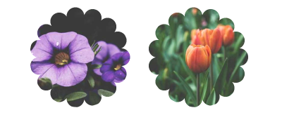
I know it might seem like this shape requires advanced trickery. But if we break it down a bit, all we’re really talking about is a series of small circles around a much larger circle.
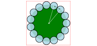
We are going to rely on radial-gradient and some math, specifically trigonometric functions. Bramus Van Damme provides an excellent primer on trigonometric functions over at web.dev. It’s very much worth your while to brush up on the concept with that article.
We are going to define two variables to control the flower shape. N represents the number of the small circles, and R is the diameter of the small circles (Illustrated by the black arrow in the figure above). If we have the diameter, then we can calculate the radius by dividing R by 2. This is everything we need to create the shape!
Here is what the code of a small circle looks like:
img { --r: 50px; mask: radial-gradient(#000 70%, #0000 72%) no-repeat {position} / var(--r) var(--r);
}
All of the small circles can use the same radial gradient. The only difference between them is the position. Here comes the math:
(50% + 50% * cos(360deg * i/N)) (50% + 50% * sin(360deg * i/N))N is the number of circles, and i is the index of each circle. We could manually position each circle individually, but that’s a lot of work, and I believe in leveraging tools to help do some of the heavy lifting. So, I’m going to switch from CSS to Sass to use its ability to write loops and generate all of the circle positions in one fell swoop.
$n: 15; /* number of circles */ img { --r: 50px; /* control the small circles radius */ $m: (); @for $i from 1 through ($n) { $m: append($m, radial-gradient(#000 70%,#0000 72%) no-repeat calc(50% + 50% * cos(360deg * #{$i / $n})) calc(50% + 50% * sin(360deg * #{$i / $n})) / var(--r) var(--r), comma); } mask: $m;
}
We’re essentially looping through the number of circles ($n) to define each one by chaining the radial gradient for each one as comma-separated values on the mask ($m) that is applied to the image element.
We still need the large circle that the small circles are positioned around. So, in addition to the loop’s output via the $m variable, we chain the larger circle’s gradient on the same mask declaration:
img { /* etc */ mask: $m, radial-gradient(#000 calc(72% - var(--r)/2),#0000 0);
}
Finally, we define the size of the image element itself using the same variables. Calculating the image’s width also requires the use of trigonometric functions. Then, rather than doing the same thing for the height, we can make use of the relatively new aspect-ratio property to get a nice 1:1 ratio:
img { /* etc */ width: calc(var(--r) * (1 + 1/tan(180deg / #{$n}))); aspect-ratio: 1;
}
Check it out. We have the shape we want and can easily control the size and number of circles with only two variables.
See the Pen [Flower shape using CSS Mask](https://codepen.io/t_afif/pen/poQMvbV) by Temani Afif.
Rotating The Shape
Now, let’s rotate the shape. The idea is to move the smaller circles around the bigger circle to simulate the rotation of the whole shape.
To do this, we are going to animate the angle. That same angle is used to place the circles, so by adjusting it slightly, we create a circular movement.
img { --a: 0deg; $m: (); @for $i from 1 through ($n) { $m: append($m, radial-gradient(#000 70%, #0000 72%) no-repeat calc(50% + 50% * cos(360deg * #{$i/$n} + var(--a))) calc(50% + 50% * sin(360deg * #{$i/$n} + var(--a))) / var(--r) var(--r), comma); } animation: rotate 10s linear infinite; /* etc */
}
@keyframes rotate { to { --a:360deg }
}
That looks super complex, right? But really, it’s the same equation we had before, but with the addition of a new variable that represents the angle (--a) in degrees and applies an animation on the image. Instead of having a fixed angle equal to 360deg * #{$i/$n}, the angle is controlled with the --a CSS variable that we animate from 0deg to 360deg to create a full rotation.
Here’s where we would get stuck without a little extra dash of modern CSS magic. Traditionally, CSS is unable to interpolate between CSS variables. That’s changed with the introduction of @property. It allows us to register a custom property and define its characteristics and, more precisely, its type (using syntax) so that the browser knows how to interpolate its values. It’s like writing our own little CSS specification.
@property --a { syntax: "<angle>"; initial-value: 0deg; inherits: false;
}
Voilà! We have rotation.
See the Pen [Rotating the flower shape](https://codepen.io/t_afif/pen/oNQKgGX) by Temani Afif.
Now, let’s try to control the rotation on hover. What about slowing it down on hover? Or speeding it up? Again, this is already possible in CSS, but even better with a modern technique that doesn’t require extra markup. And where we might have needed to define multiple @keyframes, we now only need one.
.box { --d: 5s; /* Animation duration */ --s: 0.5; /* Speed factor 0: no change in speed [0 1]: decreases the speed 1: stops the animation [1 +infinity]: moves in the opposite direction */ --_a: r linear infinite; animation: var(--_a) var(--d), var(--_a) calc(var(--d) / var(--s)) reverse paused; animation-composition: add;
} .box:hover { animation-play-state: running;
} @keyframes r { to { rotate: 1turn }
}
The whole trick relies on the animation-composition property. Quoting MDN:
“The
animation-compositionCSS property specifies the composite operation to use when multiple animations affect the same property simultaneously.”
Quoting again, this time regarding the add value:
add
The effect value builds on the underlying value of the property. This operation produces an additive effect.
I am applying the same animation (named r for rotation) twice on the image, and by using animation-compositon: add, both animations are combined. Notice how the second animation runs in reverse and is paused. This means we initially ran the first animation. Then, on hover, both animations run simultaneously.
And here comes the magic.
The result depends on the duration of the animations. If both animations run at the same duration, the element stops altogether. The way we’ve implemented the animations is that one moves forward and the other in reverse, resulting in no movement at all. Yes, there’s a little physics to all of this.
Now, if the second animation is slower (i.e., has a larger duration value) than the first, the initial rotation slows down. But if the second animation is faster (i.e., has a smaller duration value) than the first, the element rotates in the opposite direction.
This may sound a bit confusing, but once you play with the code, it becomes a lot easier to understand, especially if you’re a visual learner. Here is a demo where you can adjust the different variables to play with the results:
See the Pen [Hover to slow down the animation](https://codepen.io/t_afif/pen/vYQNLoe) by Temani Afif.
Let’s apply this to our example and slow down the rotation on hover:
See the Pen [CSS-only Flower mask with rotation and hover effect](https://codepen.io/t_afif/pen/XWyGWyJ) by Temani Afif.
That’s awesome! The only added bit in this example is a scale effect to the smaller circle on hover. So, on hover, the smaller circles change size in addition to the rotation slowing down.
Creating The “Pop Out” Effect
We’ve been focusing on the frame up to this point, but let’s re-introduce the avatar from the original demo and work on making it “pop” out of the frame on hover.
Unfortunately, we are unable to simply re-purpose the same mask we created for the frame. If we did, this is the result:
See the Pen [Apply the mask to the avatar image](https://codepen.io/t_afif/pen/WNLejBB) by Temani Afif.
We need to make sure the mask doesn’t hide the top of the avatar; otherwise, the mask sits on top of it. Let’s add another mask layer to the top portion of the frame without obscuring the bottom half of the flower shape.
img { /* Same Sass loop, variables, etc. */ mask: linear-gradient(#000 0 0) top / 100% 50% no-repeat, /* the new mask layer */ radial-gradient(#000 calc(72% - var(--r)/2), #0000 0), $m;
We’re using a linear gradient this time since that’s sufficient for covering the top half of the image element’s frame:
See the Pen [Removing the top portion of the mask](https://codepen.io/t_afif/pen/xxmKrKd) by Temani Afif.
We’re getting closer, but not yet done! The flower-shaped mask is only the bottom portion, but now we are missing the top half. We’re unable to resolve this with mask this time, but we can do it using the trusty background property since the background is painted behind the image rather than in front of it.
No need to worry! There are no complex math operations here. We defined gradients for the mask to create the flower shape, and we can reuse them on the background property to get the same flower shape, only applied to the background of the image rather than in front of it.
img {
/* etc */ mask: linear-gradient(#000 0 0) top / 100% 50% no-repeat, radial-gradient(#000 calc(72% - var(--r)/2), #0000 0), $m; background: radial-gradient(#000 calc(72% - var(--r)/2), #0000 0), $m;
}
All I did was copy mask’s radial gradient configuration and apply it to the background property. This gives us the missing part of our flower shape.
See the Pen [Adding the background configuration](https://codepen.io/t_afif/pen/YzdKQXL) by Temani Afif.
The black you see in the background comes from the black used in the gradients. So, if you prefer a different color, it can be updated by replacing those values with another color value. The alpha channel is really the only thing that matters when using a mask, so changing black to any other color won’t make a difference in this context.
All that’s left to do is add the “pop out” effect on hover. For this, we are going first to update the gradient configuration, as illustrated in the following figure:
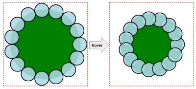
We’re basically reducing the distance of the small circles, making them closer to the center. Then, we reduce the size of the larger circle as well. This produces an effect that appears to change the roundness of the smaller circles on hover.
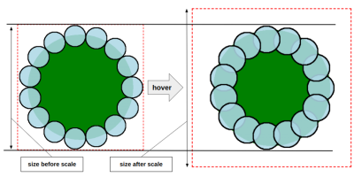
The final trick is to scale the entire image element to make sure the size of the hovered shape is the same as the non-hovered shape. Scaling the image means that the avatar will get bigger and will pop out from the frame that we made smaller.
$n: 15; /* number of circles */ @property --i { syntax: "<length>"; initial-value: 0px; inherits: true;
} img { /* CSS variables */ --r: 50px; /* controls the small circle radius and initial size */ --f: 1.7; /* controls the scale factor */ --c: #E4844A; /* controls the main color */ $m: (); /* Sass loop */ @for $i from 1 through ($n) { $m: append($m, radial-gradient(var(--c) 70%, #0000 72%) no-repeat calc(50% + (50% - var(--i, 0px)) * cos(360deg * #{$i/$n} + var(--a, 0deg))) calc(50% + (50% - var(--i, 0px)) * sin(360deg * #{$i/$n} + var(--a, 0deg))) / var(--r) var(--r), comma); } mask: linear-gradient(#000 0 0) top/100% 50% no-repeat, radial-gradient(var(--c) calc(72% - var(--r)/2 - var(--i, 0px)), #0000 0), $m; background: radial-gradient(var(--c) calc(72% - var(--r)/2 - var(--i, 0px)), #0000 0), $m; transition: --i .4s, scale .4s;
} img:hover { --i: calc(var(--r)/var(--f)); scale: calc((1 + 1/tan(180deg/#{$n}))/(1 - 2/var(--f) + 1/tan(180deg/#{$n})));
}
Here’s what’s changed:
- The Sass loop that defines the position of the circle uses an equation of
50% - var(--i, 0px)instead of a value of50%. - The larger circle uses the same variable,
--i, to set the color stop of the main color in the gradients that are applied to themaskandbackgroundproperties. - The
--ivariable is updated from0pxto a positive value. This way, the small circles move position while the large circle becomes smaller in size. - The
--ivariable is registered as a custom@propertythat allows us to interpolate its values on hover.
You may have noticed that I didn’t mention anything about the --f variable that’s defined on the image element. Truthfully, there is no special logic to it. I could have defined any positive value for the variable --i on hover, but I wanted a value that depends on --r, so I came up with a formula (var(--r) / var(--f)), where --f allows controls the scale.
Does the equation on the scale property on hover give you a little bit of panic? It sure looks complex, but I promise you it’s not. We divide the size of the initial shape (which is also the size of the element) by the size of the new shape to get the scale factor.
- The initial size:
calc(var(--r)*(1 + 1 / tan(180deg / #{$n}))) - The size of the new shape:
calc(var(--r) * (1 + 1 / tan(180deg / #{$n})) - 2 * var(--r) / var(--f))
I am skipping a lot of math details to not make the article lengthy, but feel free to comment on the article if you want more detail on the formulas I am using.
That’s all! We have a nice “pop out” effect on hover:
See the Pen [Fancy Pop Out hover effect!](https://codepen.io/t_afif/pen/qBQzrwq) by Temani Afif.
Wrapping Up
Does all of this seem a bit much? I see that and know this is a lot to throw at anyone in a single article. We’re working with some pretty new CSS features, so there’s definitely a learning curve with new syntaxes, not to mention some brushing up on math functions you probably haven’t seen in years.
But we learned a lot of stuff! We used gradients with some math to create a fancy shape that we applied as a mask and background. We introduced @property to animate CSS variables and bring our shape to life. We also learned a nice trick using animation-composition to control the speed of the rotation.
We still have a second part of this article where we will reuse the same CSS techniques to create a fancier hover effect, so stay tuned!
I’ll leave you with one last demo as a sign-off.
See the Pen [Pop out hover effect featuring Lea and Una](https://codepen.io/t_afif/pen/OJrLgeV) by Temani Afif.

(gg, yk)
